Any ideas what the faction icons represent ?
Some are pretty obvious, others not so much
Brasilia - Its an ascending star (or rocket), also the ascending star reminds the Brasilia (the real one) seal. wiki
ARC - The All seeing eye is a nod to their spy UA and maybe the dollar bill
Franco Iberia - An stylized fleur-de-lis, symbol of France
PAU - An stylized hieroglyph, symbol of Egypt
Kavithan - An stylized lotus, symbol of Buddhism
Now the hard ones
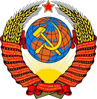
Slavic Federation - The laurel wreath is more Roman then Russian, although the lower part reminds an cogwhell, maybe a nod to production and the hammer on old Sovietic flag, the ribbon around the star may be a reference to their satellites UA too
Polystralia - The 3 dots and 3 arrows (?) represent their commerce bonus ? trade routes coming out of cities ? I have no idea
PAC - I will not even try anything on this one
Thoughts ?
Some are pretty obvious, others not so much
Brasilia - Its an ascending star (or rocket), also the ascending star reminds the Brasilia (the real one) seal. wiki
ARC - The All seeing eye is a nod to their spy UA and maybe the dollar bill
Franco Iberia - An stylized fleur-de-lis, symbol of France
PAU - An stylized hieroglyph, symbol of Egypt
Kavithan - An stylized lotus, symbol of Buddhism
Now the hard ones
Slavic Federation - The laurel wreath is more Roman then Russian, although the lower part reminds an cogwhell, maybe a nod to production and the hammer on old Sovietic flag, the ribbon around the star may be a reference to their satellites UA too
Polystralia - The 3 dots and 3 arrows (?) represent their commerce bonus ? trade routes coming out of cities ? I have no idea
PAC - I will not even try anything on this one
Thoughts ?