Vuldacon is very good at palette manipulation to change the "look" of units. He might have some good tips for reducing the shadow pixels around the edge if you ask him. As for the problem with details, I think you just need to accept that it's in the nature of units of this kind. Most modern infantry probably do look extremely similar from that distance except to the most discerning eye! It doesn't mean the unit is bad or doesn't look as good as it could. Personally I think that your units are excellent and blend in extremely well with the Firaxis ones. The problem, to the extent that there is a problem, lies more in the similar-looking nature of twentieth-century infantry, not in your rendition of them.
You are using an out of date browser. It may not display this or other websites correctly.
You should upgrade or use an alternative browser.
You should upgrade or use an alternative browser.
Gary's Poser Unit Creation Thread and Workshop
- Thread starter Gary Childress
- Start date
Stormrage
Ever Present Taskmaster
Pink, red and cyan camo, for all your anti-crackhead warfare needs!
Gary, you have to do what Steph says, he works for the Government now..
Seriously, your units look great. Take a break if you need one, but not for the reason you stated.")
Gary, you have to do what Steph says, he works for the Government now..
Seriously, your units look great. Take a break if you need one, but not for the reason you stated.
Gary Childress
Student for and of life
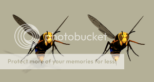
Well this doesn't take out all the shadow colors but I used the "Sharpness" adjustment in PSP to make a sharper contrast within the unit and between the unit and the surrounding magenta. Here is a sample of the added sharpness. The first pic is "before" and the second pic is "after". I think you can tell a difference. I think "after" looks a little better.


Stormrage
Ever Present Taskmaster
I think after looks a little.. pixelated.  The camo is better, but the edges are not.
The camo is better, but the edges are not.Virote_Considon
The Great Dictator
Oh, I think the "after" is much better! You can really see the camo!
Gary Childress
Student for and of life
"After" may be a little pixelated but I think more is gained in the increased detail than is lost. "After" is much sharper than "before". You can actually see the straps on his combat gear on his back. "Before", too me, looks kind of dull and lackluster, like an unpolished coin.
EDIT: Also the nice thing about the "sharpness" adjustment in PSP is that I can apply it to units which I've already animated. I can go back and spruce up most of my old units a bit.
EDIT: Also the nice thing about the "sharpness" adjustment in PSP is that I can apply it to units which I've already animated. I can go back and spruce up most of my old units a bit.
Gary Childress
Student for and of life
The picture above shows the units in game next to the duller original unit. The newer unit is on the right and I think it compares more favorably to Firaxis units. But I will let others decide if they like the sharper contrast units.
I think duller is acceptable, but after may be a little better, as it increases the visibility of the camo.
So... Do what you personally prefer!
So... Do what you personally prefer!
I think the sharper look does resemble the Firaxis units more closely, and you can certainly see the details more clearly. Personally I prefer the unsharpened original, but that may just be me. You should definitely make them in the way that you prefer.
I think what people are seeing with the Sharper Image above is that the Image is Too Sharp for the Distance in reality unless you are an Eagle  Some areas are a tad too sharp to "fit the distance" but I do like the sharpness that shows the details better...just not so much.
Try a "Happy Medium" if you intend to use PSP to sharpen finished Units. Click "Unsharp Mask" and select a sharpness in between the Original and the Sharpness you applied here.
In Poser 6, Turn Off Texture Filtering in FireFly and render a Test Image of the Unit you are working on. See if this Sharpens/Brightens your Unit like you want. Some Textures and Units will render better with Texture Filtering on but generally the Small Units we make for the CIV Game tend to be better without Texture Filtering. Texture Filtering is more for a Scene than a small single Unit.
...Another Thing that affects Brightness and Color is Shadow Maps in Poser. When rendering with Shadows, the Image will be darker over all and have a lower Clarity than when rendered without Shadows. Shadow Maps affect the Unit Image as well as the actual Shadows.
A longer procedure where you render the Unit with Shadows then render again without Shadows then Copy and Paste the Images without the Shadows over the Images with Shadows will provide the Good Brightness and Colors while Keeping the Shadows.
Anti-Aliasing is Good in my opinion, despite the Original Game Units not having it. Anti-Aliasing smooths the Edges and does not affect the Unit Image like Shadow Maps or Texture Filtering.
Here is an example of two renders. One with Shadows and one without Shadows. You can see the general Darkness of the Unit with Shadows, especially evident with the wings and detail. Note that the Shadows are not behind the Wings so this is not what causes this...it is the Over All affect of Shadow Maps on Images.
Some areas are a tad too sharp to "fit the distance" but I do like the sharpness that shows the details better...just not so much.Try a "Happy Medium" if you intend to use PSP to sharpen finished Units. Click "Unsharp Mask" and select a sharpness in between the Original and the Sharpness you applied here.
In Poser 6, Turn Off Texture Filtering in FireFly and render a Test Image of the Unit you are working on. See if this Sharpens/Brightens your Unit like you want. Some Textures and Units will render better with Texture Filtering on but generally the Small Units we make for the CIV Game tend to be better without Texture Filtering. Texture Filtering is more for a Scene than a small single Unit.
...Another Thing that affects Brightness and Color is Shadow Maps in Poser. When rendering with Shadows, the Image will be darker over all and have a lower Clarity than when rendered without Shadows. Shadow Maps affect the Unit Image as well as the actual Shadows.
A longer procedure where you render the Unit with Shadows then render again without Shadows then Copy and Paste the Images without the Shadows over the Images with Shadows will provide the Good Brightness and Colors while Keeping the Shadows.
Anti-Aliasing is Good in my opinion, despite the Original Game Units not having it. Anti-Aliasing smooths the Edges and does not affect the Unit Image like Shadow Maps or Texture Filtering.
Here is an example of two renders. One with Shadows and one without Shadows. You can see the general Darkness of the Unit with Shadows, especially evident with the wings and detail. Note that the Shadows are not behind the Wings so this is not what causes this...it is the Over All affect of Shadow Maps on Images.
RedAlert
Love one another

Just comparing the duller and sharper images above, I personally consider the pros of the sharper image, as you described, Gary, as oughtweighing the cons. But as Vuldacon has shown, the choice need not be between those two. Play around with some of the features in PSP and see if you can't come up with something Goldilocks would be satisfied with.
Personally, I prefer the sharper. I think "sharpness" tends to give better contrast against terrain.
Best,
Oz
Best,
Oz
Gary...Try adjusting the Contrast on your Units. You can add more Contrast and then change the Magenta and green shades back to their Original Shades. This way you can gain sharpness without having to Make a New Palette.
Experiment with all of these things to gain what you are looking for and obtain your personal procedures that will become faster as you work with them.
Note about General Unit appearance and contrast... It is Best to Check your Rendered Units against the Game Map they will be seen on. This does make a Difference. EFZI2 has very high Contrast and is a Dark Map while the Original Civ Game is a lower Contrast, lighter Map. The Same Unit will look different on them.

Blue Monkey
Archon Without Portfolio
I was going to offer the same suggestion as in Vuldacon's last post. I've found with the PCXs that adjusting the brightness/contrast before indexing the palette makes them easier to "read" in game. It also lets me make smaller sharpness adjustments to achieve the desired effect without getting jaggies.
againsttheflow
unpolitically uncorrect
I had not stopped by this thread in a while. Though I voted in the other thread for the before unit I'd agree with Vuldacon, there are several things I like about the sharper unit and perhaps there is a happy medium. Just FYI, Gimp has a scale for sharpness allowing easy customization that I've found quite useful.
That is a Good method for New Units againsttheflow... Gary was wanting a way to alter existing Units in this case. Paint Shop Pro has the ability to adjust any level of Sharpness desired as well as Contrast, Brightness and others.
...Applying more sharpness causes the need to make a New Palette and when sharpening the Unit, the Light pixels become too Bright which causes the extreme look that does not "blend" in a "realistic" way... Sharp Sparkles is the word that comes to mind
If an existing Unit is Sharpened, it would be best to adjust the color pixels that are Too Bright after applying the new palette.
...Sharpen the Storyboards as desired, Make a New Palette, Apply the New Palette to the Sharpened Storyboards using "Nearest Color Matching" then adjust the Pixels that are too Bright. Save this adjusted Palette as the Final Palette. You can then apply the First Palette to all of the Sharpened Storyboards using "Nearest Color Matching" and then apply the Final Palette with the "Maintaining index" setting.
Personally, I find that adjusting the Contrast and Brightness levels on an Existing Unit to work easier. All Unit Colors remain in their same index so those Unit Colors can be copied to the Original Palette using Pedit Palette Editor in the same Places. The reason to do this is to Correct the Civ Specific Colors, Smoke and Shadow Shades because they will be altered when the Unit is adjusted as well. If this Method is used, you can simply Load the New Palette to the Existing Original Unit Storyboard and Maintain Index.
Best to use a Screenshot of your Game Map as a Background to check your Adjustments when Creating or Adjusting a Unit because we cannot see the results of Adjustments against the .pal or Alpha.pal Backgrounds when working in Graphics Editors.
Just a Note about the Shadow Shades on the Unit Game Palette... I have seen many Units that Alter the Shades on the .pal Palette for Shadows. This Only affects the Preview for the Magenta Shadows. Those Shades will show as their Original Shadow Shades in Game because they maintain index for their original Shades. What this means is a Unit will have the original shadows of what ever shadow slots you use on the Palette regardless of if you change them. Changing the Shadows can make a Preview look better but in game will show the Original Shadows Shades. This is the same for Smoke Shades as well... all indexed.
...We can only Alter the 160 Unit Palette Colors of the 256 colors on Unit Palettes. Because Rendered Images are 16 Million Colors, this means we reduce the Unit Colors 100 thousand times and THAT is just one of the tough factors that affects the Desired Esthetic End Results of Units.
Comparing the Screenshot of the CIV Game Warriors to the Previous and Sharpened Units, I like the Sharpened Units but without the "Sparkles" and that would require additional Palette Editing to subdue those color pixels.
In the End, Please Yourself Gary
He had a crush on a girl, but as she didn't like him, he lost his confidence, and he has decided to join a travelling circus as a walrus trainer for some time, to ponder on the meaning of life for a few months.
Similar threads
- Replies
- 13
- Views
- 2K
- Replies
- 1
- Views
- 453
- Replies
- 0
- Views
- 350
- Replies
- 8
- Views
- 1K