New Civ7 default style

The_J

Say No 2 Net Validations
Administrator
Supporter
Joined
Oct 22, 2008
Messages
41,859
Location
DE/NL/FR
Hi everyone,

since we had the competition for a new Civ7 banner, we've decided also to make a new style.
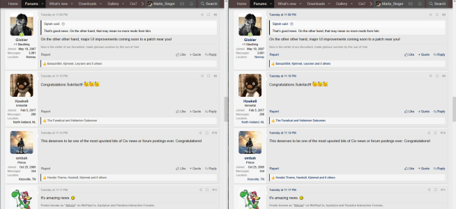
I've set this style now to default, with one of the new banners (other banners will probably get incorporated later, potentially in some of the other styles).

Now, if there is feedback, please let us know.
We're interested in 3 types of feedback:
  1. Everyone. Is there something broken, something badly visible? Let us know here
  2. You are visually impaired. Again, let us know, we'll see if this is fixable. There will be issue which are not fixable, I am afraid (although this style should completely accidentally be suitable for most colourblind people), in which case we'd need to recommend switching to one of the other styles
  3. You're a design professional. Please let us know if we did something objectively horrible. We're not designers, so this isn't our strong suite.
Thanks :).


EDIT: The old default style is still available, and you can change your style on the bottom left. The current style is called "Civ7Fanatics", and if you click on there, you get the menu for the other styles.
EDIT2: When you get a notification, and there are links in there, these are not well distinguishable from the normal text. We tried to fix this, but it seems we can't. That is the only thing which we noticed isn't working well.
 
I find the timestamp on the Notifcation when it's unread to be quite hard to read. But other than that love this glow-up

Still wish my username didn't wrap so awkwardly.
 
I like the new theme, it's a really nice banner and it overall looks more modern! 😀

If you want some feedback, maybe the theme is a bit too gray, which is a bit monotonous and can indeed lead to some readibility issue.

Just as a quick check I looked at how it would be in replacing the new gray for usernames and links with the dark blue of the Civ6 theme (see attached image). Would that be better?
 

Attachments

  • 1741479438819.png
    1741479438819.png
    254.1 KB · Views: 52
I hope the dark banner gets incorporated into the Grey scheme; light backgrounds give me migraines. :(
 
It was too bright for my eyes, too. I just went back to the old Civ 6 theme.
 
Looks alright, but the first thing that stood out to me was the banner, repeating in a mosaic-like fashion at my 2560x1440 resolution. 1440p is an increasingly common gamer's resolution, gradually succeeding 1080p as the middle ground.

So either the banner needs to be wider, maybe as far as 4K (3840px), or make use of some modern fade-out/blur-out effect to camouflage the edges the image can't reach.

Spoiler :
1741485891985.png
 
Still wish my username didn't wrap so awkwardly.

I don't know how much customization is possible on XenForo, but that could be managed with the following rule:
If the username wraps across multiple lines and has no space as natural line break, then line breaks should be added between lowercase and uppercase characters.

JavaScript:
function formatUsernameIfWrapped() {
    // Whatever is your way to identify usernames
    const username = document.getElementById('username');
    const originalText = username.innerText;
    const usernameHasSpace = /\s/.test(originalText);

    // Check if text wraps by comparing height before and after forcing a single line
    const initialHeight = username.offsetHeight;
    username.style.whiteSpace = 'nowrap'; // Force single line
    const singleLineHeight = username.offsetHeight;
    username.style.whiteSpace = ''; // Go back to default

    if ((initialHeight > singleLineHeight) && !usernameHasSpace)  {
        // Add <br> between lowercase and uppercase transitions
        username.innerHTML = originalText.replace(/([a-z])([A-Z])/g, '$1<br>$2');
    }
}

// This could be triggered on load and when window is resized
document.addEventListener('DOMContentLoaded', formatUsernameIfWrapped);
window.addEventListener('resize', formatUsernameIfWrapped);

As a result "TheMarshmallowBear" would then appear like that:
1741482346176.png
 
Last edited:
What I notice is that this style replaced the one I had before for years (blue-themed), and I can't find it again.
 
What I notice is that this style replaced the one I had before for years (blue-themed), and I can't find it again.

We lost the vBulletin themes when the forum migrated to XenForo. Which is odd, when I remember that most of the elements of TrekBBS' themes came with us when that forum migrated from vBulletin to XenForo. Some icons were lost (and I wish they'd put them back, but ohwell).

I do sympathize, as Dark Blue is the one I always used before.


@The_J: I've temporarily switched to Civ 7, to see if I have any 5-cent opinions to offer (it costs more because we don't use pennies in Canada anymore ;)).

It's not terrible, at least what I can tell so far. I agree with the people upthread who were not happy with orange font on a brown background. That combination is utterly unreadable, even for people with normal vision. There isn't enough contrast, and the brown just overwhelms the orange.

Something about the banner is odd. The title is off-center. Do you intend to add an image of some sort on the left side?

There's a problem with the style menu that lets you pick bold, italic, etc. and the rest of that. It's too light, and the moment I mouse over one of them, they become invisible. The color of the icons you click needs to be a lot darker than it is, and something needs to be done about the mouseover.

I may have more to add later. I will be going back to the Dark CFC, though, since I love that one; it's the best one for my vision.
 
This screenshot shows how the new banner is looking on my pc. The most important parts of the banner can not be seen. The old Civ VI banner is completely visible on my pc. I don´t want to change the resolution of my pc for a banner.

New Banner.jpg
 
I've set the Civ6 style for now again as the main theme, as I especially don't want to have a messed up banner.

Looks alright, but the first thing that stood out to me was the banner, repeating in a mosaic-like fashion at my 2560x1440 resolution. 1440p is an increasingly common gamer's resolution, gradually succeeding 1080p as the middle ground.

So either the banner needs to be wider, maybe as far as 4K (3840px), or make use of some modern fade-out/blur-out effect to camouflage the edges the image can't reach.


This screenshot shows how the new banner is looking on my pc. The most important parts of the banner can not be seen. The old Civ VI banner is completely visible on my pc. I don´t want to change the resolution of my pc for a banner.

View attachment 724143

:cry: I don't know.
Atlas is 1920 px wide. It seems to scale on bigger on smaller screens.
The new them is 1920 px wide. It doesn't scale.
Settings are the same.
I don't understand it.
 
The top banner’s site logo is quite difficult to read on mobile. View attachment 724082

Also, no offense to whomever chose it, but the brown/orange color scheme doesn’t really seem very Civ 7? Seems to me that a charcoal/gold (maybe white too for the marble) scheme would fit much better.

I spent 30 minutes on that, and the main outcome was that I broke the banner and had to get that one fixe.
At some point I had the colour changed, to something which also looked horrible, but I don't know which option that was ,and now all of them don't seem to be doing that anymore. I don't know if that's due to te caching on the mobile browser or not, and I don't understand what's happening.

To note: Same issue for the normal Civ6 style.
 
I like the new layout. That being said, seeing it I felt like I should made some adjustments to the banner. So I did
Spoiler :
banner1080.png
banner1080bg.png
banner1080city.png
banner1080logotype.png


logotype.png
banner4k.png
banner4kbg.png


banner4kcity.png
banner4klogotype.png


I've uploaded separated layers in case extra assets are useful.
 
I like the new theme, it's a really nice banner and it overall looks more modern! 😀

If you want some feedback, maybe the theme is a bit too gray, which is a bit monotonous and can indeed lead to some readibility issue.

Just as a quick check I looked at how it would be in replacing the new gray for usernames and links with the dark blue of the Civ6 theme (see attached image). Would that be better?

The point was to have the new theme different a bit.
I've adjusted the colours. No idea if that's better :/.
EDIT: Nope, reverted it, didn't look good on mobile :(.
 
Also, no offense to whomever chose it, but the brown/orange color scheme doesn’t really seem very Civ 7? Seems to me that a charcoal/gold (maybe white too for the marble) scheme would fit much better.

It's not terrible, at least what I can tell so far. I agree with the people upthread who were not happy with orange font on a brown background. That combination is utterly unreadable, even for people with normal vision. There isn't enough contrast, and the brown just overwhelms the orange.

I think orange and brown only appears in one instance, that's when you have an embedded link. Otherwise I've not seen that around.
For the colours themself, the light and dark (lightest grey and kinda black) are picked from the offical Civ7 logo. I wanted to add some gold type to it (as e.g. from the Civ7 banner from potworny), but that ended up clashing horribly. I had it a bit more orange-y for a while, but ended up muting that somewhat. That's how we ended up here.
 
I like the new layout. That being said, seeing it I felt like I should made some adjustments to the banner. So I did

I've uploaded separated layers in case extra assets are useful.

Thanks, having font and background separate is good, because these can be uploaded separately and will be handled separately by the server.
For the wrapping-around issue, I had considered elongating the banner on either side, so thanks for your adjustments :) (this is also the reason why I picked your banner right now, and not from the 2 other winners, as these would wrap badly).
There seems to be some other issue with the scaling, as pointed out above, so I don't know if that'll be necessary or if that can be handled differently.
Or if I figure this out at all :cry:
 
:cry: I don't know.
Atlas is 1920 px wide. It seems to scale on bigger on smaller screens.
The new them is 1920 px wide. It doesn't scale.
Settings are the same.
I don't understand it.
Actually, I think the Atlas banner has the same issue. It's just less noticeable because the sides of the image merge better. :p

Spoiler :
1741532265837.png
 
Back
Top Bottom