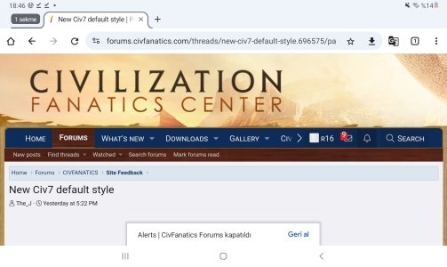
New Civ7 default style

Thanks, having font and background separate is good, because these can be uploaded separately and will be handled separately by the server.
For the wrapping-around issue, I had considered elongating the banner on either side, so thanks for your adjustments :) (this is also the reason why I picked your banner right now, and not from the 2 other winners, as these would wrap badly).
There seems to be some other issue with the scaling, as pointed out above, so I don't know if that'll be necessary or if that can be handled differently.
Or if I figure this out at all :cry:

You can ask ChatGPT, or even better claude.ai. Just ask what you want to do and it will propose either CSS or JS solutions. 😀

I think it could be all done in CSS. If I were you, I would dissociate the image of the website title (as transparent png with only text) from the image of the background:
  • The background image could be displayed as it is in CSS using "background" property, but you should add "background-size: cover" as well to make it sure that the image appears fully no matter screen resolution.
  • The foreground PNG with the website title could be always displayed at the same location from the top and the left. You could do that in CSS with "position; absolute; top: 25px; left: 50px;" adding "z-index: 10;" to make sure it appears above the background..
 
This reads as dark brown to me, maybe adjusting it to be a darker value would help. Agree that it should be darker in general to promote readability.
Could you please make a screenshot of the exact thing you mean? I am not sure we're talking about the same thing.
Actually, I think the Atlas banner has the same issue. It's just less noticeable because the sides of the image merge better. :p

God, my nerves :hammer2:.
Please check now again how the Civ7 style wraps, as I uploaded the adjusted banner from potworny.

EDIT: Also need input from @Civinator
 
You can ask ChatGPT, or even better claude.ai. Just ask what you want to do and it will propose either CSS or JS solutions. 😀

I think you should dissociate the image of the website title (as png with only text and a transparent background) from the image of the background:
  • The background image could be displayed as it is in CSS using "background" property, but you should add "background-size: cover" as well to make it sure that the image appears fully no matter screen resolution.
  • The foreground PNG with the website title could be always displayed at the same location from the top and the left. You could do that in CSS with "position; absolute; top: 25px; left: 50px;" adding "z-index: 10;" to make sure it appears above the background..
The latter suggestion has already been done, thanks :), as potworny uploaded new files, and what you suggest is kinda in the options here (luckily, phew).
(kinda, because there's always something which misbehaves, and something which gets overriden somewhere else which I'm sometimes not able to find out, and then even custom CSS will not do what I want :/ )
 
Actually, I think the Atlas banner has the same issue. It's just less noticeable because the sides of the image merge better. :p
View attachment 724234
Yes, now the old banner is appearing again and it is only showing a part of the screenshot of Lord Shadow. I always thought, this would be the normal banner. Here is a screenshot, how the now reappearing old banner looks on my pc.

The_J, sorry that this causes some trouble for you, but the old banner for me always looked "complete" by showing only the half of it, the new banner has not this luck.

Old Banner.jpg
 
Yes, now the old banner is appearing again and it is only showing a part of the screenshot of Lord Shadow. I always thought, this would be the normal banner. Here is a screenshot, how the now reappearing old banner looks on my pc.

The_J, sorry that this causes some trouble for you, but the old banner for me always looked "complete" by showing only the half of it, the new banner has not this luck.

View attachment 724239
This is useful, thanks.
@Potworny can you maybe move the city in the 1080 p banner more to the middle? Like... left border somewhere in the center of the screen? I think that could work.
 
The latter suggestion has already been done, thanks :), as potworny uploaded new files, and what you suggest is kinda in the options here (luckily, phew).
(kinda, because there's always something which misbehaves, and something which gets overriden somewhere else which I'm sometimes not able to find out, and then even custom CSS will not do what I want :/ )

That doesn't work well in narrow resolution. The text becomes super small for no reason:
1741533990514.png


I think it would be much better to crop the PNG only to the logo (see attached file below). Then to place it as I proposed from the top left. This way it will always be displayed at the same size and position.
Actually it should work without "position: absolute" and "z-index". You can simply add "margin-top" and "margin-left".
 

Attachments

  • civfanatics.png
    civfanatics.png
    28.6 KB · Views: 30
This is useful, thanks.
@Potworny can you maybe move the city in the 1080 p banner more to the middle? Like... left border somewhere in the center of the screen? I think that could work.
:yup:
 
What font is used for the logo? Probably displaying it as an SVG file would be even better.
 
That doesn't work well in narrow resolution. The text becomes super small for no reason:
View attachment 724241

I think it would be much better to crop the PNG only to the logo (see attached file below). Then to place it as I proposed from the top left. This way it will always be displayed at the same size and position.
Actually it should work without "position: absolute" and "z-index". You can simply add "margin-top" and "margin-left".
I hated web design during my masters 15 years ago, and I still hate it!
I don't see an option to plug in CSS at exactly that point, finding the right place is always a hassle.
I tried first with your cropped logo, but it turns out the logo is anchored on the bottom left. I've therefore taken the main logo, and partially cropped it.
Please reload and check again.
That's because you have "vertical-align: bottom" in your CSS. That positions your image at the bottom of the div.

Editing CSS was hell 15 years ago but now it's been made so easy with browser's inspection tools.
To adjust your CSS, right click on the image and chose "inspect" or "inspect element". You'll then be able to edit live your CSS to see how it goes. Once you're happy, just use the styles that fit in your code.

1741535204102.png
 
Last edited:
09-03-2025.jpg

1340x800 tablet . Find this one better . Not just being accustomed to it but the offer has too small touch areas . Would take one to many places , most of by accident with fingers that are not even fat . My fingers are fat .
 
That's because you have "vertical-align: bottom" in your CSS. That positions your image at the bottom of the div.

Editing CSS was hell 15 years ago but now it's been made so easy with browser's inspection tools.
To adjust your CSS, right click on the image and chose "inspect" or "inspect element". You'll then be able to edit live your CSS to see how it goes. Once you're happy, just use the styles that fit in your code.

View attachment 724259
Thanks, I know the options, but I still hate the stuff :).
The CSS which you're highlighting is default by the forum, and there are no easy options for me to change that.
I could try to override it with custom CSS, with the hope that this actually works, as some of my recent tries didn't give any results, and I think there's something else in the software interferring.
Good to see that a max-height is specified, that's not given in the interface. I can manually adjust, but it doesn't show me the default.
I'll see tomorrow if I can vertical-align:top. I'll for today stop messing around, as I have a date later and don't want to ruin something here right before, that'd be bad for my nerves and bad for my date.
Alright I see. I hadn't paid attention but that indeed applies to all <img> elements.

I don't know if you can do so but I would add id="cfc-logo" to the image of the logo like that:
HTML:
<img id="cfc-logo" src="https://civfanatics-data.community.forum/assets/logo_default/banner1080logotype_partially_cropped2.png" alt="CivFanatics Forums">

Then, in your CSS file, I would add an entry that only applies to the HTML element with that specific id:
CSS:
#cfc-logo {
    vertical-align: top;
    width: 100%;
    max-width: none;
    margin-top: 25px;
    margin-left: 100px;
}

CSS that applies to a specific id is prioritized over CSS applying to more generic elements.

With an image that would be cropped to only the logo (without the big transparent margins), you could then visually adjust the best position in playing with margin-top and margin-left (you can use up and down arrow keys from your keyboard for that).
I hope that helps.
 
Last edited:
Here's what I can see in inspecting your div:

HTML:
<div class="p-header-logo p-header-logo--image">
    <a href="https://www.civfanatics.com">
        <picture data-variations="{&quot;default&quot;:{&quot;1&quot;:&quot;https:\/\/civfanatics-data.community.forum\/assets\/logo_default\/banner1080logotype_partially_cropped2.png&quot;,&quot;2&quot;:null},&quot;alternate&quot;:{&quot;1&quot;:&quot;https:\/\/civfanatics-data.community.forum\/assets\/logo_alternate\/banner1080logotype_partially_cropped2.png&quot;,&quot;2&quot;:null}}">
            <img src="https://civfanatics-data.community.forum/assets/logo_default/banner1080logotype_partially_cropped2.png" width="" height="" alt="CivFanatics Forums">
        </picture>
    </a>
</div>

So your master div here has 2 classes: "p-header-logo" and "p-header-logo--image". And in CSS, both styles from ".p-header-logo" and ".p-header-logo--image" will apply.
If your intent is to specify styles for all images which are located in divs having as class "p-header-logo", then you will write it like that:
CSS:
.p-header-logo img {
    /* Your styles */
}

However that means that if you later add another image that would be also located in a div sharing the same class, then that style will be applied as well.
Considering how important is the main logo on a website, I would therefore recommand specifying it with a proper id that would be unique. Now if you want to frame that within a specific div, you can always do it that way, assuming that your image has id="cfc-logo" (which isn't the case currently):
CSS:
.p-header-logo #cfc-logo {
    /* Your styles */
}

So here's now a more academic summary:
  • in HTML, when an element has multiple classes, they are separated by spaces: class="my-first-class my-second-class".
  • in CSS, "." prefix designates a class, "#" prefix designates an id, no prefix designates an HTML element (like div, span, img, etc.). They are called selectors. When multiple selectors are separated by spaces like that ".my-first-class img", it means encapsulation: the style will apply to all img elements inside an element with the class "my-first-class"
 
Last edited:
This is useful, thanks.
@Potworny can you maybe move the city in the 1080 p banner more to the middle? Like... left border somewhere in the center of the screen? I think that could work.
Sure thing. Hope this works, I don't have access to my big screen currently and I keep noticing small oversights. For example, I've previously sent you an image with this eraser error...
1741561713090.png


Spoiler :
banner10802.png
banner10802city.png

BTW, I noticed you can check for looping by zooming out with ctrl+scroll.
 
Sure thing. Hope this works, I don't have access to my big screen currently and I keep noticing small oversights. For example, I've previously sent you an image with this eraser error...
View attachment 724345


BTW, I noticed you can check for looping by zooming out with ctrl+scroll.
:hatsoff: wonderful, thanks, replaced it.
And indeed, it seems the background loops good enough. The border is somewhat noticable, but only when you look.
For information, when we post an article, the title is really difficult to read and the source almost impossible:

I think that is the main colour combination which people complain about, right?
I find the title itself actually okay readable, but that seems my opinion lol. I'll have a look. The main issue is that also normal links in post will have the same colour (mandatory, by the system, and I've not managed to override the style with CSS, but I'm not a pro there), so it needs to be a colour which is readable both on light and dark background, at least somewhat. And maybe not something which is on a gray scale.
 
:hatsoff: wonderful, thanks, replaced it.
And indeed, it seems the background loops good enough. The border is somewhat noticable, but only when you look.

I think that is the main colour combination which people complain about, right?
I find the title itself actually okay readable, but that seems my opinion lol. I'll have a look. The main issue is that also normal links in post will have the same colour (mandatory, by the system, and I've not managed to override the style with CSS, but I'm not a pro there), so it needs to be a colour which is readable both on light and dark background, at least somewhat. And maybe not something which is on a gray scale.
I like the changes except for the too dark drown for quoted posts and alerts. If you lighten the brown a bit it should be fine.
 
Back
Top Bottom