You are using an out of date browser. It may not display this or other websites correctly.
You should upgrade or use an alternative browser.
You should upgrade or use an alternative browser.
Renovated Traditional CFC Style!
- Thread starter Thunderfall
- Start date
Ren
Communist Nazi
I like the modern one at the moment, but I still think the Traditional style should have the olde Fanatic logo ") That would make me switch back.
That would make me switch back.
That would make me switch back.VanillaCube
Your local Schizophrenic
I would but I actually don't like the name Traditional so I think Classic would be a better name.Originally posted by Thunderfall
I am glad you guys still like the traditional style. It would be a sad thing if everyone abandons the good old style when a new style comes out.
even though I like the Traditional better than the Modern I will stick with the Modern as the word Modern looks much better in my style slot

.:KNAS:.
Civfanatic
I agree with Ren... 
- Joined
- Oct 25, 2000
- Messages
- 12,625
It's changed to Classic CFC.Originally posted by VanillaCube
I would but I actually don't like the name Traditional so I think Classic would be a better name.
even though I like the Traditional better than the Modern I will stick with the Modern as the word Modern looks much better in my style slot
") It does sound a bit better than Traditional CFC I guess...
It does sound a bit better than Traditional CFC I guess...AVN
Deity
Originally posted by IceBlaZe
Put the old logo in the classic CFC style
If it is really classic, it should be really classic with the old logo and the fanatical dude.
I concur.
But are you going to use that style then ?
At the moment you are using Dark Blue, a complete different style
BTW the traditional style is still the best (IMO of course).
The older logo, instead of having the Civ3 swordsman in the middle, had two Civ2 fanatics on the sides, IIRC.
Octavian X
is not a pipe.
That's right. If your gonna call it classic, you might as well get the old logo. It will help make the styles look more seperate. It also does better justice to the name 'fanatic.' BTW, while I was looking at some of the afilliate sites for CFC, one of them still had a little fanatic as a link to this site.
I saw this at All Civ

I saw this at All Civ
cracker
Gil Favor's Sidekick
Tfall,
I keep meaning to ask you who did the original artwork for the swordsman logo. Since you opened up this can of worms, I'll just do it here.
When I ran it through the separation filters to create the little startegy logos, the swordsman's shadow came out a number of scale and sizing errors that said it did not belong with the swordsman. If you look at the shadow it looks sort of like Harvey the Rabbit plus the leg length is out of scale to the shadow length by a factor of 3 or 4. That shadow is just not the real shadow for the swordsman.
Ren
Communist Nazi
m_m_x made the new logo, IIRC.
Ren
Communist Nazi
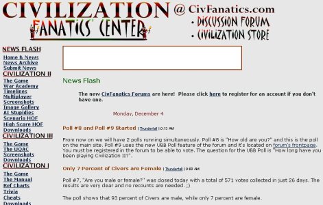
Btw here's the old logo:


Pillager
League of Empire Loyalist
Octavian X
is not a pipe.
Wow, that's... old. Where in heavens name did you get this? Before Civ III was the dominant of the Civilization games... at the advent of vBulletin...
- Joined
- Oct 25, 2000
- Messages
- 12,625
Brings back good memories... That short-lived UQAC was like the precursor of the current Info Center. 
We should revive the Quick Poll feature some day...
We should revive the Quick Poll feature some day...
starlifter
Deity
- Joined
- Jun 17, 2001
- Messages
- 4,210
Just look at the number of poll participants! Over 500. And more people are in CFC now, than back then.
Similar threads
- Replies
- 100
- Views
- 10K
- Replies
- 3
- Views
- 566