You are using an out of date browser. It may not display this or other websites correctly.
You should upgrade or use an alternative browser.
You should upgrade or use an alternative browser.
Ronning Terrain Water Feedback
- Thread starter ronning
- Start date
timerover51
Deity
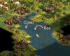
Probably my tired old eyes, but I have a hard time distinguishing between Sea and Ocean, or is there a difference. It looks like what I think is Coast and then either all Sea or all Ocean.
ronning
Warlord
Blue Monkey
Archon Without Portfolio
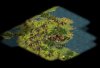
Depends on what you do with the hills. The mountains actually go well with the rest of the terrain you've worked on, but the hills are too light for everything else.Im thinking this is too dark for my terrain? Mountains
thoughts? Comments?
Can't decide. Like them, but equally so the redder ones in earlier previews. My only concern is that maybe both these & the reddder ones match the colors in the cities a little too closely. In a scenario where hills can be settled this might get a bit confusing visually.
suggestions (not preferences) -
- Try increasing contrast so darks are darker but there are highlights
- In some of the images there is a slight hint of red where some of the hills/mountains connect on the SW side. Maybe a bit more of the darker red from the earlier mountains would be a way to make the mountains stand out without making them too light.
- It looks like on some of the mountains the green that blends them into the base terrain comes up too high. Darker hills = those slopes darker as well. Might actually make them blend better overall.
- Make 2 versions. Label one as LM Mountains. Then place them both in-game for a side by side look.
Guess the overall comment is they look good, add a little variety in color without making them lighter, plus match to darker hills that blend into the greens of the grass & forests.
Gojira54
The folly of Man
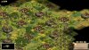
I actually prefer the new darker mountains, but to address the similar colors to the cities, perhaps vary the mountain colors a bit. Some mountains are grey, some brown, some reddish, some a pale tan, some greenish, others a mix. Making all that look realistic in game is difficult, but if anyone is up to the task it is you.
I agree the hills need to darkened, and personally I like the "broken up" hills look as well.
I also agree the Sea and Ocean tiles appear to be the same - not sure if that is intentional or not?
It might appear I am being overly critical here, but I assure you I am a fan. I love your terrain, and plan on using it once the final tweaks are in place. I've been following its progression since we were on the Site That Is No More.")
I agree the hills need to darkened, and personally I like the "broken up" hills look as well.
I also agree the Sea and Ocean tiles appear to be the same - not sure if that is intentional or not?
It might appear I am being overly critical here, but I assure you I am a fan. I love your terrain, and plan on using it once the final tweaks are in place. I've been following its progression since we were on the Site That Is No More.
ronning
Warlord
Thanks for the critique, it's helpful. I too miss the site that is no more...
Progressing...

Progressing...
Blue Monkey
Archon Without Portfolio
I second that emotion.It might appear I am being overly critical here, but I assure you I am a fan. I love your terrain, and plan on using it once the final tweaks are in place.
ronning
Warlord
but first the Byzantines are going down!

Blue Monkey
Archon Without Portfolio
In contrast to the other commenters I can see all 3 water types. Maybe part of the difficulty is that there is only a narrow band of sea terrain next to the ocean in the North Sea & West of Great Britain & Ireland, but if you compare the color of the Baltic to the North Sea there is a distinguishable difference.
ZergMazter
Prince
I can also see 3 types of water. Man You've done an amazing work. You got cities, terrain, units, and new UI. You should put this all into a single mod file and put it up in civfanatics.
Ares de Borg
Norman Knight
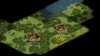
I love it. The oriental cities also look nice!
The oriental cities also look nice!I love your work. Its my favorite terrain to date, particularly like the trees, and the smaller trees.
I'm not big on the water, though, just because its too dark for my tastes - de Borg's water will be my true love for life. Having said that, your water looks good, maybe just a touch more blending is needed between coast/sea.
Not sure about the mountains. The appearance is great, of course, but the coloration doesn't fit imo with the rest of your stuff. You use a lot of contrast, so maybe make the peaks bright somehow? And just a touch more of a light brown shade on the slopes?
But these are nitpicky remarks, and only because you asked for feedback. Your stuff is top notch out-of-this-world.
Blue Monkey
Archon Without Portfolio
quick thought - if you do decide to change color on the mountains maybe these would be a good start on the snowy, or jungle pcx. 
ronning
Warlord
Gojira54
The folly of Man
Coast and Sea I can differentiate, it is the Sea and Ocean I cannot.
ronning
Warlord
Gojira54
The folly of Man
Perfecto! 

Blue Monkey
Archon Without Portfolio
Yes! They blend extremely well with your grasslands. By applying whatever you did with the hills to the mountains you'll end up with an awesome set regardless of which direction you go for coloring them.
ronning
Warlord
Yes! They blend extremely well with your grasslands. By applying whatever you did with the hills to the mountains you'll end up with an awesome set regardless of which direction you go for coloring them.
Switched to grassland pal , -08 green, and voila!
Blue Monkey
Archon Without Portfolio
I look forward to seeing the whole set!
Similar threads
- Replies
- 31
- Views
- 2K
- Replies
- 20
- Views
- 2K
- Replies
- 6
- Views
- 1K