strategyonly
C2C Supreme Commander
For now all heroes buttons are in cirles. Also many heroes got better and more accurate buttons now.
BTW Gladiator (not Spartacus!) should be moved from Hero section to normal unit section.
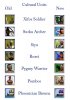
I was just thinking if you made the "square" buttons for the Heroes solid black, then making the Hero (circle touch left to right side, with a gold trim on the circle, would be and should look nice?? Just thinking here is all. Almost like the bulldozer here pic1
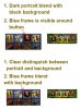
Also the Asian Spy the background is gone?? Its solid black, cant see pic??pic 2Just did another look and ALL spies are not "see able"??pic3
")


")

