Unit Previews: Pikemen

Wow Dease..looking real good there. I like both versions, colorful and not so colorful.
Yeah, it's a fictional unit so anything goes as long as it's in the spirit of the civ it's made for.
 
First version of the tupi pikeman is attached :D tell me what you think :D

I'm going to have to do some test renders at civscale to see how the civcolours turn out, so they may be changed a bit (civcolour is blue BTW)

FYI i'm going to delete all the koori previews now :)
 
Lookin' real good, Dease. You might want to make the loincloth just a teensy bit more substantial, though. The way it is right now, a strong breeze could ruin the appetites of anyone nearby. :crazyeye:

Other than that, good work.
 
I agree... the the loincloth ought to at least be repositioned so that it's hanging more than currently... well... it looks like it's already kind of flapping in the breeze. Also... bigger pike, but maybe that goes without saying.
 
:blush: you shoulda seen it before when the two sides move with the thigh, that was too much ;)
I think I'll have them all as one joint sequence then, rather than two :)

EDIT: yep, i'll give it a longer pike
 
Looks good, Dease! Thank you! :) 
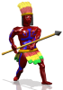
As usual, just some small adjustments are needed:

1. Could you make his skin more reddish, same tone as in Civarmy's units?
2. His body is way too shiny... He's either covered himself with oil, or been sweating a lot. :p
3. By loincloth, you guys mean the skirt, right? If so, yeah, I think it should be a bit more substantial, like Hikaro said. :D BTW, I guess leaves would look better than feathers on the loincloth.
4. The headress looks nice! But, could you replace the green with yellow?
5. The body paint looks good as well! I'd took the paint off of his face, though.
6. Not sure if it would show up on civscale, but the spear's blade should be more simple, without the doughnut-shaped thing below it. :)
 
sog, could be either I suppose, but pike is easier to type (and less letters) than spear :p

thanks for the suggestions strac, I did everything but reduce the shinyness of the skin, all my units have had shiny skin (level 1) and I think the forms would be much less obvious than with, it may also be the setup for the pic, it's one of my civpedia pic setups so the lights are a bit more intense.
That said, I'll post some pics from my normal setup (with both shiny and not shiny) soon...ish.
 

Attachments

  • tupipikeman.png
    tupipikeman.png
    22.4 KB · Views: 214
ok, here's a preview at civscale and with my normal setup :)
I did'nt bother with making a non shiny version since it's barely visible, although if anyone wants one i could post one.
I'm thinking of making the yellow on the headress civcolour also to make it mor obvious, what do you think?

EDIT: I'm going to make the southernish views a bit brighter ;)

ATTACHMENT DELETED
 
Looks good, Dease, but I'd Suggest maybe lightening up the Civ color marks on his body a bit. Other than that I'd say you're about done.
 
I decided against changeing the headress to be civ spcific, I think the yellow adds a lot of colour and character to this guy.
Instead, I did as hikaro suggested and lightened them up a bit, although, even then it wasn't notciable enough for me. So, taking inspiration from kinboat's egyptian pikeman, I put civcolour marks on the pike :)
I also lightened up the southern views to match the northern views
comments? suggestions?


ATTACHMENT DELETED
 
Back
Top Bottom