If they were to make a permanent OCC civ, my choice would be the Most Serene Republic of San Marino.
If there was ever to be one, San Marino would be about as good as it gets for it.
If they were to make a permanent OCC civ, my choice would be the Most Serene Republic of San Marino.
My prediction for San Marino's colour combination:
I carefully picked these entirely relevant colours from prominent parts of their flag.

What about Tuscany's colors?
What about Tuscany's colors?
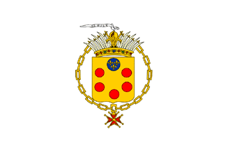

Yep, sensible choices could be based on either the coat of arms of Florence (red and white) or the coat of arms of the Medici (red and yellow):
Then again, with the existing Civs to go on they could be anything...
Amazing work. I want that right one but I agree the colors are too similar. Japan on the left and Siam on the right.
However, if that little circle on the top of the right one were a symbol of it's own it might work.
Indeed, that's what happens when you need over 40 different pairs of colours...
In blue and yellow it would be far too close to France...

Ugh - those are revoltingly ugly, even worse than The Aztecs or Morocco!
Bright Color on Red looks clashing to the eyes, and is hard to read and see the details...
Lol there's actually a city named Triest? That means 'Sad' in Dutch.Plenty of options. The Republic of Venice was quite big, at a guess a similar size to modern Austria or the Netherlands, both of which provided plenty of cities for their Civs.
Well it's definitely out of place for the Confederates which were infamously grey.
Here you go:
How... striking.
Their uniforms were. Their colors in the scenario are accurate to the Confederate Battle Flag.
")
Lol there's actually a city named Triest? That means 'Sad' in Dutch.


