Why is everything so flat?

but I feel like this break towards austerity started with the Recession.

So, what do y'all think? Is the flat design trend of the last decade a simple fad that will cycle out in time? Is it (as I suspect some of my fellow lefties on this board would suggest) a symptom of late stage capitalism, as companies take self-cannibalizing austerity to it's natural conclusion? Is it something else entirely?

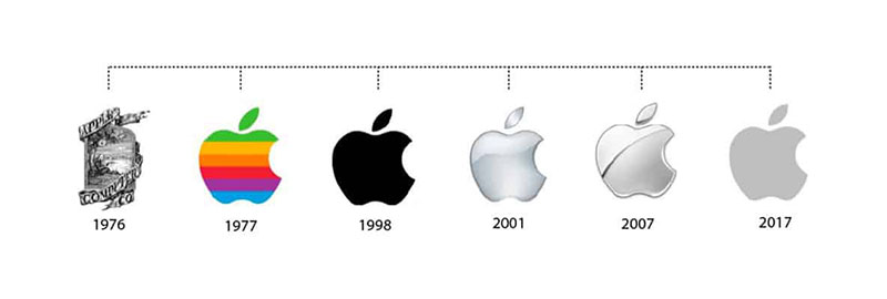
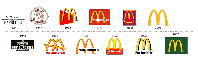
Steve Jobs made the minimalist aesthetic cool. After the recession when companies were down and trying to look for the next big thing to rebound they all just decided to copy the general Apple design for everything. Because after all if Apple was able to power through in the bad times and gain worldwide recognition (through the smartphone) to become a fortune 500 company, just copy what they do they didn't seem to be hurt. And conveniently enough it just so happens to be cheaper to mass produce without being too offensive to the eye (as in brutalism). Less risky too.

It will end when we get another big tech guru who forces his personal aesthetic onto the market place simply by proving he can get richer quicker then the rest of them on Wall Street and Silicon Valley. Then everything will copy and remain they same until the next guru and the next one after that.

Aesthetics are now determined by singular tech bros.
 
With time, things get flattened - even literally, eg stones from erosion. There is a lesser known poem by the great Constantin Cavafy, titled "The New Sophists", in which a sophist claims that his real enemies aren't those currently around, but the future sophists who inevitably will have to present the same meanings with new words.
People can also just give up - even if we assume they have the ability for depth.
 
It'll all come back.
Right now the mullet is making a comeback here, so I'm sure whatever type of you design you like will come back as well :).

Pull up a snapshot of any site from the 2000's and compare it to now. I pulled up this forum as it looked when I joined in 2010, and while the difference is subtle, you can definitely tell the details are different.

That's TBH more caused by our inability and/or lack of time to re-create the original style, and not an active design choice :blush:.
 
Honestly I miss the Windows 95/98 look. Everything back than looked so no frills and just function before form.
 
Flat people?

maxresdefault.jpg
 
Could be a Randy Newman song.

The design zeitgeist that bothers me now, a few things: short words that sometimes lose a vowel or something, or they spell in all lowercase.

Also the interior designs that are all white walls with wood this and that, and the exposed ceilings with those 19th-century looking industrial lights. How many hip minimalist cafes do we need here? Apparently more of them. Snooze!
 
The flat design trend emerged around the middle of the 2010s.
Id argue it's early 10s - Windows 8 and Metro was 2012, for example.
 
it's called flat? let's go with flat.

because of less being able to be screwed up, and appealing flat is easier to make than complicated... curvy? bubbly? idk.

i'll just gonna focus on webpage design here, because there's a lot of crooks and crannies as to how these things apply differently in other aspects of design (post vista windows is kind of its own story, which counteracts what i'm talking about)

basically think of it this way. most books have the vast majority of pages clean and blank where the clear contrast of the text can be read. now, each book could be personalized with each page having a random set of patterns behind the words. but it tires the eyes unless done very well. like, actual strain. takes a lot of focus to parse complicated imagery.

interestingly, there's a similar movement in books that there was incredulous and indulgent detail in quite a bit of older manuscripts. tomes were precious to make, precious to read (in the west, they were often connected to the esoteric and mystical), so you had a lot of time to properly detail each page, and in turn, reading a book was also a considerable endeavour since they were few and far between.

a similar thing happened with the internet. as processing power and graphics and whatever made it easier to showcase what you could do that made your technological thing special. websites were done on dialup, so it was something you dedicated time to, it was limited. then each website would have a lot of care put into it looking like its own thing. but as things have come always-online, people are always browsing websites, etc. it emulates the physical page to lessen strain then (a lot of early desktop design did that too in another way, to shorthand what was required of the user to take in; desktop, folder, recycling bin are all office elements).

like, have you ever been at an art museum for a whole day? brain gets tired, whether you enjoy it or not.

basically - like books, white background = less strain, unlike books buttons and (more) lines are needed, so keep buttons simple and add hamburgers and such.

for people that think it's a temporary design movement - i mean, i agree, but we ain't gonna see much like this again

1720314951838.png
 
Last edited:
Id argue it's early 10s - Windows 8 and Metro was 2012, for example.
Metro jumped the gun a bit in ny opinion. I quite liked it, but as far as I'm aware my opinion was very much in the minority and it didn't set any trends that other companies followed (to the extent that Windows Phone was terribly managed as a product and died).
 
As the number of people in this simulation reality increases it puts more processing strain on the architecture running the simulation.

The software compensates by, amongst other things, reducing the displayed dimensionality, hence reality appears flatter nowadays.

But this doesn't always work so it switches people into complexity saving zombie mode.

You may have noticed some of them crossing the road in front of you when you are driving your car.
 
Since some people are complaining that their OS's do not look how they want they to look I thought I would show yous all the range of customisation that should be possible. These are all desktops on top of basically the same OS.
Spoiler Customized Linux Desktops :
6-Customized-Linux-Desktops-reddit-u-derob--no-excuse.jpg

6-Customized-Linux-Desktops-MacOS-Miku.jpg
6-Customized-Linux-Desktops-reddit-u-shubhkarmansingh-perfect-workflow.jpg

6-Customized-Linux-Desktops-reddit-u-SwerveVillechaize-minimal-and-bright.jpg

6-Customized-Linux-Desktops-u-londoed-debian-flames.jpg
 
Last edited:
Yeah, I've been meaning to get Linux for some time.
 
Yeah, I've been meaning to get Linux for some time.
It is so easy. Just make a live USB, Ubuntu is probably the "standard" one now, stick it in any old computer and reboot it. It will have no effect on the host OS unless you choose to install, and you cannot do that by accident.
 
What do you mean by flat? I think examples would help.

It is not actually from the olden days, but my news agglomerate of choice harks back to the simpler days of the internet. Whether it is my eyes getting worse, my tolerance for distractions getting lower or site design getting "busier" (I so hate embedded videos) I so much prefer reading plain text that I can freely change the size of. Is this "flat"? Is flat good?


Just because it may have taken a while for the world to figure out how much more difficult cosmetic embellishments make to a UI on a small screen does not mean it is not true.

Oh, just look at the evolution of the Firefox logo. We went from fur & ocean detail to just colors and shapes.
 
Oh, just look at the evolution of the Firefox logo. We went from fur & ocean detail to just colors and shapes.
I actually linked a piece on this earlier that demonstrates the thought and care that went into Mozilla as a brand (who don't just have Firefox as a product):
Obviously, some level of subjectivity in this, you can like it or not like it, but there are times when solid design principles are the reason, vs. "brand's gotta brand".
 
Oh, just look at the evolution of the Firefox logo. We went from fur & ocean detail to just colors and shapes.
Interesting. I had a bit more of a google, and it is not clear that the trend is consistent but there is a bit of a peak in "3D" type logos in the early noughties. I think Cannon should have kept their original logo. That would be great across offices all over the world.
Spoiler Logos :

apple-evolution-thumbnail.jpg

04-17-23_Nike-Logo_Evolution_Infographic.jpg

History-of-the-Coca-Cola-logo.jpg

20150603-Historia-Logos-Mcdonalds-2.jpg

shell-logo.jpg

Histoire-logo-Levis.jpg

br.jpg

canon-logo.jpg

1_LORn-rQB8D47Dqf6KZoiPA.jpg

Pepsi-Logo-history.jpg

Chevrolet-Logo-history.jpg

msft-logo.jpg

logaster-2020-03-the-1st-logo-5.jpg

amzn.jpg

logos.jpg

BMW-Logo-History.jpg

Adidas-Logo-History.jpg

Walmart-Logo-history.jpg

 
The 1995 circa logos were objectively the best looking of them all.
 
There's one company that apparently never got the memo about simple and flat design.
Multi billion revenue and their logo still has that "Whoa, look what my computer can do with the letters!" vibe.

it's actually amusing because having been in german supermarkets - and i know it's austria, a different thing - this just screams german visual design
 
Back
Top Bottom