Windows 10

What if Metro were completely optional, but still present?

Does that include some of the system setting windows that might force you into the metro style interface? Reverting all of those back as well?
 
Yeah, there were a couple of things that did it. I cannot remember off the top of my head now, and as I've rolled back to windows 7 for many months now, I unfortunately cannot just play around until I find it again.
 
I finally got a new laptop with Windows 8. Touch screen is a fun way to go. It is a little schizophrenic to basically have two OS styles layered on each other. For instance I can go log on to chrome in the desktop, or I can click the Google search app in Metro. Why are there two different things? No real reason other than Microsoft's current "unifying" strategy of having one OS for everything, but oh hey you all probably still want a desktop on your PC so here you go.

Knowing people want the old way of doing things on traditional laptops and desktop machines (which is still a perfectly acceptable way of operating a non-touch based computer) MS has to basically shoehorn two different styles together. I'd surmise this is in the hopes of tying people into an MS account, and then hopefully pulling people off Android or iOS mobile devices, into the MS ecosystem via the slow drip, hand-held introduction to Metro.

Metro isn't necessarily bad, as much as it is simply sort of half-cocked. I like the additional touch based functionality of this new generation, but I think whatever the next iteration is, it should be more confident in what it is, exactly.
 
You could just have Metro, no desktop, and just enable the use of non-MS apps in Metro, but enable people to make the Metro start page look like a desktop if they want. For instance when I click Chrome in Metro, or Control Panel, or anything not specifically "metro-ified" I go to the desktop. How about I just stay in Metro? To me at its base level Metro is just a desktop but with bigger flat icons, and putting everything in front of you rather than behind a start button (which I never used anyway.) Basically an iOS/Android style GUI but with a distinct MS tile branding going on.

Not to say I don't like the desktop, I do. But I'd be perfectly happy trying out Metro some more to see if it is a better way of doing things. In fact I never used the Start button to access stuff when it was originally introduced, I always did the "old" way of having icons and folders right on my desktop or in the taskbar. Simple and minimalist has been my style for a while. So Metro is just a style change for me really. Big flat square icons with a flat background instead of icons... big deal. But if MS wants me to "try" Metro they seem to be limiting its utility and trying to funnel me into Store-bought, MS approved stuff. Which is especially hard considering the MS store is like a North Korean grocery store. I want a full fledged open operating system to try.

I think you could unify it by retaining the traditional openness of the desktop, but just changing the look. (Or making the Metro look default but allowing users to tinker with it to make it look more like a desktop, i.e., changing the flat tile to the desktop icon if they want, using a background image, etc., and allowing you to open any program without kicking you into another GUI layer.) As opposed to literally having GUI's on top of one another.

I'm still messing around with it so maybe all of this is possible and I just haven't figured it out. But right now it seems there is an artificial wall between the two ecosystems. It feels like the old days when you could "run" DOS programs in Windows... sort of.
 
By non-MS apps, I assume you mean non-store apps?

I doubt that would make much of a difference, there are basically three reasons for desktop apps that aren't available as Metro apps:

1. Apps where the UI doesn't lend itself to metro, mostly because of high information-density.
2. Highly complex/developed apps which would take tens to hundreds of millions of dollars and years to port to metro.
3. Apps which need capabilities which aren't allowed by WinRT.

MS allowing sideloading in Metro doesn't help any of the first couple points - there's no reason for Adobe to put in the expense to move Photoshop to Metro, and even if they did I can't see how the UI wouldn't be worse than on the desktop. Stuff I use that fall into the third categories are mostly background system things (Flux, admuncher, AHK, etc.) where metro/desktop is mostly irrelevant since I don't have the UI for them open 99% of the time that they're in use.

I think MS should allow opt-in sideloading of Metro apps, but that's mostly because I'm ideologically opposed to vendor lock-in, I don't really understand what problem you're trying to solve with it.

And you can set start tile icons and the background image to whatever you want already?

Re-read your post actually: I think you're overthinking the start screen. The start screen itself isn't Metro in any meaningful way. It might make more sense if you see it on a multi-monitor system - if you're on the desktop, the start screen is simply a single-screen popup to choose your next desktop app to open. Or metro app - but the desktop itself behaves more like a metro app than the start screen does.
 
Sure. Whatever it is, it is more of a way for Windows to tell desktop and laptop PC users "hey look at our tablet/phone OS! cool huh?" than as a functional GUI. If the Start screen is a popup which you can ignore while retaining complete functionality, what is it's function, other than as an advertisement for an OS you would normally use on a tablet or a phone?

Since I can basically set up my computer to just never, ever use the Metro start screen, it is not much more than a mild annoyance. I appreciate all the other Windows 8 improvements. But, I wouldn't mind if I could try and use the Metro start screen to use anything (i.e., not MS store purchased) without the clumsy "ok let's go the desktop for that" intermediate step. Of course I suppose I can set up my desktop that way too.
 
For a desktop/laptop it's broadly functionally equivalent to the start menu, with the bonus of having glanceable tiles for info. (I've got weather, email, calendar, rss reader.) Its function is to have the same launcher on convertible devices that are used as both tablets and desktops.

I still don't really get what you're asking asking for - the start screen opens desktop or metro apps. If you install a start menu on Win8, it also opens desktop or metro apps.

I also don't understand how "ok let's go to the desktop for that" is an intermediate step for anything. If you want to open desktop Photoshop on Win7 or Win8, the steps are identical. If you want to open Metro Photoshop (not Express), that will never exist, irrespective of what MS allows you to install as Metro apps.
 
If I click on Chrome on Metro, it opens Chrome in the desktop. I close Chrome, I am in the desktop. Where did the Start page go? Oh, I have to push the windows button or touch the bottom left corner of the screen. OK.

?? It's clumsy. It is clearly shoehorning in a phone/tablet OS onto a laptop or desktop to introduce the non-windows phone, non-Surface tablet world to the Windows mobile environment. Instead, I could just have one environment without a pop up page or whatever.

I can have an RSS reader or a weather thing on my desktop if I want, why do I need another overlay page for that? Because MS wants me to learn their mobile OS, they want me to create an MS account, they want me to integrate into their mail app, their calendar app, they want me to buy stuff in their store, etc. Well, they're not giving me much of a reason to do that if all I am getting by integrating is a pop up page that can only do a limited number of things, rather than a fully functional GUI that integrates my entire computer/internet life.... which the "old" desktop paradigm does just fine.

If they want the Windows experience to be uniform across all platforms, unify it. They are not doing that. (And, I question the premise of unifying all platforms anyway. Apple has that right.) As it stands it's inelegant.
 
See, that's why thinking of the start screen as part of the metro environment really doesn't work. It doesn't behave like a metro app, it behaves like the start menu (but with a couple bonus features).

What you're saying works exactly the same way with the start menu:

"If I click on Chrome on the start menu, it opens Chrome in the desktop. I close Chrome, I am in the desktop. Where did the Start menu go? Oh, I have to push the windows button or touch the bottom left corner of the screen. OK."


If you set your desktop background as your start screen background and pin your desktop icons to the start screen it's pretty much the same as having a bunch of desktop icons, except it saves having to minimize and restore all your desktop apps any time you want to open anything from the desktop.
 
I get your analogy to a "new start menu." It remains clunky no matter how it is framed. And the old start menu sucked for other reasons. I.e., following an endless tree of tiny little icons to nowhere. I never used it other than to shut down my computer.

But even so, when you "left" the old start menu, you didn't go anywhere. You were on the desktop. From a design perspective the user is still in the same interface. The user probably gets why the "menu" disappeared once you opened the program. It disappeared because you were done with the menu.

If you want to call the start screen the "new" start menu, that just makes it worse, because they just made the sucky Start button even more in your face. Now it is a whole page! And you go their by default. And when you leave, you go somewhere that looks very different, and it is not intuitively or immediately clear how to get back to the Start page. "Where did I go when I clicked that program? Oh I went to the desktop. Oh I can open that program from the desktop too? Why do I need the Start page then?"

Yes, the Start button had similar redundancy. That just means that the Start page and the Start button both suck, then. Which I think is true. (Until the Start page increases in functionality or stylistically integrates more with "old" desktop programs.)
 
Well that's why I pointed out it makes a lot of sense on the desktop if you've got multiple monitors - on my setup the start menu takes about 10% of my monitor real estate vs the start screen takes about 25% - not a particularly significant difference.

Either way it's just a launcher that goes away after I launch something that's not on the taskbar, it's not functionally a different place from the desktop.

Any currently shipping computers should have a tutorial that shows how to open the start screen. (Not to mention I don't believe in intuitive interfaces - when people talk about intuitive interfaces what they really mean is familiar. QWERTY is both unintuitive and measurably inefficient compared to numerous alternatives.) (Also, default depends on whether you're using a touch-capable device.)


I've also pointed out numerous times that I don't think either the start menu or the start screen are very good. I'd love to see a Windows version of Quicksilver with no way to open anything using the mouse.

Quicksilver is like carrying a light-saber and throwing robots across the room with your mind.

Quicksilver allows me to do near superhuman things with files and applications. It makes me a frakkin Ninja and my Mac a Ginsu Knife.
 
Well I'd wager multi-monitor set ups are a very slim minority of PC users, I doubt that's what they had in mind when they designed it. But I can see how that would be nice.

I still think the taskbar analogy is weak. The Start page is trying to be more than that--there are "Metro" style "apps" that have a style similar to the Start page, and there is everything else. You mentioned earlier that programs need to be coded specifically to work in that style/environment, whatever it is. A taskbar should be simpler than that. I think MS wants the "Metro style" to be an environment you live in. In that way it is more of an advertisement or a hook to get people used to that environment so they can also sell windows phones and tablets, rather than something that truly adds functionality to the interface.
 
Multimonitor desktop Win8 is actually pretty great, one of the biggest desktop improvements from Win7, and the biggest improvement to multimonitor use since Win95.

MS wants Metro to be valuable for mobile form factors, but they're clearly not expecting people to use it exclusively, they haven't even released a Metro-capable Office yet.


I don't see why the start screen needs to be an advertisement or hook to metro - if you're designing an OS for a device like the Surface Pro, it needs to be usable for both a desktop power user and tablet use.

This gives you essentially three categories of things:
1. Desktop productivity apps. (Visual Studio, Photoshop, R, etc.) These are never going to work in Metro for various reasons.
2. Touch-optimized apps. MS spent half a decade fiddling with the desktop to try and make it better for touch use without much success.

A lot of things (ie. see IE/Chrome/Firefox browsers with desktop/metro versions) are going to work better on the desktop/metro if specialized UI for each use case. (1 & 2) However other things are going to work essentially equally well for both desktop and touch users, so it doesn't make much sense to duplicate them. I'd argue that the start screen is one of the best examples of this, since there's pretty much no downside for desktop users. (The new networks panel is junk, metro notifications are accessible by some random desktop programs but are inconsistent and confusing vs. systray notifications, for some reason I can't get rid of QWERTY and the metro language toggle in the systray)

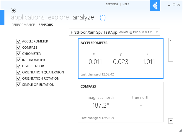
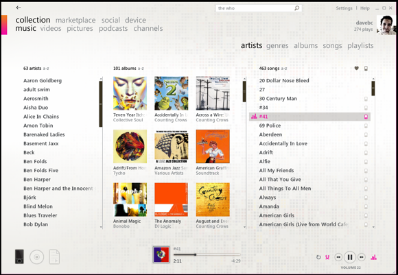
And if it's just a visual style thing, you can look forward to more desktop programs using "metro-style ui" in the future. Pile of screenshots from "metro style" desktop software (not screenshots I took, but I use each of these programs on a daily basis):

Spoiler :
dashboard.PNG


sensors.png


multiple-room-view.png


ZuneCollection.png
 
A Metro-style Github program? That looks really strange. At least to me, being used to source management via web interfaces, Explorer extensions, IDE plugins, or via the command line. Although I suppose it's just another option to use to access it, and will coexist rather than replace.

Zune has had that interface since well before Metro existed, though. And it does work for Zune. I used it for awhile, and, other than being a bit resource-heavy and having some ID3 compatibility issues (some of my longer track names got truncated), it was actually quite a good music player. But I don't know that it really counts as Metro-style when it predates Metro itself. Proto-Metro, maybe?

The majority of people I know who use Windows 8 in real life, though, are unhappy with the Metro screen, and most of those use a third-party Start menu. Granted, none of those people are using touch screens. But I'm still hard-pressed to think the Metro screen is the best UI for most people, regardless of form factor, when the people I know who use it mostly say it isn't. And by now, they've all been using it for 9+ months, so I can't really discount it as adversity to change, either.
 
That's the official github program. For work projects I typically use it, the github website and the command line at the same time. Program is particularly good for nicely viewing diffs, discarding files, creating and rolling back commits. For personal projects I'm exclusively web/command line Mercurial. (I just checked and I guess I have TortoiseHg installed, but I have no idea what anything in the UI does.)

I don't actually like Zune as a music player, I use foobar for all my actual music. Zune I only use on Win7 computers for the xbox music access.

The majority of people you know who use Windows 8 aren't at all typical. I worked out the numbers at some point before, the proportion of people on Win8 using third-party start menus are low single-digits. And if they're using a third-party start menu, they haven't been using the start screen for 9+ months, so unless they've just recently switched to a start menu after being early start screen adopters, you can absolutely discount it as adversity to change.

My handful of anecdotes for Win8 of tech-savvy people (me, all my tech-savvy co-workers at both my present and previous job) and non tech-savvy (my mother, father, sister, landlord) are all fine with the start screen.
 
Back
Top Bottom