Album Artwork

Joined
Dec 11, 2022
Messages
2,816
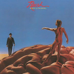
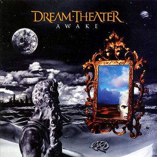
I've been trying to understand what makes a 'good' album cover: what art/design rules does it follow or/and what makes an album cover popular?

For the first question I can't find any answer. A look on Canva discovers some very good designs, and you can see all of them follow some sort of compositional rules (e.g. text contrast with imagery), but most album artwork is so widely different from one another that there doesn't seem to be any one uniting theme.

For the second question, it seems that the popularity or iconicness of an album cover is heavily dependent on the popularity of the album and the band. I don't think the Beatles could have gotten away with their plain white album cover for The Beatles (1968) had they been a small-time band.

I am not any closer to finding an answer to my question. What makes an album cover good? What is the thought process behind someone choosing a certain artwork for their album, and for someone looking around for an album to buy/listen to?
 
I very much doubt theres a single rule to follow. I think below is a good cover design. Simple, arresting image, tells you who the artist is.

.
Easter_cover.jpg
 
If you look on Canva you can see more or less a common 'theme' (for want of a better word – scheme?):
Screenshot_2023-09-23-23-37-06-189_com.canva.editor-edit.jpg


But in mainstream pop-culture album artwork is much more varied. Here are two successive album covers for the same band:
Aftermath UK.jpg

ExileMainSt.jpg
 
There have been hundreds over the years. the best ones change over time as taste and culture changes.


And there are some that have been simply terrible.


O-kay... seriously, WTF???!

Alan Hale's Roman Orgy???

(can't do a screenshot for some reason, but... :ack:
 
The music I listen to has a different trend than what you are finding on canva. Here's a track that recently impressed me, and its goofy cover.
 
Good to know it's a hoax. I did think something was weird, given that "Skipper" is a copyrighted character.
 
I think the general trend is that artists tend to release album covers that identify and familiarise themselves or capitalise on their fame early in their career as see:
Spoiler :

images (11).jpeg

Withthebeatlescover.jpg

RSEP1.jpg


And can later go on to experiment more with covers when just their name is enough:

Spoiler :

LetitbleedRS.jpg

MagicalMysteryTourDoubleEPcover.jpg

Michaeljacksondangerous.jpg


Some of course just don't seem to care:
Spoiler :

Nirvana-Bleach.jpg

 
I think you’re on to something though quite artist dependent
 
Even pop these days, some start all safe but some are weird from the get go.
 
I always liked the inside artwork for Music For The Jilted Generation

 
what appeals to me in covers is the equivalent of base rules for making good book covers.

in general, album covers that portray some form of the primary musician(s) as a vehicle for what is essentially brand identity turn me right off getting into it. this is the equivalent of having a splash photo of the author (usually ignoring the ghost writer) for a bad biography. it's not just elitism that has entrenched readers dismissive of such book covers, they're often badly written and are vehicles for other purposes than good prose - most """serious""" literature doesn't just have a picture of the author on the book. the fact that post-90s albums often mix it up with some artsiness of musician photos doesn't help much, no. rihanna's anti comes to mind (and i like rihanna)

otoh most music that i listen to just has some random artwork that doesn't say or imply much, and is rather equally uninspired. just smacking some artwork on your album doesn't do much. some iconic album covers follow this rule of "i think this is pretty cool, let's just use it"; joy division's unknown pleasures, for all the good it is and all the iconic imagery it holds, falls under this category (yes, i know it's not just abstract art, i know the story of that album). mr. beast by mogwai, another album i enjoy, is honestly just some cool artwork that doesn't say much

the best covers have something thematic and clear on the cover that isn't just a posing dude/gal and isn't just a random artwork the artists/producers settled on.

for ironic covers, i'm also unsure of the quality. it's fun to poke fun at the music industry, but then it's most often completely detached from the music itself, the album rarely actually concerned with what the cover is trying to say

what do i like? this cover, for f♯ a♯ ∞, for example, is really good; relatively innocious/bland but its imagery is completely cohesive with the style & point of the music; depressing grayscape, and kind of overwhelming in an empty sense staring out a car or train window. when the end of the world is just nothing
(and yes ofc it's just another godspeed you! black emperor apprecation post)

1695633558999.jpeg


chukchi mentioned prog rock albums, and imo they're often on point; they're usually dali-esque dreamscapes and it fits the aimlessness and experimentation of the music pretty well; and it's a genre i don't listen to much
 
Last edited:
Top Bottom