Very nice, but delete "Thunderfall's". We all know who owns this site, and there are many other people who have, and continue, to make contributions that make this place successful.That's a good point... So here a backgroundless png:

You are using an out of date browser. It may not display this or other websites correctly.
You should upgrade or use an alternative browser.
You should upgrade or use an alternative browser.
Community Forum Skin Project
- Thread starter ainwood
- Start date
hoplitejoe
Top fun-poster
- Joined
- Mar 22, 2010
- Messages
- 5,470
We should have a vote to choose which mods name goes there instead of thunderfall's 
Irkalla
ENTP POWWWEEEEEER
We should have a vote to choose which mods name goes there instead of thunderfall's
Thunderfall is our equivalent to Sid Meier. Creator, but others mainly "own" the site through their contributions. I say it ought to stay. What has Sid done for Civ lately besides input?
That's a good point... So here a backgroundless png:
Try deleting the V a little better. Use a pencil eraser at pixel level. Also put it on an obnoxious coloured background for this purpose.
hoplitejoe
Top fun-poster
- Joined
- Mar 22, 2010
- Messages
- 5,470
This isn't a game which could increase it's sales if it has a certain name attached to it, it is a game communities forum. I also think it kinda does a disservice to the site, this is (to my knowledge at least) the biggest Civilization forum, it the THE Civilizations Fanatic Center, not just one which thunderfall owns.
kingchris20
Wisdom Seeker
So remove the Thunderfall? I don't think it matters too much, though the logo in use for the default theme doesn't have his name in it either.
Spoiler :

I like that one for the webpage. The "golded" letters are perfect.
Spoiler :

and I just like that one for its awesomeness!
")
SamSniped
DJ Goodboye
Second one looks great, and works in landscape mode on the iPad! 
Irkalla
ENTP POWWWEEEEEER
Yeah, the logo you guys provided. I think it to be better than my Gods & Kings type logo. I admit defeat!
I like this one. The only comment I have otherwise is that it looks like you're announcing civilization, and this is the centre where the fanatics hang out.Spoiler :
I like that one for the webpage. The "golded" letters are perfect.

Maybe restore the apostrophe to show the plural possessive? (Fanatics')
Mise
isle of lucy
Very attractive colour scheme so far, and sukritact's logo looks amazing!
Amazing polishing mr Sukritact!
Glad you like it; still, credits to you for the initial arrangement!
That's my favorite arrangement as well.and I just like that one for its awesomeness!
What you should try doing next is to make the "Fanatics Center" text use the same font as the "Brave New World" text in the title screen.

had a tiny experience with this one (i hope it's no problem
") ), here's the result:
), here's the result:still based on sukritact's and Leugi's logo, but with bnw-ish font
Attachments
Irkalla
ENTP POWWWEEEEEER
What font are you using there? Fanatics' looks good but center looks funny.
The drop shadow should probably be less prominent IMHO.
The font is an all caps font I think. He's using the wrong case for some of the letters.
kingchris20
Wisdom Seeker
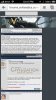
Just a note, the current Civ V (Revised) theme seems to be Right Justified on the iPhone screen, The banner goes all the way across, but the rest of the page is all the way right....anyway it could be centered? without screwing up the PC browser view?
And it has room to scroll horizontally...(and of course I realize this is still in development, just making a friendly note )
And it has room to scroll horizontally...(and of course I realize this is still in development, just making a friendly note
)Attachments
Irkalla
ENTP POWWWEEEEEER
Just a note, the current Civ V (Revised) theme seems to be Right Justified on the iPhone screen, The banner goes all the way across, but the rest of the page is all the way right....anyway it could be centered? without screwing up the PC browser view?
And it has room to scroll horizontally...(and of course I realize this is still in development, just making a friendly note
I would theorise that the banner is making the page wider than the cells holding the text.
Also right justified? wich direction is wich guys????????????????????
SamSniped
DJ Goodboye
That's why I asked for a mobile device-compatible banner 
Similar threads
- Replies
- 6
- Views
- 667
- Replies
- 1
- Views
- 322