SS-18 ICBM
Oscillator
Quake family tree:

Oh hey, something that isn't an economics chart or a map. Where's Counter-Strike though? It runs on the GoldSrc engine. Same deal with Half-Life.
Quake family tree:


How are expectations figured out? I assume a survey - by who and of who?
Arwon said:How are expectations figured out? I assume a survey - by who and of who?
Integral said:And if your central bank targets inflation, the spread tells you what market participants think inflation will be, so you can monitor how well you're doing at hitting your target in real time!
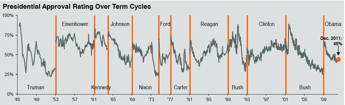
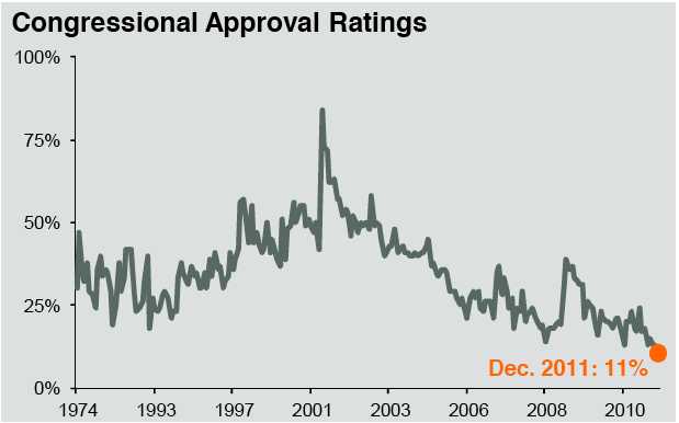
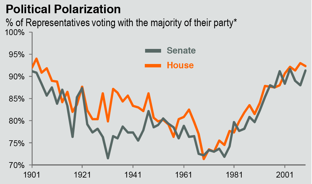
Fascinating set of charts from the quarterly J.P. Morgan Asset Management deck.
Its as a good a time as any to open up the conversation: Why is Congress approval rating at record lows? Why are so many people at such political extremes?
I get that deck every quarter. I always pull 6-10 slides for future reference and should probably post some when the new one comes out. What I find fascinating in those is the negative correlation between approval rating and Political polarization. I guess no surprise, really.
Another slide I like is median monthly rent (@$708) vs. monthly median mortgage payment (@$521). No major difference between the two from 1988 until '05 where mortgages completely blow out and now it's going the other direction big time. Along with a lot of discussion around the topic.
There's a shortage of rental stock and even with the large amount of building it' not meeting demand. What a recent group of economists have suggested is allow potential foreclosed properties be converted to rentals to the people who would ordinarily be foreclosed on at below market rent, no credit hit and allows investors to come in as buyers. I saw one bank piloting this in Phoenix, Vegas and NY.What's the reasoning behind rents historically being much higher than mortgages?
But the people who live in those houses still need a place to live so I'm not sure I understand how that matters. The multi-dwelling construction market will still stay strong, and it is, as long as there's demand.I've heard of that program to deal with the housing problem. But many of those houses is not in the cities where I would think that rental property is the tightest.
