[RD] Daily Graphs and Charts

Status
Not open for further replies.

Winner

Diverse in Unity
Joined
Sep 24, 2004
Messages
27,947
Location
Brno -> Czech rep. >>European Union
OK, I think we should have a thread where people can post interesting graphs, charts, or tables (if available as images) they run into while browsing the internet. Something like the Altered Maps thread, just for graphs - starting a new thread about each one seems pointless.

If you find something interesting, post it here, and others can comment or discuss it briefly, before someone else posts another one. What do you think? :)

---

I'll start with a graph from the Economist:


"Asia's seemingly relentless economic rise is still not inevitable

LIKE most of the 30 years that preceded it, 2012 will be punctuated by statistical evidence of Asia’s growing weight in the world economy and by the West's relative decline. Sober Asian policymakers, however, worry. In the short term, they know that the region would be badly hit by another severe downturn in the West. This short-term vulnerability to the rich world's economic woes is a symptom of a longer-term worry: a failure in many countries in Asia to progress from growth fuelled by resources and cheap labour to growth driven by higher productivity. As wages rise manufacturers often find themselves unable to compete in export markets with lower-cost producers elsewhere; yet they still find themselves behind the advanced economies in higher-value products. This is the middle-income trap which saw, for example, South Africa and Brazil languish for decades in what the World Bank call the “middle income” range (about $1,000 to $12,000 gross national income per person measured in 2010 money)."
 
So is Asia going to have too many Rich, poor, (or both) people? Welcome to most of the world
 
I understand that the worry is they're going to get stuck where Latin America has been for many decades - not extremely poor like Africa, but not quite developed enough to count among first world countries (USA, Europe, Japan, Australia, etc.).

Of course, to lump so many totally disparate countries under the term "Asia" is dubious at best.
 
Spoiler :


I was pretty amazed by the claim that Chinese spend the second highest average hours online among all nations; the image I had of them was that of people stuck in long work day industrial and agricultural jobs with considerably less time and resources to spend on internet widgets than Americans. Did they include the non-internet users in the average or just the 500 million? Would find it easier to accept the figure if the other 800 million were left out. The fact they say "internet users" suggests they did, but it's not 100% clear.

ps. social media can actually be a pretty cheap form of entertainment compared to a lot of more material forms of luxury, so maybe the low wages are actually a stimulant in that regard.
 
Pangur Bán;11139644 said:
Good idea for a thread.

THis is interesting (won't post the images directly):
http://www.bbc.co.uk/news/in-pictures-16090055

The interest rates on government bonds is an interesting one. Seems that Greece is just returning to where it was before the Euro was introduced :lol:
 
I think pie charts are useless as a rule, but I don't see what's particularly wrong with that one.
 
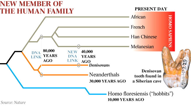
In the past couple of years, the most extreme versions of the "Out of Africa" model of human origins is increasingly being challenged. Currently it seems that non-African population have mixed with non-African human subspecies: Neanderthals in the Middle East and possibly Europe, and "Denisovans" (named after the cave where their remains have been found) in Asia/Indonesia:


I am still waiting for them to prove that Europeans received more substantial gene flow from the Neanderthals than the other Eurasians though. Makes sense because modern humans and neanderthals co-inhabited the same area for thousands of years and we know interbreeding was biologically very possible.
 
Personally always found it pretty implausible that human males wouldn't breed with the Neanderthals. I imagine what happened was that this did happened, and that some Neanderthal traits helped humans adapt to the harsher climate, while most others were bred out. What do I know, right? Well, I've been saying that for years, even when we were being told there was no link.

Incidentally, all these tree metaphors are quite poor for explaining any detail. There are all sorts of complicated links between various populations ... and of course Theirry Henry and such fellows might have some qualms with contrasting genetic Africans with the "genetic French".
 
So far it seems some of the genes related to our immune system may have been inherited from the Neanderthals and then selected for, because they gave early Homo sp. sp. "colonists" an advantage. I wouldn't be surprised if other traits that gave us some advantage in the unfamiliar northern climates were also carried over.

There seems to be some weird insistence that the interbreeding with the Neanderthals only occurred in the Middle East and not in Europe proper, although we know there were many more Neanderthals there and they shared it with modern humans for thousands of years, living literally alongside each other (there are even signs of some cultural influence and some skeletons that have been interpreted as human-Neanderthal hybrids).

I think it's more likely that since the Neanderthals were actually spread out very thinly, their genetic trace just got diluted in the sea of Homo sp. sp. immigrants, so it's pretty hard to quantify right now. But isn't it a coincidence that Neanderthals may well have been pretty light-skinned and carried the genes for red hair? :lol:
 
But isn't it a coincidence that Neanderthals may well have ... carried the genes for red hair? :lol:

I guess it's just confirmation that we Scots and Irish are, as we've always been told by our lovely neighbours, a little bit "less human" than them. :D
 
Making economic predictions for 2050 is ridiculous. Did the Economist magazine predict the recession of 2008-2012...'tillwhoknowswhen?


Market share among US banks.
 
saw that on Barry Ritholtz' blog, but the graph is misleading. the inner circle fits within the middle one well over three times. they should have matched the area to market share, not diameter.
 
Ehh, it's not especially misleading, it's just a terrible, useless chart.

EDIT: It seems like all I've done in this thread is moan about the type of chart used. Sorry :p
 
Chicago, hell yeah!
 
Status
Not open for further replies.
Top Bottom