Deliverator
Graphical Hackificator
I followed Slvynn's suggestion and made a desktop icon from the Spice eye button. This can be used to set an icon in the install script which according to phungus needs updating to the latest version.
Why do worms cause lightning???!? I don't remember any mention of this.
Ok i made more focused investigation of Tech icons
There is no 9c, assume you mean 9b. Are the others what you intended?
I actually quite like 5old and 7old. Desert landscapes in general look good.
Desert survival could be a cactus though (the whole, getting water from the cactus in the desert thing).

7. b is slightly better, at least it is a distinguishable shape.
Do you mean 7a, its more distinguishable than 7b.
?
I cannot tell what 7a represents, even at full size. A guy with weird glasses and a hood? 7b clearly represents people walking in the desert, even at 50%.
")
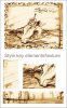
On picture - Ayat Sketch with style features marked.
I like your idea of some hand-drawn art for these. I'm guessing this is some kind of desert plant from what we discussed, but it is a bit hard to see that from your sketch.
 )
)