Dune Wars Art Thread

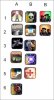
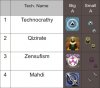
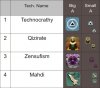
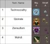
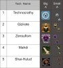
For technocracy, I like C. For Qizarate, I like B. The challenge for religions icons is gamefont_75 -- they have to be understandable at 12 pixels. Bold colors and unique shapes are important. I don't care much for the Tleilaxu one, but I don't have anything specific to suggest.

I usually use images.google.com to find concept art. I entered "crysknife" and got a ton of hits. I like this one, which we had previously used for the "Desert Warfare" icon:

http://wow.gamepressure.com/gfx/icons/INV_Weapon_ShortBlade_15.gif

Regarding buildings, there is this thread where I tried to point out the buildings and icons I think are the worst. It looks like Deon showed up for a few days and then vanished, so we may not get any more building 3D artwork. But if you can look into the download database and consider reskinning some of the existing buildings, we may be able to find a lot to improve.

Although deliverator has not had the chance to complete the overall Art Plan, you could also probably just pick some of the most annoying looking units, and reskin them. I did a quick runthrough of the units, and these ones look the worst to me:

Great Merchant (could use two variants, for the Ecaz Smuggler unit)
Grenade Trooper (could use two variants, for the Ordos Chemical Trooper)
Heavy Trooper
Lasgun Soldier (big and red ??)
Lasgun Trooper
Mentat (is it some kind of lizard ??)
Technocracy Advocate

If you do reskin a unit, please also redo the button on the yellow background. A couple of the newer units (devastator, missile launcher) are missing this type of button.
 
Ok, here is 16 pixels 75 font uses 16 pixels and not 12 btw , and, i think Techno A good too.... Even better. It does not lose to C, but bigger scale pic looks better.
The problem with C that its actually somewhat like Landsraad shapes. Small circle inside. I dont like it. I'll hope that Deliverator will like it too :P

Quiz B thats it , agree
Zensufi remade abit, need comments , i like big one (some contrast may be added for sure), smaller one have original shape. If shape is liked i can improve it for sure.
Mahdi - i adding this one centered in middle.

Reskinning totale is not a priority yet. My plan is something like:
Religions,
Religious buildings reskins and arts.
ACTION BUTTONS (those are really bad, really)
HUD (on background)
today/morrow i plan finish religions and and action buttons, quite ambitious i am heh

But that list is good to have, it helps alot, i wanted one like that.
I am just insisting that most of Art should be original. So i dont want that Final Frontier icon, and Vanilla Action buttons not fit completely.

Also comment about idea for imperial to use aztec style, and changing art for Slave Pit will be appreciated :)
 

Attachments

  • rels2.jpg
    rels2.jpg
    91 KB · Views: 111
techno still prefer c; then a. b does not have enough contrast at small size, it just looks like a grey blur. zensufism still doesn't "grab" me but you are the artist.

Imperial using aztec style seems fine.

For slave pit, I agree the effect is not useful today. The actual problem is that with hurry-population ("whip") allowed, every AI civ uses it too much and their populations drop to nothing. We need an experiment to figure out why at some point.

I am not too worried about art for the UB yet, but if you want to change the slave pit art go ahead.
 
Ok great, i still prefer to stay with Techno A
For Zensufi i working now to improve smaller sizes. I hope Deliverator will like it. Yep it is artistic, and kinda zensufi, we'll see.

As soon i get Deliverators comments i will know whats going on and patch buildings.

I dont know yet what will be a changes, but perhaps there will be some.

Then might be just will finish that Ordos stuff for koma.
I just looked into action buttons and they have some prob.... I dont want to keep all those alphas. Perhaps i will tend to Final Frontier / Afterworld style. I marked some really great ones.
We'll see, perhaps i will go sleep now, and will continue tomorrow with new ideas and comments. :P

EDIT: take 3 on zensufi attached + mahdi
 

Attachments

  • rels7.jpg
    rels7.jpg
    105.6 KB · Views: 120
another chart:
A1 - A4 - good building base art, A3 improvement from FF can be used as building art too


A5 and Further is remade and some added stuff for action buttons
C is button for choosing same or different type units in stack, i am not sure, will listen what you say :)
 

Attachments

  • g2.jpg
    g2.jpg
    87.1 KB · Views: 108
Nice work on the religion icons, Slvynn. Comments:

Technocracy: I agree with David that it needs to be more symbolic at the smaller scale, although I like the blue globe style. The blocky ying yang doesn't feel very appropriate either. Perhaps you could try making the triangle bigger within the circle on A? Or try another symbol that is distinctive at 16x16?

Qizarate: B looks fine. Is the large version going the same as Big A or will it have a monochrome background?

Zensufism: I like the pink colour scheme, but again some kind of clear foreground symbol would be nice. I'm thinking something like a stylised the Legs of Man without the feet, perhaps with some influences from the biohazard symbol?

Mahdi: Looks OK, the only thing I would suggest is to make the Crysknife more of a clear solid white. I prefer Crysknives to be clearly bone/tooth coloured like the one's in the movie.
 
Dont forget other chart - we just xposted.

Ok Techno - bigger triangle
Quiz - should be colorful
Zensufizm eh i liked ambryo theme, ok i can use those legs. They seem to be quite good.
Mahdi ok i will just bleach it.
 
Zensufizm eh i liked ambryo theme, ok i can use those legs. They seem to be quite good.

I not suggesting using the legs exactly as they are, but making a circular symbol based on the same pattern - the ends can be pointed instead of having feet, for example. A stylised version perhaps - for example, style of biohazard symbol, pattern of legs, if that makes sense.

The reason why I don't like the embryo so much (although) it looks nice is that it is the mysterious religion of the Tleilaxu we are trying to capture here rather than the genetic engineering.

I will post on the other icons later. Are these for action buttons?
 
Part of them yes, modified/added from BTS mods. (i did touched few of them)
4 ones are building art.
A3 is FF improvement which can be used as building.

Here is change for religions:

Also Qizirate small can be without yellowish square, just a figure for small size. what you think?
 

Attachments

  • rels9.jpg
    rels9.jpg
    69.4 KB · Views: 77
I really like the technocracy icon, but I think it would profit from a less strong gradient, it's getting to greyish towards the bottom. Furthermore, the big version would have the triangle a bit more distinct - it "drowns" a bit in the blue, perhaps a very thin bevelled frame?

Cheers, LT.
 
For Mahdi, I prefer the previous one from post 844. All I was suggesting that you could paint out the grey bits on the blade so it looks more pure white and more like a worm's tooth, rather than grey-scaling the whole thing.

If you take the version from post 844 and paint out the crescent from the background that would be fine with me.

Perhaps a darker background for the Zensufism symbol would be nicer than white?

the problem with crysknife that it will be just white-offwhite shape in smaller sizes.
For ZF Bg i will patch something
For Techno LT comment - sure i will reduce gradient nice idia.
 
the problem with crysknife that it will be just white-offwhite shape in smaller sizes

Well, I was think you should keep the background even at the smaller sizes to keep it consistent with Landsraad, Imperial, etc - so then it would be white knife on blue background which will be distinctive.

I don't see a need to remove the backgrounds - I quite like the gamefont icons being squarish - that looks nice in the scorecard and the background colours help with the distinctiveness.

Ok ' i'll reduce knife's contrast then and tint it to direction you mentioned.
Backgrounds that's it then. I think still that small ZF and Techno will stay as they are. Still, shape is another thing that make small icons look different.
 
I think there are some good aztec buildings in there.

Regarding the religion icons, my only comment is I'd prefer to avoid having two blue icons, the Mahdi one and the Technocracy one you are working on. I guess nobody else likes the black/white technocracy one. But, can you paint one of them a different base color?

Well i was going to post new ones and saw your comments
ok i made Mahdi bit turquise, i think they quite distinct. Also Techno is round shaped.
 

Attachments

  • rels11.jpg
    rels11.jpg
    69.7 KB · Views: 61
  • rels12.jpg
    rels12.jpg
    70.2 KB · Views: 99
Looks good! The Tleilaxu one is the only one with a transparent background. Do you think it will show up on dark terrain?

Check.

Ah and shai hulud!
Praise the Maker!
 

Attachments

  • rels15.jpg
    rels15.jpg
    83.8 KB · Views: 76
Back
Top Bottom