Slvynn
Duke Vector fon Pixel
- Joined
- Apr 3, 2005
- Messages
- 2,073
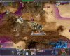
Announcing DW Action button style:
small preview:
buttons for unti type sellection - 2 options - with color lights and without.
Those units presented without border - regular border of blue-white gradient. Its same scale with ZZZ.
Also some version of Zzz button. All buttons will be consistent uthing that background or desert if need to show environment
Another one is movement button - go to action.
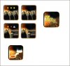
")