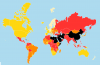
Guess the Map 12: Or, How I Learned to Stop Worrying and Hate Mercator

Status
Not open for further replies.
Mortality rate?
Really close, but note:
Samson said:
Every country has some things. Every thing is one of 3 classes. If I convert the proportions of these things into an RGB value, I get this map
Repeating image, so there is a copy on this page:
rgb_scale-png.578406
 
The colors stand out much better here, but I haven't the foggiest idea how to interpret your descriptions.
 
I wonder if this will make it any more clear. Here are the countries with the lowest and highest Red values:
Code:
> head(data.frame((world[order(world$R),]))[,c(1,68:71,76)])  # Lowest R
              name          R          G         B     RGB RGB_scale
229 United Kingdom 0.03334991 0.07037085 0.8962792 #0912E5   #0012F4
130         Malawi 0.03856674 0.73540301 0.2260302 #0ABC3A   #06F112
134          Malta 0.03906072 0.04985241 0.9110869 #0A0DE8   #060BF9
158        Nigeria 0.04137739 0.74531198 0.2133106 #0BBE36   #09F40E
35        Bulgaria 0.04244275 0.02738671 0.9301705 #0B07ED   #0A04FF
83          Greece 0.04258490 0.03253497 0.9248801 #0B08EC   #0A05FD
> head(data.frame((world[order(-world$R),]))[,c(1,68:71,76)])  # Highest R
                    name         R          G         B     RGB RGB_scale
175                Qatar 0.2666454 0.07479364 0.6585609 #4413A8   #FF13A4
228 United Arab Emirates 0.2627314 0.08304247 0.6542261 #4315A7   #FB16A2
212                Syria 0.2244659 0.09721333 0.6783207 #3919AD   #D11BAA
178               Rwanda 0.2239916 0.53234692 0.2436614 #39883E   #D0AD18
162                 Oman 0.2222198 0.13003723 0.6477430 #3921A5   #CE26A0
47              Colombia 0.2078140 0.13000165 0.6621843 #3521A9   #BF26A5
 
Last edited:
So on the Legend:
United Kingdom is top right (blue), Malawi is top left (green), Qatar is at the bottom (red). I think Rwanda is on its own in yellow at the bottom left.
rgb_scale_true_res_10_legend-png.578407
 
Last edited:
What I have plotted is the value by country, and summed over time. If I instead plot by time, and sum by country I get:
one_country_world_prop_true-png.578459

I could look at only one country, and plot by time:
one_country_qatar_prop_true-png.578460
 

Attachments

  • one_country_World_prop_TRUE.png
    one_country_World_prop_TRUE.png
    3.1 KB · Views: 160
  • one_country_Qatar_prop_TRUE.png
    one_country_Qatar_prop_TRUE.png
    3.4 KB · Views: 162
Births, deaths and growth ?
One of these is the things, then you have to have a reasonable go at the classes before I give it to someone.
 
red: violent deaths
green: premature deaths not directly caused by violence
blue: natural deaths
Yeah, close enough to win :beer: . More precisely:

1 – in Red: Injuries caused by road accidents, homicides, conflict deaths, drowning, fire-related accidents, natural disasters and suicides.
2 – In Green: Communicable diseases (i.e. infectious diseases) such as HIV/AIDS, malaria, and tuberculosis together with maternal deaths, neonatal deaths and deaths from malnutrition.
3 – in Blue: Non-communicable diseases. These are often chronic, long-term illnesses and include cardiovascular diseases (including stroke),B cancers, diabetes and chronic respiratory diseases (such as chronic pulmonary disease and asthma, but excluding infectious respiratory diseases such as tuberculosis and influenza).

I was aiming for "Which of the 4 horsemen gets you", but it was difficult from both data capture and data display fronts. The distribution I plotted is easily available from Our World in Data.
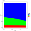
I was really surprised how high the Gulf Countries injuries rate is. I guess this is all the imported workers, who is they die on the job are counted in the gulf, but if they get any disease they are re-exported home. This really demonstrates the value of workplace health and safety.
one-country-Qatar-prop-FALSE.png

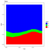
Rwanda out there on its own demonstrates quite how horrific the genocide there was. If I plot the absolute death rate you get the graph below. About the same number of people have died from injuries in the last 27 years as have died from non-communicable diseases, most of those in 1 year. That is just horrific.
one-country-Rwanda-prop-FALSE.png

There is hope in there as well. This is Bangladesh, and the number of people dying from the main preventable deaths, the green ones, has gone down loads.
one-country-Bangladesh-prop-FALSE.png

I have done a pdf with all the countries / regions. The better one is absolute values here , or here for the proportions.
 
Last edited:
It has been over a month. I know I have done most of the recent ones, but this is very different in at least one way:
untitled-png.582029
 

Attachments

  • Untitled.png
    Untitled.png
    106.5 KB · Views: 96
It has been over a month. I know I have done most of the recent ones, but this is very different in at least one way:
untitled-png.582029

some indicator coming from/alligned with social-democrat values like for example workers protection ?
 
Status
Not open for further replies.
Back
Top Bottom