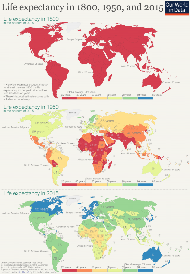
In relative terms or absolute?
I’m going to take a guess and say percentage of people on antidepressants?

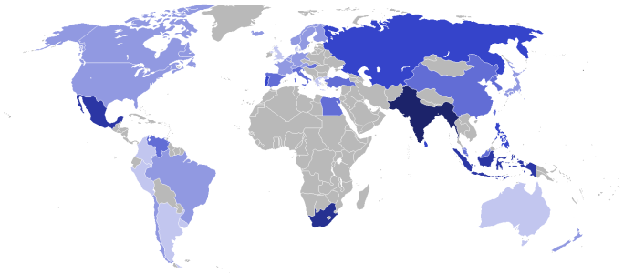
It is an integer, and purple is the largest. Generally one would see this as positive.
In relative terms or absolute?
I’m going to take a guess and say percentage of people on antidepressants?
I think what might have helped was if every pair of countries was its own color, which would've helped us understand the groupingsOkay, gonna kill this one. This was more of a puzzle than intended. It's countries with smallest / largest population by alphabetical order.
So,
Andorra and Argentina
Barbados and Brazil
Etc
There's only one country that starts with O, Q and Y which is why Oman, Qatar and Yemen could be both min and max.
In Spanish, Germany starts with an A, which is why Argentina went grey and to replace Germany in G, Ghana is next.
Promise not to be abstract again, sorries for frustration. Suggest an open floor.
")
There's nothing with orange or lower actually on the map, right?
Is it directly correlated with wealth?

I know what it is.It is an integer

I noticed that too - I didn't make the map. I can't make out what the value for EU Kosovo is; probably Chad-level.
It could be related to cost of living along with wealth.
we are like seeing the attached files thing , with the file name , ı think , maybe two CFC posters , doesn't it show up to others ?