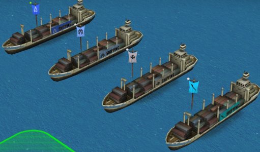
[UNIT] PPQ unit art and questions thread

So what's wrong with them? :dunno:
I think they are great :thumbsup:
Well for one thing the flag and background don't match colors perfectly. Also, the text is always black which some time clashes with the background like say if the teamcolor is too dark. Although that can be fixed by just repainting the text for those particular civs and creating a white text version.
 
Looks like you're using the teamflag gloss shader. That's probably why it looks darker than the rest. You could use the regular flag shader used on the flags, or add a bit of shading to the alpha. Probably take a lot of trial and error to get them to match (if not impossible).

I don't know why you are so hung up on this. Most people probably wouldn't care about team color at all. I think you are like those pilots suffering from target fixation, and flying directly into the ground. :run:
 
It occurred to me that instead of randomly trying to match the shade for the alpha color to the flag gloss; why not just use the ACTUAL flag textures themselves. To test this I used the Civ5 cargo ship.
I copied the "Shield_Icon_32.dds", and set the color white to the alpha channel. This leaves an opaque gray texture to paste into the alpha channel behind the shipping text. Also, I inverted the colors for the "Shield_Icon_32_Gloss.dds", set the color white to the alpha channel, and pasted that as well.
In game it looks really close. In civopedia interface it looks crappy, but things always look crappy in there for some reason.
TEAMCOLOR.jpg
 

Attachments

  • Team_Color_TEST.rar
    547.3 KB · Views: 27
I'll take a look at it today.
 
Yea.. the unit looks good enough in game now but it's completely gray in the pedia. I have to find a way to solve that.
 
I don't know what's causing it to be gray and I can't figure it out. I'll have to take a break from this model and come back to it later.
 
In my experience, the pedia (and the lower left window showing the unit) uses a different renderer from the one used in the main game, and some stuff behaves differently. For instance, usually, there is no discernable difference in-game between a unit using TCiv4Skinning shader and the same unit that doesn't use a shader (like vanilla *_fx.nif and *.nif units), while in the pedia the lighting is handled differently between them. Wouldn't surprise me in the slightest if they interact with more obscure shaders in unpredictably different ways as well.

While I'm here, a question for the experts - have you managed to get the teamflag shader correctly with the whiteflag flags (you know, the ones that aren't supposed to have any civcolor on them). For me, it still gets overlaid with the actual civ colour.
 
I've seen the grey texture thing before. I think it was with a workboat for what that is worth. That unit has two UV maps for some reason. I don't think that is the case. I haven't been able to reproduce it since though. Things to rule out is ensuring the material is correct (has alpha controller), Alpha property, and texture property. If a shader is used to ensure it has a skin partition. Another thing to check is the trishape, or ninode it is a child of is named correctly (what it is referred to in the KF).

I'm sure the pedia uses a different renderer as well. I thought perhaps adding vertex colors might do something. It did nothing. :dunno:

have you managed to get the teamflag shader correctly with the whiteflag flags
Nope. :wallbash:
I've put up with this for a long time:
teamflag.jpg


Code:
<CivilizationArtInfo>
            <Type>ART_DEF_CIVILIZATION_AMERICA</Type>
            <Button>Art/Interface/Buttons/Civilizations/America_02.dds</Button>
            <Path>Art/civflags/Usa.dds</Path>
            <bWhiteFlag>1</bWhiteFlag>
        </CivilizationArtInfo>
You see white flag is set to 1. The normal flag is correct, but the ones on the ship are not. :shake:
I don't know what to do about it.
 
I am not sure you can do anything. The shader basically works like this:

Base Texture: This one has two jobs. Firstly it acts as clipping which is applied to the object it self. Transparent meaning do not render. For example, if you have a texture that's a white ring on a transparent background for this slot and your object is a rectangle your resulting object will be a ring. It also seems to be applied as a texture underlay to the model. That's where you get the wavy lines on the flag from.
Gloss and Glow textures: These seem to just work like normal gloss and glow.
Detail Texture: This one determines what image is applied. It's basically tentacled on top of the whole model using teamcolor1 from the XML.
Decal 0 Texture and Decal 1 Texture: I have no idea what these do. By default they are set to teamcolor0 and teamcolor1 but frankly changing them seems to do nothing.

Either way, I'll just start on the truck from scratch using the same mesh. That should fix everything.
 
I accidentally stumbled upon something interesting. Normally the texture file is under "has base texture" in the TextureProperty. I noticed a ship was much brighter than normal in the pedia. I went to check what was going on. I had the texture file under "has detail texture" instead. It is also brighter in game as well.

Base_Detail_Texture.jpg
Making progress here. Good progress.
Gimme dem goodies. :drool:
 
I accidentally stumbled upon something interesting. Normally the texture file is under "has base texture" in the TextureProperty. I noticed a ship was much brighter than normal in the pedia. I went to check what was going on. I had the texture file under "has detail texture" instead. It is also brighter in game as well.

Detail maps do usually look brighter; I think that on a non-shader unit, the engine simply "forgets" to apply lighting to it, and it is basically lit with 1 intensity white ambient, same as TCiv4MechNonShader does - basically making a unit that looks more "flat" than it normally would.

BTW, I once experimentally found out that Civ 4 materials can actually process lighting intensity above 1 - NifSkope colour wheel does not allow you to go over 1, but if you directly input numerical intensity values, you can go crazy with 2, 10, 100 whatever. And Civ 4 engine actually recognizes that, resulting in a unit that's brighter lit in game. I haven't really found any meaningful use for that, as generally I'd want all units to be lit in the same way, but thought I'd share.
 
In other games the default is "fullbright" in the absence of shader lighting. I barely have a clue what is going on here. I think the purpose here is for the damage state texture to act like a decal over the base. For whatever reason it doesn't use lighting at all, or is significantly brighter.

For non shader units (90% of custom ones) this could help them match the vanilla units in brightness. Unless there is some nasty side effect I'm unaware of.
 
Why not brighten the texture itself instead? The nasty side effect is exactly that, lack of lighting, so the model looks worse in-game than it could have with the same texture used as base. In-game a non-shader unit using just base texture is more or less indistinguishable from a shadered one, the real visible difference is in the pedia only - unlike a detail-skinned unit or a TCiv4MechNonShader unit, which look noticeably worse with the same model. A pdf file from ~15 years ago even specifically calls it out on that and advises against using it, with which I wholeheartedly concur.
 
Long story short as it stands right now I have the following components:
1. Flag
2. Side bar in teamcolor
3. Text on side bar

And my problems are:
1. Match the flag and side bar colors
2. Make the text look good on both light and dark background colors ranging from bright yellows (Holy Rome) to dark reds (Rome), purples (China) and even black (Nod)
3. Make the unit look good in both the game and pedia

So far #3 is pretty much cracked. I figured out what was making the unit gray and avoided it. But #1 and #2 are in conflict. If I make the background shaded to match the flag the text does not pop well on darker backgrounds and vice versa.

Odds are good at this point that I'll just sacrifice some fidelity on #1 and accept that they won't match perfectly.
 
So far #3 is pretty much cracked. I figured out what was making the unit gray and avoided it.

So what was it?

But #1 and #2 are in conflict. If I make the background shaded to match the flag the text does not pop well on darker backgrounds and vice versa.

Just spitballing here - civs have secondary colours; is there really no way to invoke it on a unit with something teamcolor.bmp-related?
 
Why not brighten the texture itself instead?
Yeah. I use shadered units in my own mod, but to reduce the size there is no reason to not use the teamcolor.bmp in huge mods like RI. Using the detail texture is kind of a hack thing to do. Which leads us to....
is there really no way to invoke it on a unit with something teamcolor.bmp-related?
It is possible. I demonstrated it with the Civ 5 truck thing a while back:

https://forums.civfanatics.com/threads/c-c-universe-civs.668183/page-6#post-16133477

You set the texture file to "detail"
PlayerColor01.tga to "decal 0"
PlayerColor02.tga to "decal 1"

Definitely a happy side effect, and not its intended purpose. Instead of showing the texture the entire mesh is colored the secondary player color. So, you would have to make separate parts of the mesh in blender or max have that material. In the case of the great merchant truck I modeled some letters for the sign on the side of the truck.
Spoiler :
 
It is possible. I demonstrated it with the Civ 5 truck thing a while back:

https://forums.civfanatics.com/threads/c-c-universe-civs.668183/page-6#post-16133477

You set the texture file to "detail"
PlayerColor01.tga to "decal 0"
PlayerColor02.tga to "decal 1"

Might this be the solution to PPQ_Purple's conundrum here then? If the text is coloured with the secondary colour, then it will always be legible on the primary-coloured background. If, as you say, you can only colour it solid, it can be a solid-coloured plane with another solid plane in front of it, stencilling the text via transparency.

BTW, haven't seen this truck before, it's absolutely adorable.

Edit: a boring but practical alternative to ensure legibility would be the old "white text with black border" trick, as perfected by countless memes.
 
Top Bottom