You are using an out of date browser. It may not display this or other websites correctly.
You should upgrade or use an alternative browser.
You should upgrade or use an alternative browser.
dylansan
Warlord
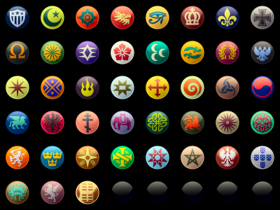
Thoughts (WIP)?

Maybe I'm too used too old version, but it feels odd.
Things I think go in a good way: Russia, Carthage (both might have been changed too much), Indonesia.
Things I thing go in a wrong way: Morocco (too similar to Shoshone), France (pink was easily distinguishable), Inca (light blue was fine), Polinesia (now is meh).
Things I think go in a good way: Russia, Carthage (both might have been changed too much), Indonesia.
Things I thing go in a wrong way: Morocco (too similar to Shoshone), France (pink was easily distinguishable), Inca (light blue was fine), Polinesia (now is meh).
dylansan
Warlord
I think we both are probably too used to it, but I'm glad that you generally like them all the way they are.Maybe I'm too used too old version, but it feels odd.
Things I think go in a good way: Russia, Carthage (both might have been changed too much), Indonesia.
Things I thing go in a wrong way: Morocco (too similar to Shoshone), France (pink was easily distinguishable), Inca (light blue was fine), Polinesia (now is meh).
If I do release this, it'll be an alternative to the current colors, not a replacement. The biggest changes here are the countries I've most often seen complaints about.
You're right about Morocco, That's probably why I went the way I did originally.
Indinesia hasn't changed (but I did change the light/shading overall so it may look different).
Other minor changes include India (more saturated, cleaner green), Venice (brighter background, more purpley icon to distinguish from Carthage/Japan) and Japan (less purpley red).
Are there any civs in the current 3.0 version that you have trouble distinguishing? Units in particular, as making 43 civs clearly distinct on the minimap is impossible. What about barbs, are Ethiopia, Korea and Greece far enough away from the black/red?
I don't think so. Apart from Japan/Carthage similarity there were all ok imo.I think we both are probably too used to it, but I'm glad that you generally like them all the way they are.
If I do release this, it'll be an alternative to the current colors, not a replacement. The biggest changes here are the countries I've most often seen complaints about.
You're right about Morocco, That's probably why I went the way I did originally.
Indinesia hasn't changed (but I did change the light/shading overall so it may look different).
Other minor changes include India (more saturated, cleaner green), Venice (brighter background, more purpley icon to distinguish from Carthage/Japan) and Japan (less purpley red).
Are there any civs in the current 3.0 version that you have trouble distinguishing? Units in particular, as making 43 civs clearly distinct on the minimap is impossible. What about barbs, are Ethiopia, Korea and Greece far enough away from the black/red?
- Joined
- Jan 4, 2018
- Messages
- 1,208
The changes seem minor and good overall. It's good to have the best distinction by contrast.
dylansan
Warlord
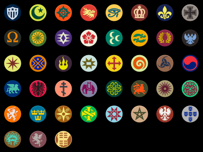
Some further tweaks. I'm decently happy with this, so as long as I haven't missed something obvious or created a color combo everyone hates, I may proceed to finalize this into something downloadable.
Notable changes this time around:

Here's the flat colors so it's easier to imagine how they'd look as unit icons and on the minimap, etc. The shading has a stronger impact on how the colors are perceived than you may expect.

Edit: are Siam and Polynesia too similar? That might actually give me a reason to switch Polynesia's background to pink, even if it's not quite so nice. Polynesia is one of few civs where pink is arguably a historically relevant color.
Notable changes this time around:
- reverted changes to Polynesia and Inca - they were more interesting before
- gave Venice a unique pinkish color. I couldn't quite convince myself to use the bubblegum pink from France for it, but it's in the same vein, and should at least be distinct from other colors. It's kinda inspired by the bricks of St Mark's Campanile, but not exactly. It's more inspired than the previous color scheme, though.
- Gave Morocco it's beige and green again, this time based on colors found on a "Banner of the Moors". The red and green is just hard to make both pretty and legible, not to mention, nothing like the modern flag of Morocco existed at the time of Ahmad Al-Mansur.
- Darkened the blue of Korea slightly, as it was very similar to Babylon and would blend together on the minimap.
- Gave Portugal a slightly darker shade of gray so it's hopefully more easy to distinguish from Japan on the minimap.
- Russia's background color is somewhere in between the previous brown and blueish colors. There's not much historical basis for the background color, but red or white (or yellow) would not work very well. Blue was historically associated with nobility, but Babylon is already the "blue + blue" civ, and varied colors are more interesting, I think.

Here's the flat colors so it's easier to imagine how they'd look as unit icons and on the minimap, etc. The shading has a stronger impact on how the colors are perceived than you may expect.

Edit: are Siam and Polynesia too similar? That might actually give me a reason to switch Polynesia's background to pink, even if it's not quite so nice. Polynesia is one of few civs where pink is arguably a historically relevant color.
- Joined
- Jan 4, 2018
- Messages
- 1,208
I appreciate the flat style. I think it would probably appear better on the graphs with such a style in-game. What other parts of the game use that particular shading on the standard icons?
dylansan
Warlord
Well, I really just showed the flat style because it's easier to judge the color combos, but you raise an interesting point. It's theoretically possible to use a flat style for some smaller versions of the icons, which might make them more readable, or at least nice looking.I appreciate the flat style. I think it would probably appear better on the graphs with such a style in-game. What other parts of the game use that particular shading on the standard icons?
But some of the smaller versions of the icons are actually generated in game by drawing the icon onto a colored circle, which doesn't always look great, but there's no way to change those as far as I know.
BackseatTyrant
Queer Anarcho-Transhumanist
- Joined
- Jul 10, 2013
- Messages
- 598
This mod is definitely taking the color schemes in the right direction; Sweden, Inca, Brazil, Arabia, Aztec, Spain, Rome, Greece, Celts and Iroquois are bang on the money for me. However, there are still a good amount of adjustments I'd make:
- Assyria should have Songhai's colors
- Songhai's colors should be purple on light turquoise
- The Huns should have Denmark's colors
- Denmark's colors should be maroon on gray
- Germany's gray should be changed to a golden, almost orange-y yellow
- Persia should have Indonesia's colors
- Indonesia should have Poland's colors
- Poland's colors should be fire red on dark red
- England should have China's colors
- China's colors should be light purple on light yellow
- Austria's pink should be more on the purer, brighter magenta side of shades
- Siam should have cyan on mauve
- France's colors should be white on lavender
- Ethiopia's colors should be white on lime
- India's colors should be light blue on dark blue
- Babylon should have the Ottoman colors
- The Ottoman colors should be teal on mint green
- Russia's black should be changed to wine red
- Venice's colors should be pink on light lavender
- Carthage's colors should be amber on violet
- Shoshone's colors should be dark blue on light blue
- The Zulu should have Polynesia's colors
- Polynesia's colors should be blue on white
- Portugal should have the Maya's colors
- The Maya's colors should be pale cyan on dark green
- Byzantium's gray should be switched out for purple
- Japan's colors should be white on pink
EDIT: I forgot about Babylon
Last edited:
What is your justification for these changes. For some nations colours are history related, like Poland, white and red.
BackseatTyrant
Queer Anarcho-Transhumanist
- Joined
- Jul 10, 2013
- Messages
- 598
Most often, it's a matter of making the roster less yellow-heavy. Other times, there are some historical precedent, such as with Persia, Indonesia, England and Polynesia (the blue and white coming from Hawaii's flag). Also, I wanted to dodge some more stereotypical color schemes, such as taking away the brown from the Zulu and replacing it with a neon lime-scarlet combo that to me evokes the flag of Zimbabwe and other southern African flags. As for Poland, I like to imagine it's still white on red, but it's in a dark medieval throne room, lit only by the warm fire of a fireplace
Bonyduck Campersang
Staring into the distance
- Joined
- Dec 11, 2022
- Messages
- 4,739
OP where did you get the civ icons from? As I understand, they're not accessible from the game files?
Similar threads
- Replies
- 9
- Views
- 6K
- Poll
- Replies
- 52
- Views
- 19K
- Replies
- 197
- Views
- 74K
- Replies
- 208
- Views
- 105K

