- Home
- Forums
- CIVILIZATION IV
- Civ4 - Creation & Customization
- Civ4 - Project & Mod Development
- Civ4 - Caveman 2 Cosmos
You are using an out of date browser. It may not display this or other websites correctly.
You should upgrade or use an alternative browser.
You should upgrade or use an alternative browser.
Win 8: better or more problems with C2C
- Thread starter chueche
- Start date
I want to ask that someone have experience with the new Windows8 and C2C.
Drive it more stability or faster?
No significant difference to Windows 7.
No significant difference to Windows 7.
This. I actually profiled between the two, and there was a one second drop out of a 20 second turn in win8, so not really noticable.
Thunderbrd
C2C War Dog
The interface looks wretched. Are you guys enjoying Win8? Or do you, as I suspect I would, find it terribly annoying?
The interface looks wretched. Are you guys enjoying Win8? Or do you, as I suspect I would, find it terribly annoying?
I'm enjoying it. And I actually like the new UI, atleast in the desktop.
The interface looks wretched. Are you guys enjoying Win8? Or do you, as I suspect I would, find it terribly annoying?
The desktop is little changed once youmget used to the lack of a start menu.
strategyonly
C2C Supreme Commander
The desktop is little changed once youmget used to the lack of a start menu.
What NO start menu
 I keep forgetting that from now on they are mainstreaming towards tablets, and the like etc. . .. I just heard from an interview from the new CEO of Microsoft, that PC's are a down going effect now . .?
Hydromancerx
C2C Modder
Since when is 2009 old? I still use windows XP 
Thunderbrd
C2C War Dog
Yeah... touch screens are aweful in general imo, and with them moving towards a more touchscreen based device method, I'm going to be in revolt for a while I think. No Start menu can't possibly be a good idea IMO.
God-Emperor
Deity
The new interface is such a bad idea that they can't even come up with a reasonable name for it.
It was Metro for a long time, but they couldn't come to terms with some German company with a trademark on that term so they dropped it (and said it was "just the development code name").
Then it was the "Windows 8 App" interface for all of something like 48 hours. This was a stunningly bad idea since you have the fine situation where you'd have Windows 8 apps that were not Windows 8 Apps (programs that run on Windows 8 but do not use the new Windows 8 App interface). Imagine the Abbot and Costello routines that their help line calls would turn into.
After that it was the Modern UI. This may have been appropriate in terms of art styles (keeping in mind that the "Modern" style of art covers a period that ended a while back - sometime around 1970) as some of that featured big blocks of color. In terms of interface design it is not "modern" (more like "welcome to 1989").
Now it is the "Windows Store app" interface (the "app" is apparently not being capitalized) . This is only marginally better than "Windows 8 Apps", especially if it is ever possible to buy an application from the Windows Store that runs with the regular Desktop instead of the "Windows Store app" interface. Yes, you'd then be able to buy an app from the Windows Store that isn't a "Windows Store app".
You may see the term "TIFKAM" here and there. That stands for "The Interface Formerly Known As Metro".
I expect that a better name for it would be "Microsoft Window". Just like the existing name but singular instead of plural since apps using the new UI run full screen, one thing showing at a time. That's right, your new CPU can now actually do 4 or more things at the same time but the OS's new UI has been designed so it wants to show you only 1 thing at a time. (Fine on the small screen of a Phone, or probably even a small tablet - silly for anything else.)
They could pick almost any word and it would be fine. Watermelon? OK. Snack? Why not. Flounder? Probably a lot better than anything they have tried using - not only does it describe the thing (a flounder is flat, for a fish it is almost not 3 dimensional, and the new user interface does not use any 3 dimensional appearing things to let you know what is a button or other control) but it also describes what their "brilliant design team" (not to mention the marketing people) have been doing instead of coming up with a name for the thing that is not moronic ever since their first choice was ruled out. "The Flounder UI: if a fish can be flat so can your UI."
You're all missing the central point (IMO), that if you switch to the desktop in Win8 what you get is just an improved version of the Win 7 desktop (less start menu, but with a more generic search that actually works at least as well once you get used to it).
No metro.
No tiles.
Just a normal desktop.
The Metro UI is for touch screen (primarily tablet/phone) use. If you're on a desktop/laptop you just switch to the desktop at boot up and forget about metro.
The lack of start menu takes a little getting used to, but desktop icons, taskbar pinning, and the very powerful sweep-to-bottom-right search functionality is better once you get used to it I think.
I honestly after using win8 for a few days now can't understand people's complaints to it. Before it was released I understand that many were afraid that MS and others were moving away from laptops and focusing on tablets, but I think that the opposite is happening. Manufacturers are now making a lot of PCs/laptops with touch screens built in, but still running x86_64 procs. I personally think that that is a great idea, and will merge the tablet with the laptop, as opposed to vice versa.
As for the lack of Start button, I found that there were many free programs out there that added a start button back into the desktop shell, so that hasn't been too much of an issue for me.
As for the lack of Start button, I found that there were many free programs out there that added a start button back into the desktop shell, so that hasn't been too much of an issue for me.
Osmowstroyer
Warlord
- Joined
- Aug 10, 2012
- Messages
- 253
At least civ4 can be played on win8, I don't have it but I have tested it in another PC, there is no problems.
JosEPh_II
TBS WarLord
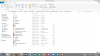
How about a screenshot of a desktop Win 8 system?
I'd like to see it.
JosEPh
I'd like to see it.
JosEPh
How about a screenshot of a desktop Win 8 system?
I'd like to see it.
JosEPh
Here's mine (you probably can't tell it from a Win7 one).
JosEPh_II
TBS WarLord
Does it still have a Taskbar at the bottom? That would be kind of important for me.
JosEPh
JosEPh
Does it still have a Taskbar at the bottom? That would be kind of important for me.
JosEPh
Yes. I just have mine set to auto-hide so it only pops up when I mouse down to it.
Similar threads
- Replies
- 3
- Views
- 359
- Replies
- 15
- Views
- 2K
- Replies
- 10
- Views
- 1K