Altered Maps V: The Molotov-Threadentropp Pact

Status
Not open for further replies.
Here's a map I made and coloured based on this information. Sorry if I read wrong.

regionq.png


Yellow: Northern Europe
Blue: Western Europe
Olive Green: Southwestern Europe
Green: Southeastern Europe
Red: East Europe
Orange: Central Europe
Brown: Southern Europe

I know it's ugly but I'm not that good at MS paint :( It's incomplete too, to boot. I'm too lazy to paint all those islands blue, for example...


That looks fairly accurate, but what is brown? I would just group it with olive and call it southern Europe, or make greece green, and italy/spain/portugal dark blue.

Also, green = Balkans would be more accurate.
 
Yeah, sorry I forgot to explain brown :lol: Changed it to green = Balkan too.

I don't know why CIA decided to group Italy and Greece together while separating them from the Iberian countries. Still, it's a reliable source and the pro-Poland-is-in-Central-Europe side needs those ;)
 
You stole the sequence of characters and spaces right out of my keyboard there!

I really didn't expect anyone to agree with my assessment of how to segregate Europe geographically! That is a pleasant surprise. You might be interested in my newsletter.
 
Yeah, sorry I forgot to explain brown :lol: Changed it to green = Balkan too.

I don't know why CIA decided to group Italy and Greece together while separating them from the Iberian countries. Still, it's a reliable source and the pro-Poland-is-in-Central-Europe side needs those ;)

The support from the CIA makes me uncomfortable, but hey, we'll take it!
 
Only improvement to that mapf would be Modolva as Balkan region, even if it isn't in it.

You should keep all Romanians in the same group imo.
 
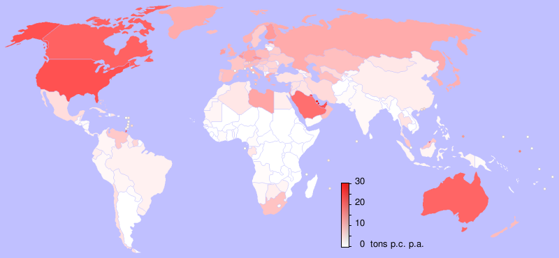
Lies, China and India must be redder than that.
 
CO2 per capita. They have a lot of people.

About 3-4 times as much as America, but much higher CO2 output. Compare America's color to China's. They should at least be Pinkish.
 
Per capita means their output gets divided by the number of people. So each person only has a very small output. The map makes sense.
 
From the appropriate Wikipedia page:
Countries are ranked by their metric tons of carbon dioxide emissions per capita in 2003. Note that emissions as a result of manufacturing exports and emissions avoided by importing products are not considered in the following list. For instance, around 33% of China's emissions in 2005 were due to the production of exports rather than consumption.
So, really, it's a measure of carbon footprint by consumption, rather than production. With that in mind, it seems more reasonable. (The date may also explain something, given how furiously both countries have been industrialising recently.)
 
London is not in Central Europe.
 
At least Danzig is correctly named.
 
Status
Not open for further replies.
Back
Top Bottom