[RD] Daily Graphs and Charts

Status
Not open for further replies.
You sure are acting like every other person is wrong though. And to say your experience is more applicable is an exercise in extrapolation, like me pontificating on the Trans-Siberian Railway simply because I've ridden commuter rail regularly. Anyway, are you just here to defend your honor or will you start posting some graphs too?

Anyway, this would seem to be a good generalized layout of nearly every orchestra in the world. All the ones in front are constants needed for every performance, after all.
Seating.gif
 
Anyway, this would seem to be a good generalized layout of nearly every orchestra in the world. All the ones in front are constants needed for every performance, after all.
Seating.gif

Form follows function. You want a guest conductor to be able to direct, so as far as I know they are ALL laid out the same.
 
Never thought of that. My guess was just the inertia of tradition.

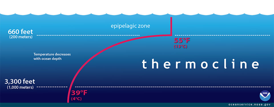
Anyway, a typical thermocline.
thermocline.jpg

"The red line in this illustration shows a typical seawater temperature profile. In the thermocline, temperature decreases rapidly from the mixed upper layer of the ocean (called the epipelagic zone) to much colder deep water in the thermocline (mesopelagic zone). Below 3,300 feet to a depth of about 13,100 feet, water temperature remains constant. At depths below 13,100 feet, the temperature ranges from near freezing to just above the freezing point of water as depth increases."
 
Just a note on common usage...

The single word "thermocline" is often used where the phrase "upper boundary of the thermocline" would be technically correct. So if you read that someone fishing for sharks was trolling "below the thermocline" don't think that they were running out a thousand meters of line, they really mean they were trolling in the thermocline, for sharks that don't like crossing through that line where the temperature change is really abrupt.
 
Interesting. I didn't expect the UK to be number 1 (near the top, certainly, but not at the top).
 
Those death panels are paying off.
 
Saturn V was so perfect the government felt compelled to get rid of it.
 
Nice infograph.
The Allen (hex socket) drive type is also known as Inbus in some parts of Europe and strongly associated with IKEA.
 
Spoiler :
9IW0Lin.png

Case anyone is interested: "Pixel tags" are also a problem here.
Sometimes you see bots posting random short sentences here, with an embedded smiley :) (similar to the ones used here) from another website, for the same purpose.
It's hard to find these, so if anyone stumbles over them, then please report them.
 
8z3H8aR.jpg
 
No space battles? That was probably my favorite mode in the old one!
 
Oh the humanities! No space battles. :dunno:

I always thought the manatees should get something from that. 1% for habitat and fish or some such. Torpedoes to fight back at the *******s in their powerboats. GPS and remote controlled space based lasers to...well nevermind.

I leave this thread there's nothing for me on the outside. A thread about Africa and their problems, but I'm in a 3rd world country and trying to work though things in my own way here, Africa is far from my mind. There's a tread about that overweight guy but that's done, I been and gone. Can't really connect with Europe's problems about refugees. They've been so critical for so long about the US illegal immigration problems that I just figure what goes around comes around. There's a thread about leaving Islam and I haven't been in but really when it comes right down to it I'm all for it, but really I don't care enough to click. Lets see, the "Music you're listening to" thread, well nobodyn is listening to the music I'm listening to. I'm not trying to fit in with any group, couldn't give a rat's ass about being cool, so why go there? Guaranteed I prefer Creedence to any stuff on there. Gimme Joe Cocker or some Spanish guitar, and take a hike with trendy crap. Bomb blasts, Clown Cars, Manga, screw em all.

I need someone to post another graph. Have some mercy...
 
From the indescribably boring:

The map, from cost information website HowMuch.net, scales each country based on the size of its debt compared to GDP (hello, Japan!) and then colours them based on their growth rate.

According to the IMF, which HowMuch cites, there is no "unsafe" debt threshold which countries should stay below, however, some studies have shown that a debt-to-GDP ratio of somewhere above 96 per cent can be damaging for growth.

Spoiler :

19512-1qzxhg9.png

 
I think that when Japan is allowed to erase some of its debt to get to viable level, the people there will have an interesting crisis...

Not sure how they accepted to slave for so many decades. Unfair :\

Also, "from the indescribably boring" echoes of HIGNFY ;)
 
Status
Not open for further replies.
Back
Top Bottom