I need your help with these maps

Winner

Diverse in Unity
Joined
Sep 24, 2004
Messages
27,947
Location
Brno -> Czech rep. >>European Union
A repost from off-topic Altered Maps thread.

what are these images showing?


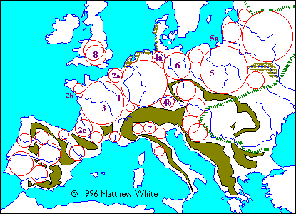
It's from the Medieval America site. The author is (was) trying to make a 'believable' world in which technology regressed back to the Middle Ages and America is a mish-mash of feudal kingdoms, nomadic steppe tribals, and absolutist hydraulic empires.

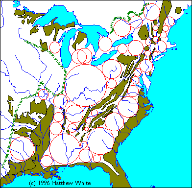
This clearly is some geometric way of determining where (feudal?) nations/kingdoms would form, but how does it work? Clearly, the gold colour represents regions unsuitable for forest-zone agriculture. They separate other regions, which are more suitable. In the first picture, we have Europe and the same methodology is obviously applied in the second map. This would explain his other map:

Spoiler :


So, any ideas? Do you think it is a legitimate method developed by "historians" (probably those dealing with history on the most general level, like Jared Diamond), or the author's own idea?

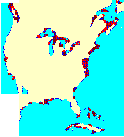
He also mentions another method for determining the "litoral" regions where maritime civilizations are likely to arise:


Littoral zones are not merely coastal; they are regions in which your neighbor is more likely to be across the bay rather than down the road. They are the tips of peninsula, offshore islands, embayments and estuaries. A long smooth coast does not stir seafaring ambitions because there's no place to go except out into the open sea, but a crinkly, convoluted collection of bays and islands gives the local inhabitants plenty of sailing practice with short easy hops. Similarly, a smooth coast is not going to attract the attention of seafarers because any camp they set up will be vulnerable to attack from the land, but a peninsula or island makes a better stronghold.

To pinpoint the littoral zones of North America, I used a technique explained in detail in Colin McEvedy's Penguin Atlas of Ancient History. Basically, you plant a grid over a map of the coast. Then, in blue, you color every square which contain a piece of the coastline. Next, in red, you color every square in which a majority of its neighbors are coastal. It doesn't matter whether this square is coastal itself, only that most of its neighbors are. McEvedy applies this technique to the Mediterranean and shows that the areas which became colonies of the great ancient mariners -- the Greeks and the Carthaginians -- had a geometric unity that other areas lacked. This technique also highlights the principle sea powers of the Middle Ages -- the Venetians, Byzantines and the Genoese -- although McEvedy does not mention this.

If my map of littoral America looks vaguely familiar, that's because land and sea have already come into conflict twice in American history. The first time was when the Europeans first colonized the shores of North America, and sure enough, their primary effort fell in the larger zones shown on the map: the Chesapeake Bay, Long Island Sound, Massachusetts Bay and Nova Scotia. The second time was during the Civil War, when the US Navy imposed a blokade on the Confederacy, and the earliest successes were often in areas highlighted on the map: the Chesapeake, Albemarle Sound, the Sea Islands and the Missisppi Delta.

In Medieval America, there would be a strong tendency for the littoral regions of a particular coast to be joined into a maritime empire of some sort, and to develop a separate culture from their inland neighbors.

This leads me to think the methods from the maps above may also be taken from somewhere else.

Anybody knows...?
 
Do you think it is a legitimate method developed by "historians" (probably those dealing with history on the most general level, like Jared Diamond), or the author's own idea?
It may have been developed by anthropologists or it may have been developed by the author, but either way I have a hard time believing that it is "legitimate", due to the very simple fact that political borders rarely, if ever, represent geographically closed spaces. Political control and cultural influence are contingent on many different factors, and geography is only one of those - and not a particularly important one at that.

Now, such borders might have occurred anyway. That's kind of the point: they're contingent on fundamentally unpredictable events, so we can't really say "yes it would happen this way" or "no it wouldn't". I don't think that using this system makes such borders inherently more plausible than any other hypothetical borders, and I don't think it has any predictive value whatsoever.

I think the point was to get an idea as to where cultural/political entities may likely occur rather than where they must and always will occur; that is definitely useful in such a world-building exercise (the alternative is to just draw random borders and rationalize them somehow).

Now the map of Europe shows he's up to something — clearly there is at least some predictive potential in this model. I wonder what the circles are supposed to represent, exactly.
 
This leads me to think the methods from the maps above may also be taken from somewhere else.

Anybody knows...?
I'd imagine the Annales historians had some influence on this guys thinking. They were very interested in geography and physical space, and his emphasis on mountains and seas seems particularly reminiscent of Braudel. (Although, that probably doesn't bear over-stating, because Braudel was generally contemptuous of "mere" politics, so would probably have disapproved of this sort of project.) It's not a new approach, anyway, although it's still novel enough in the English-speaking world that little of it has filtered through into popular history.

Political control and cultural influence are contingent on many different factors, and geography is only one of those - and not a particularly important one at that.
That probably depends on how you define "important", though. It doesn't determine the development of political and cultural spaces in any way which we could predict, sure, but it does a lot to set the terms of what kinds of material societies can build. Even something as simple as, e.g. rainy reasons turning the roads to mud can have significant effects on the ability of the states to act over a distance, which has self-evident political consequences.
 
I think the point was to get an idea as to where cultural/political entities may likely occur rather than where they must and always will occur; that is definitely useful in such a world-building exercise (the alternative is to just draw random borders and rationalize them somehow).

Now the map of Europe shows he's up to something — clearly there is at least some predictive potential in this model. I wonder what the circles are supposed to represent, exactly.

Cultural/political entities, of course. Cultural entities have an influence on political entities, which in turn have an influence on cultural entities. So for speculative purposes it does not make sense to differentiate between those.

Those overlapping circles in england confuse me. Otherwise it looks like they tried to find the biggest circles that cover the map. The rationale would be something like that cultural/political entities try to minimize the length of their borders compared to the size of the entity, but want to cover the largest area possible. If you want to minimize the differences between any two people of the entity, yet want to form a powerful entity you end up with a circle as the best shape.
 
Why are they going for the area of an unbroken circle? That they overlap in some areas is the connection of the available land space. I am not sure what the green "rail ties" borders are. Maybe fault zones?
 
Cultural/political entities, of course. Cultural entities have an influence on political entities, which in turn have an influence on cultural entities. So for speculative purposes it does not make sense to differentiate between those.

Those overlapping circles in england confuse me. Otherwise it looks like they tried to find the biggest circles that cover the map. The rationale would be something like that cultural/political entities try to minimize the length of their borders compared to the size of the entity, but want to cover the largest area possible. If you want to minimize the differences between any two people of the entity, yet want to form a powerful entity you end up with a circle as the best shape.

I was thinking along those lines, yes. Also we're speaking about a society with very limited means of transportation. People moved on foot, used carriages (limited by the lack of good roads), or sailed along the coast. The power projection potential of any feudal polity was rather limited. There is a *reason* why in most bigger European countries the capital is located more or less in the middle (or in the middle of their most productive regions).

As for the overlapping circles in England, as well as those that are missing in some other places, also confuse me. Also, it doesn't really explain why Italy was so broken up in the Middle Ages/Renaissance period. Maybe a little, but not really.

Why are they going for the area of an unbroken circle? That they overlap in some areas is the connection of the available land space. I am not sure what the green "rail ties" borders are. Maybe fault zones?

In Europe, the one in the south-east shows the westernmost limit of the Eurasian steppe that the nomadic invaders such as the Huns, the Avars, the Magyars and the Mongols used as a springboard for raids and invasions of Europe. The other "rail line" in the north-east probably marks the northernmost limit of agriculture. Beyond that it's only taiga, which is too cold for agricultural societies to inhabit.

In America, these lines likewise represent the easternmost limit of the Great Plains (poor American feudals, they seem to have a lot longer border with the bloodthirsty nomads than the Europeans ever had) and the limits of the Canadian taiga.
 
I think the point was to get an idea as to where cultural/political entities may likely occur rather than where they must and always will occur; that is definitely useful in such a world-building exercise (the alternative is to just draw random borders and rationalize them somehow).

Now the map of Europe shows he's up to something — clearly there is at least some predictive potential in this model. I wonder what the circles are supposed to represent, exactly.
I guess, but I don't think that it takes a modeling system to say that you're not likely to find big complex urbanized societies in, say, Siberia before you find them elsewhere. Apart from that, you really can't be sure at all.

As far as his map of Europe goes, I don't see any predictive power in it at all. The circles that it shows don't really correspond well to political or cultural borders at most points in history. It's missing some political/cultural areas that one would think ought to be important enough to be on there, and it adds ones that took an awfully long time to become, well, relevant. The map of America is similarly useless. It doesn't correspond to the broad outlines of the major pre-Columbian societies.
That probably depends on how you define "important", though. It doesn't determine the development of political and cultural spaces in any way which we could predict, sure, but it does a lot to set the terms of what kinds of material societies can build. Even something as simple as, e.g. rainy reasons turning the roads to mud can have significant effects on the ability of the states to act over a distance, which has self-evident political consequences.
Sure, but that doesn't appear to be in the scope of this project.

I think I made a comment somewhere around here to the effect that geography is the canvas on which human interactions paint history: it places limits on what people can do, but it rarely determines what they will do. I still agree with that sentiment, more or less, even though it's too flowery and the analogy is somewhat poor. So you're kinda preaching to the choir there.
 
I guess, but I don't think that it takes a modeling system to say that you're not likely to find big complex urbanized societies in, say, Siberia before you find them elsewhere. Apart from that, you really can't be sure at all.

It's within those areas which are favourable to forest-zone agriculture where the problem arises. It's not rocket science to figure out that agricultural societies won't exist in places where agriculture is impossible.

As with any kind of a model trying to capture the behaviour of humans as a group, it should (must) be treated in terms of likelihood and statistics. The bigger the sample, the more likely it is to approach the predicted results. It's very Diamondian in this regard.

I totally understand why you dislike anything that smells of determinism, but since this should be used for world-building purposes, I don't really see any harm in it.

As far as his map of Europe goes, I don't see any predictive power in it at all. The circles that it shows don't really correspond well to political or cultural borders at most points in history. It's missing some political/cultural areas that one would think ought to be important enough to be on there, and it adds ones that took an awfully long time to become, well, relevant. The map of America is similarly useless. It doesn't correspond to the broad outlines of the major pre-Columbian societies.

I don't know, it seems pretty good. It shows the cultural cores of both France and Germany plus their dependant sub-regions (Occitania, Bretagne, Flandres, Bavaria) it explains why Spain/Iberia is so fractured even today, and it accurately places the core of Poland (WARNING: This is NOT a signal post for Pole-jacking this thread, so in case you were just about to start, don't - or I will be reporting you) and Russia.

For some reason, some regions are omitted (Ireland, Scandinavia, the Balkans, most of Italy, also those parts of the "steppe" which in fact are conducive to medieval agriculture) - without knowing the reason, it's hard to say if that's because it was beyond the geographic scope of the model, or there are other factors, such as that those regions are considered "litoral" and different rules apply, or something like that.

As for America, it's supposed to be an application of that model. Keep in mind it's designed for medieval tech level societies. Pre-Columbian North America (what we know of its states, which isn't that much) is a whole different category.
 
Sure, but that doesn't appear to be in the scope of this project.

I think I made a comment somewhere around here to the effect that geography is the canvas on which human interactions paint history: it places limits on what people can do, but it rarely determines what they will do. I still agree with that sentiment, more or less, even though it's too flowery and the analogy is somewhat poor. So you're kinda preaching to the choir there.
Cool beans.
 
I have to agree with Winner that the Europe map is kinda intriguing.
There IMO clearly is quite a correlation of circles and actual entities.

Though a lot of the dirty-green areas seem to be mountain ranges. Which is troublesome if the impact of arability as such is supposed to be demonstrated, while in truth it may be more about movement than food (or rather a combination of the two).


Spoiler :


I am not sure what the actual use of it could be though.
Winner speaks of a "Nation-building-excercise"
?
So if I want to create the next Middle Earth or Westeros I decide on arable land/mountain ranges first and then can use this method to help me decide the boarders of the realms? Okay, that is cool (really). But for actual history I see no use - which proabably explains Dach's hostility towards the whole thing.
 
I have to agree with Winner that the Europe map is kinda intriguing.
There IMO clearly is quite a correlation of circles and actual entities.

Though a lot of the dirty-green areas seem to be mountain ranges. Which is troublesome if the impact of arability as such is supposed to be demonstrated, while in truth it may be more about movement than food (or rather a combination of the two).

I think the problem is the steepness/rockiness of slopes, rather than sheer elevation. Agriculture is clearly possible in mountain valleys and plateaus.

The main point is that areas unsuitable to agriculture create natural dividing barriers. The more geographically diverse a region, the more separate cultural/political entities are likely to get established. Which is kinda obvious, but this is a nice way to picture it on the map.

Spoiler :


I am not sure what the actual use of it could be though.
Winner speaks of a "Nation-building-excercise"
?
So if I want to create the next Middle Earth or Westeros I decide on arable land/mountain ranges first and then can use this method to help me decide the boarders of the realms? Okay, that is cool (really). But for actual history I see no use - which proabably explains Dach's hostility towards the whole thing.

Yes. When I create an imaginary world, I try to be as realistic as possible. Neither Tolkien nor Martin really cared that much, despite the latter's reputation for gritty medieval realism. Westeros/Essos are pretty unrealistic once you start thinking about it. Of course, in fantasy you can always handwave such mundane concerns away and invoke magic. I like to be more in line with the laws of nature.
 
As for the overlapping circles in England, as well as those that are missing in some other places, also confuse me. Also, it doesn't really explain why Italy was so broken up in the Middle Ages/Renaissance period. Maybe a little, but not really.

The overlapping circles seem to be of the same size. I suspect that in these cases the method does not give an unique solution, but at least two: Placing the center at point A creates a circle with the same size as when placing it at point B.

I would be careful about the predictive power of the model: With only one real world example to compare to no one knows how much of the result is really a prediction and how much of it is fitting the model to the desired result.
 
I think the problem is the steepness/rockiness of slopes, rather than sheer elevation. Agriculture is clearly possible in mountain valleys and plateaus.
You are wrong. Many plants are afraid of heights. Sometimes they are so terrified that in their panic they try to run away. Of course killing themselves by a painful death of thirst and occasionally - if you got a mass panic - it causes terrible landslides which kill even more plants and also animals as well as occasional humans.
It is all very tragic really.

Spoiler :
I agree, it is probably not the height itself which causes agricultural trouble

The main point is that areas unsuitable to agriculture create natural dividing barriers.
Probably. But I must stress that the map is not able to show so in a satisfactory way - as those created barriers coincide with the very real barrier of a mountain to be climbed. Perhaps it isn't clear why that matters. So here is my little theory: Human entities rest on some sort of common history which naturally rest on interaction. Interaction rests on movement (as an, I need to move to my computer to reply to you or in an Agrarian society - I need to go even further).
Mountain ranges have a general influence on movement - weather they are arable or not. As in - people will tend to no cross them.


Yes. When I create an imaginary world, I try to be as realistic as possible. Neither Tolkien nor Martin really cared that much, despite the latter's reputation for gritty medieval realism.
Yeah well realism... The standards of fantasy for realism are so low that such a reputation isn't trustworthy to the latter if you ask me. But I get your point.

Well a bit of an idea of plate tectonics, temperature/humidity and air circulation and this circle-concept should suffice for some first-glance geographical realism.
But if you wanted to be really good, you would probably need some knowledge about geology, sediments and so forth. And a good grasp on how all this shapes plant life and how all this then shapes animal life and at best how all this tends to shape population density....
 
I don't know, it seems pretty good. It shows the cultural cores of both France and Germany plus their dependant sub-regions (Occitania, Bretagne, Flandres, Bavaria) it explains why Spain/Iberia is so fractured even today, and it accurately places the core of Poland (WARNING: This is NOT a signal post for Pole-jacking this thread, so in case you were just about to start, don't - or I will be reporting you) and Russia.

For some reason, some regions are omitted (Ireland, Scandinavia, the Balkans, most of Italy, also those parts of the "steppe" which in fact are conducive to medieval agriculture) - without knowing the reason, it's hard to say if that's because it was beyond the geographic scope of the model, or there are other factors, such as that those regions are considered "litoral" and different rules apply, or something like that.

As for America, it's supposed to be an application of that model. Keep in mind it's designed for medieval tech level societies. Pre-Columbian North America (what we know of its states, which isn't that much) is a whole different category.

I was comparing the Iberian peninsula to Italy and wondering whether or not there's a bit of bias in how those regions were drawn (i.e. to artificially inflate or deflate the number of naturally-occurring/predicted civilizations).

Also, it might be hopeless. :lol:
 
I was comparing the Iberian peninsula to Italy and wondering whether or not there's a bit of bias in how those regions were drawn (i.e. to artificially inflate or deflate the number of naturally-occurring/predicted civilizations).
I think that's probable. Today I was looking at a similar map of the Iberian peninsula, but because the shaded areas were cut off at a lower elevation, it looked very different from White's map. The white areas in Catalonia, Andalusia and Portugal were still there, but reduced and isolated, while the areas in Galicia and the Basque Country were reduced to a thin coastal strip, and the area in Castille eliminated altogether. It's a map that would offer a totally different set of predictions.

I have to agree with Winner that the Europe map is kinda intriguing.
There IMO clearly is quite a correlation of circles and actual entities.


You can pretty much make a map like this say whatever you want. In this case, I have done away with France and Germany, and installed in its rightful place mighty Lotharingia, natural hegemon of the European plains. So if White's circles correspond to any particular polities, all that tells us is that he has drawn them to be so.
 
Though a lot of the dirty-green areas seem to be mountain ranges.

That's true in the European map, but not true of the American map. Really, it just makes no sense overall.

The American map is relatively nonsensical to anyone that lives here. In particular, the Appalachian mountains are not any kind of natural barrier that divides kingdoms and I can't think of any reason you'd find a thousand petty Kingdoms in Maine and Vermont. On the other hand, other natural dividing points don't divide, so it's wrong in both ways.
 
You can pretty much make a map like this say whatever you want. In this case, I have done away with France and Germany, and installed in its rightful place mighty Lotharingia, natural hegemon of the European plains. So if White's circles correspond to any particular polities, all that tells us is that he has drawn them to be so.

Besides, all you need is a bit of Apophenia anyway. In your map, I can see Lithuania, Poland, Belarus, Prussia, England, Brittany, and Normandy so that's a pretty strong correlation.
 
Winner said:
it accurately places the core of Poland

Maybe these three maps posted below can help:

1. The shift of the densely populated area, main settlements, and the core of the Polans' state in the 9th (IX) century - based on archaeological evidence:

Noteć = Netze River
Warta = Warthe River
Odra = Oder River


2. The core of the Polans' state in the early 10th century (early 900s) - based on archaeological evidence (mainly on dendrochronology of buildings):

Years near names of strongholds / urban settlements, designate the approximate time of their construction (based on dendrochronology):


3. Expansion of the Polans' state under Siemomysł and Mieszko I in years 940-999 (based on archaeology, dendrochronology and written sources):

Punctual tokens / symbols designate main strongholds and main urban settlements constructed or captured in each approximate period:


When it comes to Cracow (Kraków), there is some controversy regarding the date when it became part of the Polans' state.

According to 11th century Czech chronicler Cosmas of Prague, Cracow was captured by Polan duke Mieszko I in year 999.

The problem is, that Mieszko I died already on 25 May 992 - as it is known from other sources.

So either Cracow was captured earlier (maybe in 989), or it was captured by Bolesław I - Mieszko's heir.

In the map above, I assumed that Cosmas confused the person, not the date. Thus I accepted 999 as the correct date.

======================================

Another controversy is the issue of how far to the south-east extended the area which became known later as the Red Strongholds.

That area was captured by Mieszko ca. year 970, and was lost by Poles to Kievan Rus in 981 (according to Nestor, the Primary Chronicle). Later it changed its owner yet few more times (in 1018 to Poland, in 1031 to Rus, in 1069 to Poland, in 1086 to Rus, in 1240 to the Golden Horde as a tributary, in 1340 to Poland). But there is no consensus among historians regarding how far to the south-east into what is now Western Ukraine that area extended. In the map above I chose the minimalistic version of the south-eastern extension of this area. In fact it most probably extended much farther into what is now Western Ukraine.

======================================

THE END

I hope this single post was helpful (and no, I don't want to hijack this thread for Poland-related discussion - it was the first and the last post :p).
 
Top Bottom