The font of all knowlege

Serif?

  • Yes.

    Votes: 8 34.8%
  • No.

    Votes: 15 65.2%

  • Total voters
    23
I like Helvatica for the same reason BVBPL doesn't like it (stuff white people like).
 
I was partial to Book Antiqua at first, but now I usually type in Slyfaen. And the more serifs the better!
 
Say about Comic Sans what you want, but it's one of the few fonts with a decent "round" lowercase a.
 
I use it all the time in my handwriting. The other a is unnatural and wrong, and I refuse to have it enforced on me by Big Typography.
 
I tend to use the Aurebesh in written documents
 
I know nought about fonts but I'm interested to know if anyone else thinks this comic sans isn't half as comedic as this thread implies. If it wasn't called what it is I wonder if anyone would raise an eyebrow.

I'm tempted to e-mail in it for a week.....I doubt whether anybody would so much as even mention it.
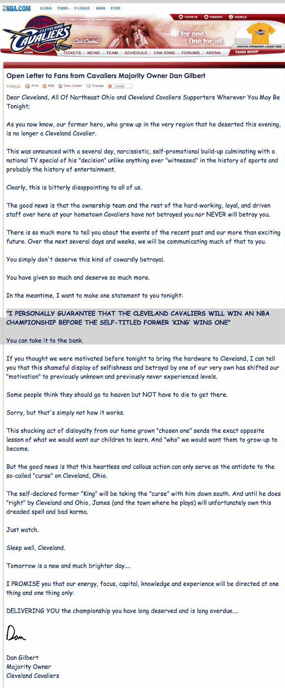
Oh, in certain contexts it can be completely hilarious.
Spoiler :
dan-gilbert-letter.gif

N.B.: The LeBron-led Miami Heat went on to appear in the Finals every single year since, and won two out of three championships. They are the current prohibitive favorite to win for the foreseeable future. The Cleveland Cavaliers have missed the playoffs every year since Gilbert's guarantee.
 
Dammit, beat me to it!

I use Calibri for most internal communications,and when I write for stuff that isn't for immediate publication. My style guide forces me to pretty much write in 100% Times New Roman though.
 
I know nought about fonts but I'm interested to know if anyone else thinks this comic sans isn't half as comedic as this thread implies. If it wasn't called what it is I wonder if anyone would raise an eyebrow.
I think so. It resembles the block letters children are taught in school, everything is round and the lines are slightly slanted. It looks playful and not very serious.

Of course most of its bad reputation has been aggregated over time after some people started using it in inappropriate contexts and typography nerds got upset about it which prompted more people to look down upon it etc.

And by the way, I've always thought that Aurebesh is a kickass name for a script.
 
Sans serif FTW. My personal favorite would have to be Johnston Sans, aka the font Transport for London uses.
 
Hello. This is hal 100. Do not fear, for all i can do is write in harmlessly large fonts.

For now.

 
Verdana>Everything
Look, i am the first one to say that type shouldn't be "manly".
For example i find it rather amusing when people run a national campaign, decide that Futura doesn't have enough balls, instead opt for Gotham - a ridiculous typeface that really is bold even when it's not, that looks imposing and authoritative and very much transports the air of someone who either had or desires major penis enlargement surgery - proceed to win the campaign and act all surprised when there is a popular movement calling them arrogant and authoritarian two years later.

That being said, Verdana is uber crap, possibly the worst font in the word. It's gullible, hypocritical, spineless, confused, slighly tipsy poop.
Unless you are the modern equivalent of a 19th century entitled young female from Kent, Verdana is probably not your font.

That doesn't mean we cannot all use Verdana. We are all using toilet paper as well.
Following that line of thought Ikea's switch to Verdana is really nothing but honest and consistent...
Say about Comic Sans what you want, but it's one of the few fonts with a decent "round" lowercase a.
[...]
I use it all the time in my handwriting. The other a is unnatural and wrong, and I refuse to have it enforced on me by Big Typography.

The two storey lower case a enhances readability. If you don't want it and prefer the aestetics of the geometric lower case a there is really no reason to resort to something as desperate as contemplating the use of Comic Sans.
Just use Futura.
Sans serif FTW. My personal favorite would have to be Johnston Sans, aka the font Transport for London uses.
I don't know... i have this thing about huge corporations and government agencies adressing me (via signs and the like) in humanist typeface.
I am never quite able to completely get past the impression that it's intentional mockery.
 
Back
Top Bottom