ugly logo?

OrsonM

Our man
Joined
Jan 1, 2011
Messages
555
Right, so I'm not sure how many would agree or care about it, but logo works is one of the best ways to judge a book by it's cover, a judgment that will usually prove correct (because that saying is full of crap). As in if a logo looks cheaply made, the rest of the product will most likely be cheaply made.

logo_onblack-14391-cropped.png

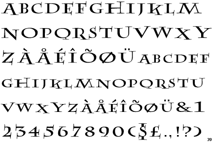
And people say you can't design logos in Microsoft Word...

So my regards to Firaxis, for working in what it looks like a banging fan made mod for Civilization V, from it's unusual title (gods plus kings?) to what looks like a completely different graphic designer working on the logo, which seems to have little to no connection to the old logo, aside proximity.

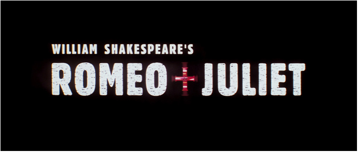
In any case, and following the example of another title that refused to use an "and" or an ampersand (this thing: &), which was Baz Luhrman's Romeo + Juliet, I hope secretly that the new main menu theme is Young Hearts Run Free.

122_romeo+juliet_blu-ray.jpg

Not only a better logo, better ai too.

So yeah, in short, what to think of the coming expansion pack?, well, that the title and logo are really lame. Here's to hoping they spent all that money in programming the actual thing, and that only the logo was rushed. And my regards to anyone who rocked to that Young Hearts Run Free song, it's just that good.
 
I love the logo. Why do you have to nitpick like this?
 
Because the civ-community is a merciless beast :spank:

I like the logo as well, it's clear, strong, slightly chic and has a crusaderish touch to it.

I agree, now a days people find anything to complain about

I don't care, I care what's on the inside of a GAME, not the outside, it's opposite in RL, I care what's on the outside of a person THEN whats on the inside xD
 
I strongly disagree with the OP statement that it doesn't connect with the original "look".

As a graphic designer you are normally allowed to use up to 3 different fonts in a graphic scheme. Otherwise it get's messy. In this case there are two, thereby holding this first rule. Using the second font is though needed since you want to display the novelty and mark a difference. The two fonts do however interact by sharing the same grey scale gradient and thus creating a connection.

It's quite elegant and slick and I think it's lazy to just arbitrarily call something lazy.
 
They can make the logo in Paint if they want and just scribble something really quick. The logo isn't important. Who cares? The game is important, I'll nitpick that.
 
I'm also a graphic designer, it's not like I'm pulling this out of my ass. It's not the best logo for an expansion pack, and I cannot share a knee-jerk reaction and defend it just because I'm really eager to play the expansion, particularly when it's a far lesser quality than the last logo.

The main problem with the new logo is that it has no connection to the style set by the last logo. The last logo had a stylish Art Deco look, from it's slick sans serif typeface to it's slight embossing and color.

The new logo has none of these characteristics, and it basically looks tacked onto the old logo. It's style doesn't have much ambition to it either, it's a medieval looking font with a cross/sword as the "+". We know the title appeals to a certain medieval themes to it, but do they have to be that unoriginal?

logo.gif

a sword for an extra medieval flavor??, get right our of town mister!

When reviewing a logo, you gotta take into consideration everything that's meant to be connected to that logo, and if you isolated this logo separately into it's own graphic, there would be no way in hell that anyone would associate it with Civilization V. It has little to do whether or not the logo came out well or not, but if it's working well as a whole.

But don't take it from me, take it from other great expansion pack logos that were designed a bit better:

Retribution-Logo.png

Same war torn badass visual codes.

heart-of-the-swarm.jpg

Part of a saga, all expansion packs will use the same style...

starcraft-2-logo-02182010.jpg

...as such.

gaytony.jpg

The-sims-3-world-adventures-expansion-pack-logo.jpg


Both two great examples of great integration into their original logos, they look and feel as if they are part of the same universe, which is key for an expansion pack. The Ballad of Gay Tony icon is remarkably well designed as well.

logo.jpg

Even this blast from the past gets it.

So what's wrong with the new logo?, probably that it looks like the logo of a fan made mod. Which is not a bad thing, if you are indeed attaching such logo to a fan made mod made for no money. But in a project like this?, makes you wonder why such ineptitude in the marketing department. That logo should had blew me out of my chair, instead it just made me wonder what went wrong.
 
I agree with the OP. "Lazy" is the perfect adjective to describe the logo.

Theres not really wrong with it, but just isnt creative. "gods and kings" is placed on the most obvious place with a font that dont bring any "emotion" to it.
 
I agree with the OP. "Lazy" is the perfect adjective to describe the logo.

Theres not really wrong with it, but just isnt creative. "gods and kings" is placed on the most obvious place with a font that dont bring any "emotion" to it.

Agree :) Civ5's design is overall kinda minimalistic - both in artwork and user interface. It's far from "gamey" in my opinion. The new religion icons are also flat and only 1 colour. I wish they would drop the "application design" AKA microsoft word design and do some real artwork for a GAME.
 
I like the logo. There is a sort of balance to it, without all the words being plainly centered in the photo. I enjoy the minimal depth the V gives as well. I like the GTA one also.

The rest I think look mediocre, Warrior Hammer and the Sims3 being somewhat of an eyesore.
 
No, that's a statement...

Just like stating my opinion is equally valid - good things rarely come from "yes-men". You learn from mistakes and criticism, not from silence and indiference. I really don't care about the logo, but like the OP I thought it looked like a 2-minute job.
 
I like Civ5 art style. It has a cultural and history feel to it and not too cartoony and fake. The game is like a visual history book rather than some mindless fighting games... not that I don't like mindless fighting.... :D
 
I just showed my wife the new expansion logo, as I usually do to make sure I'm not crazy, and she right away asked me "is that the Harry Potter font??".

Which I thought was funny, they do look a lot alike, it's not the same though.

AbleNew.gif


In any case, it's not that it's a bad logo on it's own, it's just that it looks weird next to the far superior original logo, which obviously had more TLC in the making.

A sign of a poor logo is when my eyes do not immediately read the text I'm supposed to read, I read Civilization V first, and then my eyes sort of travel all the way down to that afterthought that was stapled to it (they are also kinda fighting for protagonism a little bit).
 
Just like stating my opinion is equally valid - good things rarely come from "yes-men". You learn from mistakes and criticism, not from silence and indiference. I really don't care about the logo, but like the OP I thought it looked like a 2-minute job.

Where are you getting that I care only about "yes-men"? Why did you even bother quoting me?

All I said was that he wasn't making a complaint. I didn't say anything else.
 
Think it looks fine. The Art-Deco styling and the interface are clean and nice, and the wonder splash pages have some excellent artwork. The only thing I would like to see is more distinct ethnic artstyles for cities and units, but overall no complaints about artwork.
 
Back
Top Bottom