You are using an out of date browser. It may not display this or other websites correctly.
You should upgrade or use an alternative browser.
You should upgrade or use an alternative browser.
Why on earth...
- Thread starter Aheadatime
- Start date
- Status
- Not open for further replies.
AlpsStranger
Jump jump on the tiger!
- Joined
- Feb 8, 2009
- Messages
- 5,820
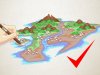
I like the "map" filter purely for artistic reasons, though I don't deny it has clarity issues.
Perhaps three options?
Sepia Map ( current )
Color Map ( Sepia map with artistically appropriate colorization )
Traditional ( Civ5 Style )
This is the rare case where just straight up adding more options is the way to go, IMO. You *can* please everyone in this case.
Perhaps three options?
Sepia Map ( current )
Color Map ( Sepia map with artistically appropriate colorization )
Traditional ( Civ5 Style )
This is the rare case where just straight up adding more options is the way to go, IMO. You *can* please everyone in this case.
Ozisl
Warlord
I do like the effect they were going for, but it is underwhelming when it comes to function. I expect there to be a lot of texture packs once the Steam Workshop opens.
duckstab
Child of Noble Family
While I haven't purchased Civ6 yet, and I'm sure the UI will need some tweaking, I hate the misty haze of Civ5. Even after the FOW is cleared I find the map very hard to read and spend 90% of the game in the strategic layer. I think the clean, crisp graphics of Civ6 are a step backwards to Civ4. In this case, that's a step in the right direction IMO.
Joch
Warlord
- Joined
- Oct 27, 2014
- Messages
- 157
I disagree completely on this one. I really like what they have done with Civ6 FOW. It makes it very easy to distinguish which areas you can see into and which you can't and it gives it a old cartography look.
Personally, it only took me a short time to get used to it and I don't find it any more difficult to figure out where to settle new cities than in Civ5 or BE.
Personally, it only took me a short time to get used to it and I don't find it any more difficult to figure out where to settle new cities than in Civ5 or BE.
I switch to strategic view when I want to be sure about hills, or even generally about what terrain I've improved with what. I find the standard view difficult to tell quickly, and sometimes end up leaving useful land within the city radius undeveloped as a result.
smartcanuck1988
Warlord
- Joined
- Jun 16, 2016
- Messages
- 276
I think the shaders they are applying to the fog of war are nice. However the models of tiles like hills (and you can through the resource icons here too) are not that distinct. So the result is what we see.
Kracked1
Chieftain
I only play in strategic view now (as I always did in Civ V) - seems to speed up the game a bit too (but could be perception). I played a couple of games through with the global view (non-strategic) to see the pretty pictures and animations and am now back to gool ole strategic view which is where I will likely stay until Civ VII. 
Atwork
Immortal
The two screenshots are not a fair comparison. You've got satellites in the Civ V one, which show everything.
BD123
Chieftain
- Joined
- Aug 4, 2013
- Messages
- 95
I like the "map" filter purely for artistic reasons, though I don't deny it has clarity issues.
Perhaps three options?
Sepia Map ( current )
Color Map ( Sepia map with artistically appropriate colorization )
Traditional ( Civ5 Style )
This is the rare case where just straight up adding more options is the way to go, IMO. You *can* please everyone in this case.
I like the second option, the sepia with colors. It'd be easier to read and would preserve the aesthetic they were going for. It could be like nice water colors too.
Differentiating hills from flat land (even in full sight) is just awful, and all that needs to be done is to make the hills more... hilly. Like in CiV where the hills obviously jutted out of the flat land.
Also, when you hover over the areas in FOW info doesn't show up, at least not for me

I like the map, but also agree it can use improvement. The main points for me:
-bigger distinction between FOW and unexplored terrain. I've had cases where I look at my map and can't tell what I've explored and what I haven't.
-as everyone else said, bigger hills. To add on, bigger resources too. I mean obviously I keep resource icons on, but it would be nice to also be able to clearly see a horse or pig in the background, as opposed to this tiny object that is impossible to determine.
-Keep the resource icons for resources under cities/districts! I got the tech for oil, and it's basically impossible to know where they are! There might be one hiding under a neighbour's district and I wouldn't be able to tell at all.
But yeah, would be nice to have more obvious hills at the very least.
CrimsonEdge
Warlord
- Joined
- Aug 25, 2006
- Messages
- 256
Damn good old Civ 5, looks so beautiful. Miss it already. I cannot understand how people think VI looks better.
Civ 5 was great for distinction but was very bland. It was like looking at a EU or CK map.
MistyRonin
Warlord
What I don't get is how it took so long for the devs to get a truly awesome fog of war like the map textured one. It's one of the coolest features of the game.
Now it really feels like exploring a World.
Now it really feels like exploring a World.
Atwork
Immortal
Now it really feels like exploring a World.
And I suppose...re-exploring the world over and over again because you can't read the drab map.
Ozisl
Warlord
Maybe they could make it so the FOW changes based on your era... ancient you see nothing, classical to Renaissance you see parchment, industrial to a nice print, modern eras to photographic...
Manifold
ModderProtectionAdvocate
- Joined
- Aug 27, 2007
- Messages
- 1,580
I agree 100%. Overall the game is pretty good, but that muddy brown fog of war is just awful.
While playing Civ 5 and scolling fast over the map I always had some graphic bugs in the late game. I guess that had something to do with the performance and it looked similar to the muddy brown fog of war in Civ6.
So if it was the goal to avoid this graphic bug then I choose the muddy brown fog of war. It is better than the bug. This bug even appear on my new computer with best hardware so it must be something to do with Civ 5.
Aheadatime
Prince
- Joined
- Dec 21, 2009
- Messages
- 325
The two screenshots are not a fair comparison. You've got satellites in the Civ V one, which show everything.
This comparison is 100% identical. What you're looking at is two different versions of the same thing - terrain that you've "discovered" but don't currently have vision of. With Civ6, I had to manually discover all the terrain myself for this experiment, since there is no IGE mod yet. With Civ5, I just unlocked Satellites to discover all of the terrain.
The method of discovery doesn't matter whatsoever, so I don't see your gripe. Satellites technology doesn't provide constant vision of every tile on the map, it just 'discovers' tiles that you didn't explore yourself throughout the course of the game.
- Status
- Not open for further replies.
Similar threads
- Replies
- 156
- Views
- 4K
- Replies
- 0
- Views
- 502
- Replies
- 16
- Views
- 1K
- Replies
- 6
- Views
- 387