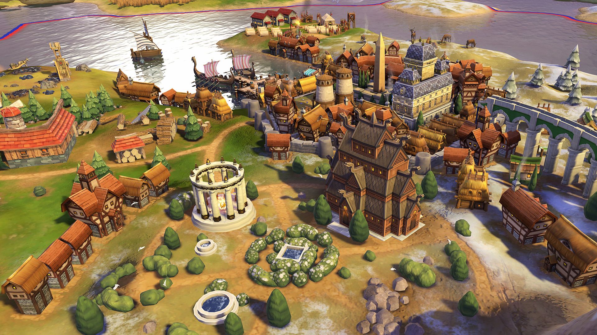
I still hate the way districts have the same visual footprint as cities, and cities in the late era just never stopped being ugly, compact bundles of skyscrapers. Even if you didn't like CiV's grittiness, it shined in the late game, it effected drama and order from all that unbridled sprawl, whereas VI's art inverses that.
But the last two months of refinements made ancient->medieval cities look lovely, and certainly a lot less like Clash of Clan forts.
Good or bad, we can agree from the let's plays that the visual mandate that supposedly inspired all this stuff-enbiggening, readability, has been obliterated in the current form. Nothing's really very discernible on the map to new eyes, especially wrt resources improvements and trained eyes were going to be able to tell more subtle things after repeated plays no matter what approach the aesthetic took. "Oh it's their commercial district, I can't point out why, but I've been playing this game for 1000 hours so nah I don't need the icons."
Meanwhile, the appended VI strategic view turned out to be really attractive, it actually deserves the name "stylized"*, and it's... readable. I anticipate playing a lot or all of the time in that.
*Please can we not elevate VI's look to "stylized." "Cartoonish" is the apt, perfect word, for form that has soft reality but no formal excess: it exaggerates symbolic features, but is as beholden to The Symbol of an Arm as realism is to The Grit of an Arm. Yes, it can still be beautiful. The last months in VI's fleshing-out have taken us from Last Airbender season 1 to Last Airbender season 3, thank god. But if you need to know what "stylized" would look like, just think of the Beginnings storyline in Korra.