You are using an out of date browser. It may not display this or other websites correctly.
You should upgrade or use an alternative browser.
You should upgrade or use an alternative browser.
[RD] Daily Graphs and Charts II: Another 10,000 to come.
- Thread starter Cutlass
- Start date
 .
. ...
...EnglishEdward
Deity
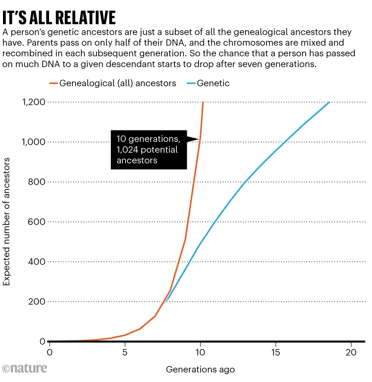
This is one of the things that really worries me about it. There is so much trouble now, and this is with it on easy. If large areas of the tropics become uninhabitable in the next decade or two it could be a choice between open borders or WW3.0
I don't assume that open borders will avoid WW3.0
Yes, I was pleasantly surprised how much the efficiency of photo-voltaic cells has increased in 20 years.I like the graph as it has so many meaningful features. The absolute X position is the proportion of total generating capacity, the X component of the vector is the proportional growth rate over 10 years, the absolute and component Y obviously the same for cost and the angle the "learning rate by installation".

It is a great map even if a bit old.

Last edited:
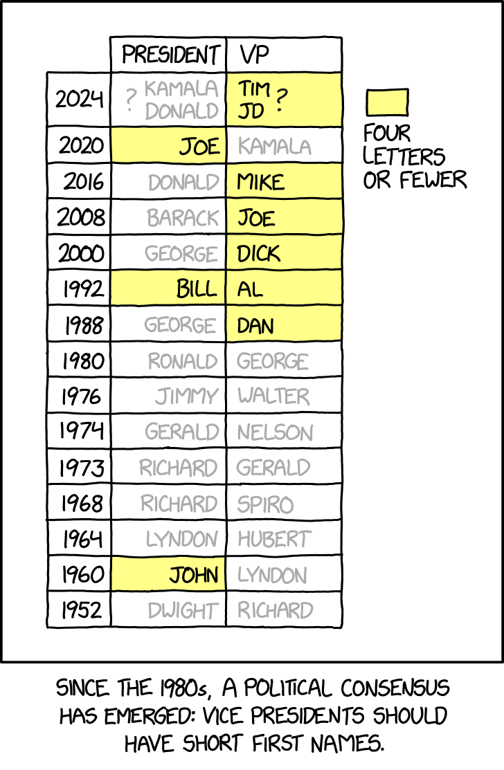
^Til that there was a US vice president of Greek descent.
Fan fact: the run-up to the elections with Doukakis as the nomination of the dem party must be my first ever politically-related memory (a comic sketch in a newspaper my father was reading).
Fan fact: the run-up to the elections with Doukakis as the nomination of the dem party must be my first ever politically-related memory (a comic sketch in a newspaper my father was reading).
Last edited:

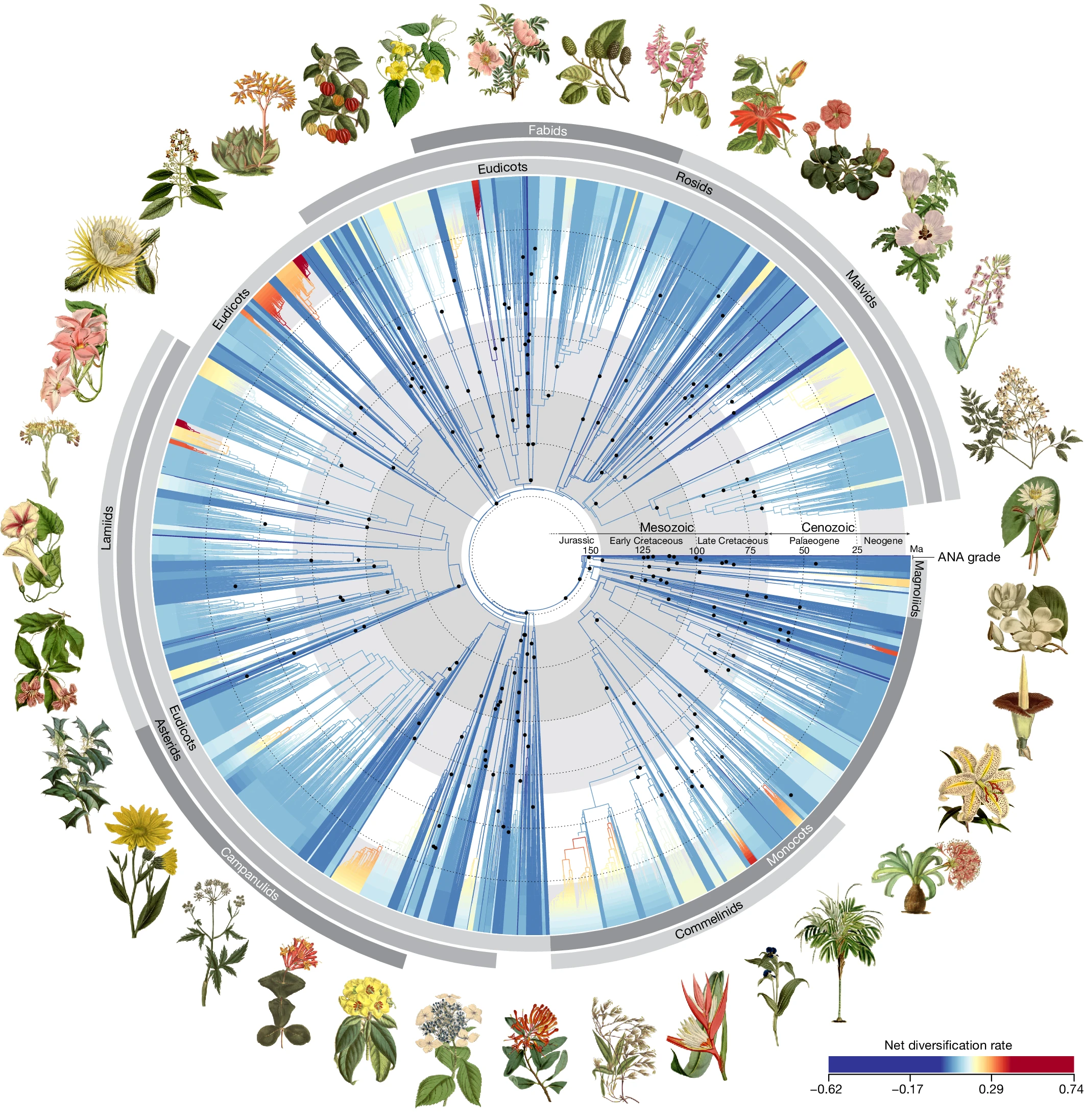
Is this pretty enough? You can get a 350 MB pdf of it here.
Time-calibrated phylogenetic tree for angiosperms based on 353 nuclear genes.
Spoiler Legend :
All 64 orders, all 416 families and 58% (7,923) of genera are represented. The young tree is illustrated here (maximum constraint at the root node of 154 Ma), with branch colours representing net diversification rates. Black dots at nodes indicate the phylogenetic placement of fossil calibrations based on the updated AngioCal fossil calibration dataset. Note that calibrated nodes can be older than the age of the corresponding fossils owing to the use of minimum age constraints. Arcs around the tree indicate the main clades of angiosperms as circumscribed in this paper. ANA grade refers to the three consecutively diverging orders Amborellales, Nymphaeales and Austrobaileyales. Plant portraits illustrating key orders were sourced from Curtis’s Botanical Magazine (Biodiversity Heritage Library). These portraits, by S. Edwards, W. H. Fitch, W. J. Hooker, J. McNab and M. Smith, were first published between 1804 and 1916 (for a key to illustrations see Supplementary Table 2).

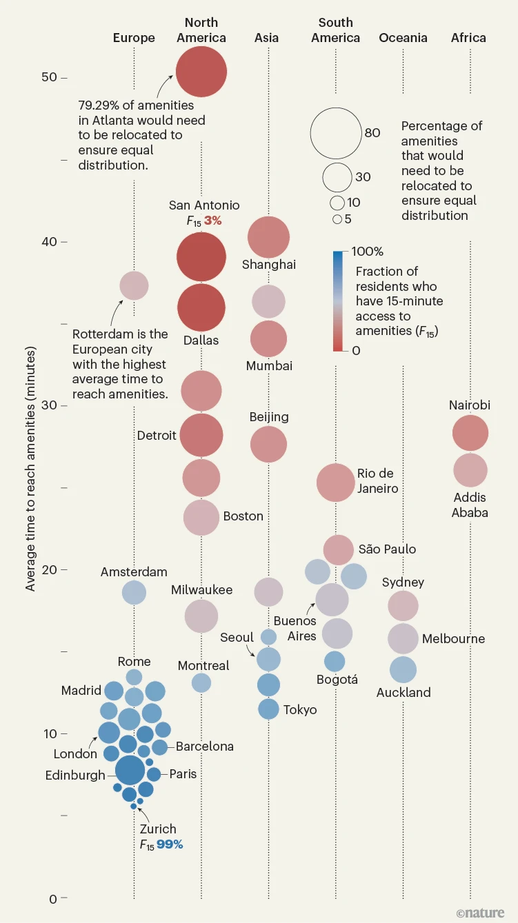
How walkable is your city? Researchers have built an online platform to assess how close metropolises of the world are to the hypothetical ‘15-minute city’: one in which residents can access essential amenities on foot or by bike in 15 minutes or less. The model shows that European cities most closely resemble the ideal, with Zurich an almost perfect example. US locales need the most adjustment from their current set-ups to fit the mould, with residents of Asian cities Shanghai and Mumbai also needing to travel over 30 minutes on average for amenities.
They have a world map you can browse.
Spoiler More detail :
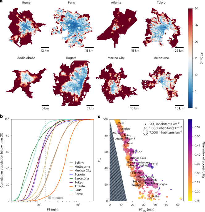
Local accessibility measured in several different cities. a, Computed maps of local accessibility scores for a subset of the studied cities. Each hexagon in each city is colored according to PT, that is, the time to access the services of the 15-minute city. The color code is such that blue (red) colors correspond to areas where the accessibility time of the services is below (above) 15 minutes. Remarkable differences are observed among different cities. For instance, a small fraction of the city area in Atlanta has PTs that are less than 15 minutes. Conversely, Paris has a considerable fraction of the city area below 15 minutes. b, The cumulative distribution of PT scores among the population in selected cities, that is, the population fraction whose accessibility is below a given PT. The curves for different cities display similar S-shaped behaviors, though their growth occurs at very different positions. We highlight the curve intercept for a PT of 15 minutes, revealing the fraction of the population living in a 15-minute condition. c, A scatter plot of different accessibility scores of cities in our study. For each city, we report the average PT score, PTcity, versus the fraction of the population living in a 15-minute condition, F15. The circle size is proportional to the population density of the city (inhabitants per km2). The color codes for the Gini index, which captures the unequal accessibility across cities. The triangular gray area represents a theoretically unreachable phase: if a city has a low PTcity, the proportion of people within 15-minute accessibility cannot be lower than a certain percentage. We observe a decreasing trend of F15 versus PTcity, which is to be expected. Less trivial is that the Gini index shows an increasing trend with PTcity.
Years of birth. (19,xx) is more common, (xx,19) is not as common as I would have thought given that.What's the deal with (xx,19) though?
")
See any other areas of interest? Eg for the relative prominence of x<31^y<13, it is primarily x=day of birth, y=month of birth and secondarily a y≃x/2, but the actual line for y=x/2 isn't highlighted.
Also, look at the somewhat shiny 29(=y)17(=x) and its symmetrical point in regards to f(x)=x, 17(=y)29(=x). That cab number ended up not being dull at all. Sq3 is nearby too.
Likewise for the first four digits of pi (and, rapidly diminishing in brightness, I expect for some other digit tetrads of it too).
Not sure what y=86 is about. Google produces information about May Day if x=18 and Mexico WC if x=19.
Some fractured curves of 'last two digits of year parent/grandparent was born/ltdofy kid was born' are there too.
Last edited:
Similar threads
- Replies
- 4
- Views
- 457
- Replies
- 128
- Views
- 14K
- Replies
- 352
- Views
- 22K