You are using an out of date browser. It may not display this or other websites correctly.
You should upgrade or use an alternative browser.
You should upgrade or use an alternative browser.
[RD] Daily Graphs and Charts
- Thread starter Winner
- Start date
- Status
- Not open for further replies.

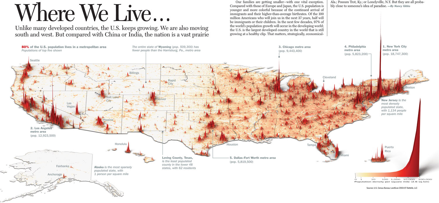
The US has slightly more total land area than China. The US has 1/4 the population of China. That leaves a lot of room for not that many people per square mile in the US. Many of the western states have vast areas of mountain and desert, which have little to no resident population. Most of the central states are primarily farm and ranch land. So they have some centers of population, but the majority of the land is sparsely inhabited. As you go east to west in the central states you go from more intensive farming to less intensive ranching. And so the number of towns of any size declines, and the numbers of people spread out between the towns declines as well.
JohannaK
Heroically Clueless
not that China doesn't have its fair share of sprawling deserts, mountains and other inhospitable terrain in abundance.
Lohrenswald
世界的 bottom ranked physicist
"Using information on 18,300 HUD properties across 15 metropolitan areas, the researchers mapped the nationwide picture of affordable housing. In the map below, the more expensive affordable housing is in red. In these places, transportation costs are more than 15 percent of what the typical local low-income household makes in a year. That means housing plus transportation costs are upwards of 45 percent the household’s annual income. The most affordable housing is in orange, where transportation costs are under that 15 percent threshold."
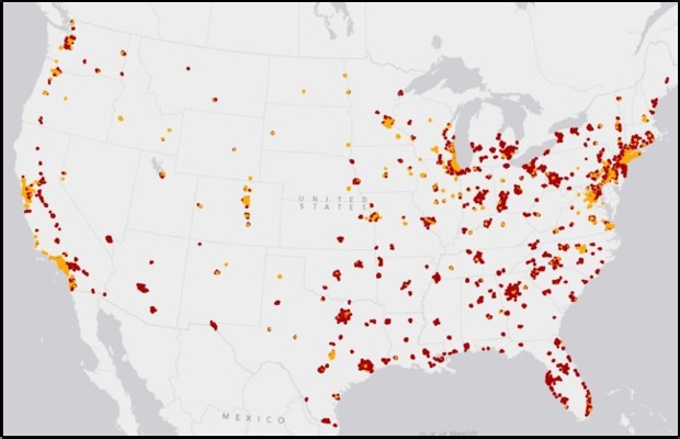
shows all those californians complaining about living costs harumph tarumph
The US has slightly more total land area than China.
actually China is slightly larger
but your point still stands
JohannaK
Heroically Clueless
Spoiler :

SS-18 ICBM
Oscillator
SS-18 ICBM
Oscillator
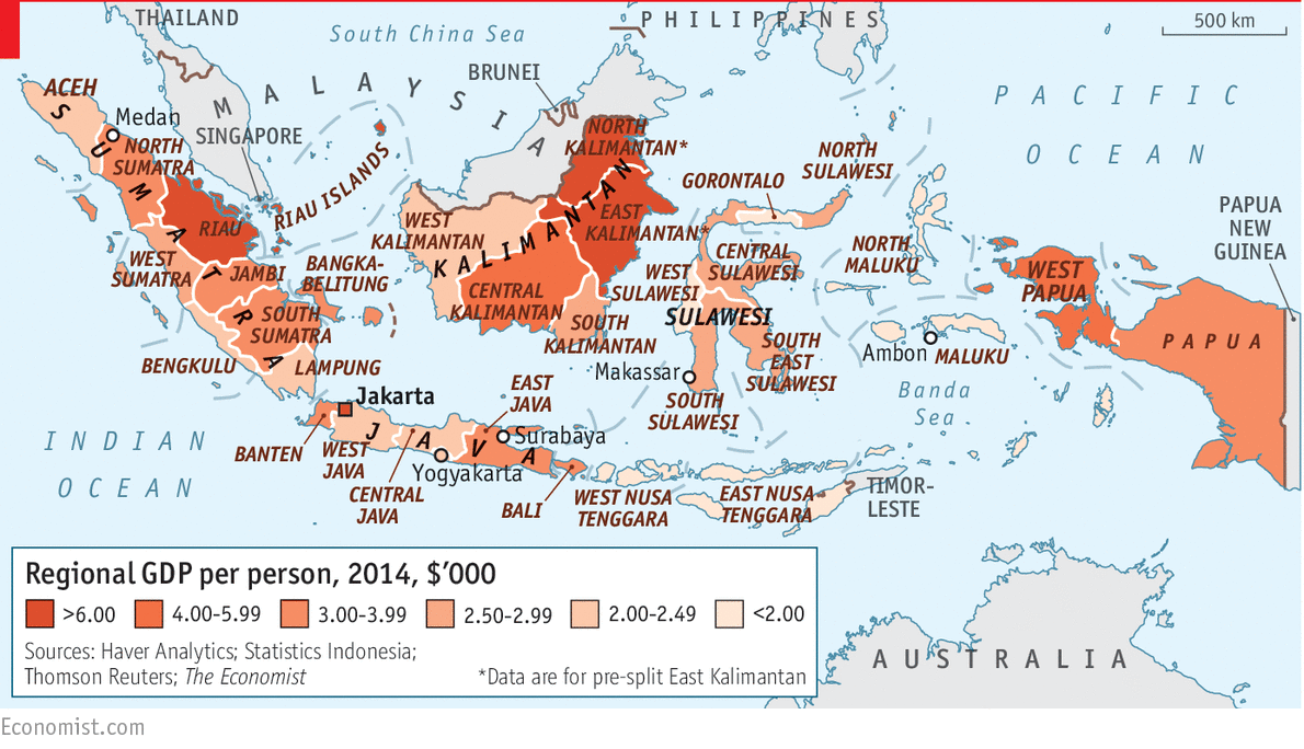
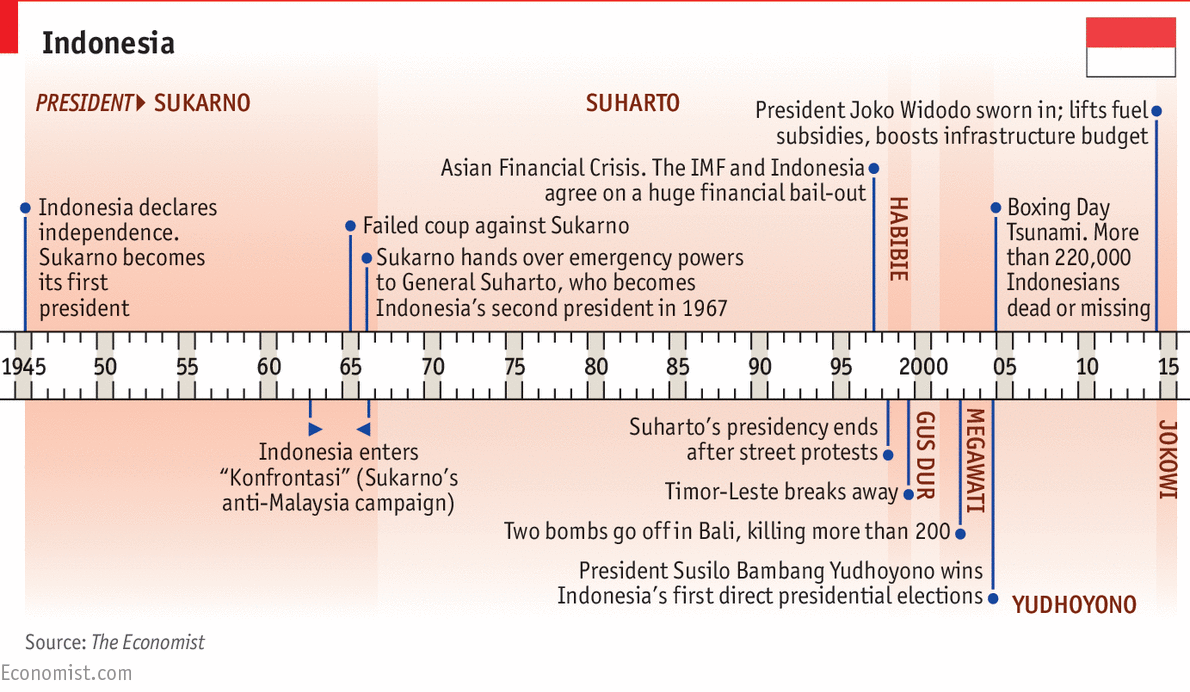
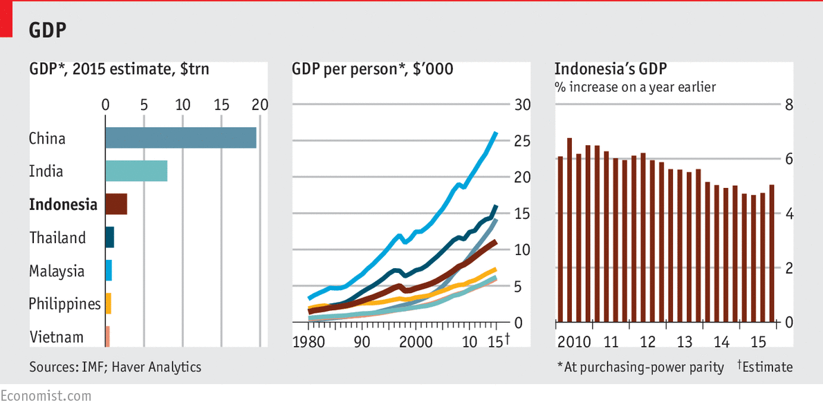
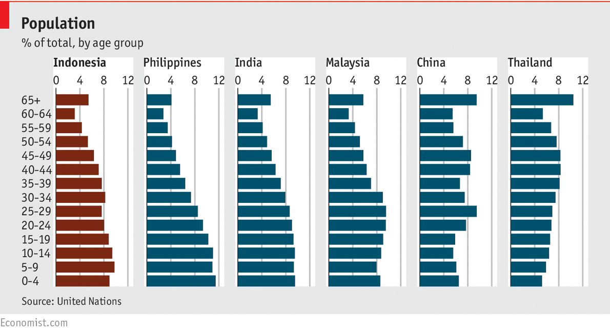
Let's take a look at Indonesia.
Spoiler :
Spoiler :
Spoiler :
Spoiler :
I am a terrific fan of the Big Mac index. It's a little hard to completely standardize, but as an estimate it's sooooo good as an indicator of the society's relative wealth.
I remember hearing a talk by its inventor at the London School of Economics (via podcast). It was so much better than the small articles that bring it up.
edit: very strong possibility that it was this talk, which I can just listen to on my phone using earbuds while I toodle around the house. I'll def relisten today.
SS-18 ICBM
Oscillator
Spoiler :

gay_Aleks
from the river to the sea, Palestine will be free!
What about the next tsunami wave? They can't make many windmills that would be also resistant to the waves - they'd be at a too high loss
Thorgalaeg
Deity
I doubt a tsunami would affect the offshore windmills. it becomes destructive when reach the coast, in the middle of the sea with some deep it is only a 2-3 meters wave.
What about the next tsunami wave? They can't make many windmills that would be also resistant to the waves - they'd be at a too high loss
Not an every day occurrence, nor does it hit all places at once. With wind, you have to geographically disperse to a large extent. 100 here, 100 there, 100 someplace else.

JohannaK
Heroically Clueless
holy crap North Dakota. Sweet sweet oil?
- Status
- Not open for further replies.
Similar threads
- Poll
- Replies
- 120
- Views
- 8K