[RD] Daily Graphs and Charts

Status
Not open for further replies.
Huh. I see the Black Death, but I don't know what caused the mid-15th C slump, unless the Wars of the Roses were that devastating.

The population seems static throughout the 17th Century and I believe that the Civil War killed more Englishmen proportionally speaking than any other war since then.

The plague continued in the 15th C. The little ice age.
There was also the Great Plague in 1665.
 
30 years war. More devastating to central Europe but it looks responsible for all those little dips in the early-mid 1600s.

30 years war is one I don't know much about, and probably most people don't, but proportionately it was like the 3rd deadliest modern war.

bubble-and-lines-final-03-768x579.png
 
I don't know if I'd call it modern, but proportionately it looks like it is the second deadliest.
 
Well, if Shakespeare is Early Modern, the Thirty Years War really ought to be.
 
I don't know if I'd call it modern, but proportionately it looks like it is the second deadliest.

I wouldn't either but couldn't think of a better word. Because I think some of the barbarian invasions pre 1400 would top this like the mongol invasions and huns invading rome, maybe even some of the persian/greek ones.

Why is the second world war separate from "genocide of the jews" o_O?

I have no idea. It's just how the guy presenting the data chose to do it I guess. Did Stalin carry out genocide vs jews specifically?

I found this chart one day by googling "historical chances of dying in wars" cus I wanted to see if the world is safer today generally speaking.
 
Why is the second world war separate from "genocide of the jews" o_O?

The Armenians are separated from the first world war.
WW2 starts in 39 but Japan was fighting in China from about 33.
 
best-worst-2018-map-article.png


Best and Worst Drivers by State 2018


If you’re constantly frustrated with the drivers you share the streets with, you’re not alone. And there may be some truth to your road rage. Car crashes are a leading cause of death in the US and were expected to cause around 40,000 deaths by the end of 2018.

To put it plainly, America's roads are dangerous. Texting behind the wheel is a major reason for many traffic fatalities, and it’s only getting worse. In 2016, 3,450 people were killed by distracted driving. Plus, cheap gas and a strong economy means America’s 222 million licensed drivers are driving more than ever. More people on the road leads to more accidents and citations.

Regardless of the risks on the road, you have to get to around somehow! Every state has their share of bad drivers, but some are worse than others. See how your state stacks up against the rest.
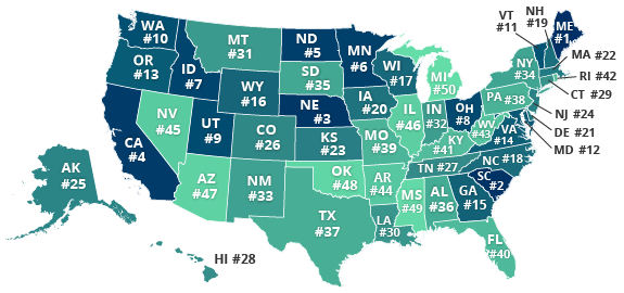
Rankings
We ranked all states from worst to best based on the methodology outlined at the end of the article. The top states on the list have the worst drivers, whereas the last states on the list have the best.

  1. Maine
  2. South Carolina
  3. Nebraska
  4. California
  5. North Dakota
  6. Minnesota
  7. Idaho
  8. Ohio
  9. Utah
  10. Washington
  11. Vermont
  12. Maryland
  13. Oregon
  14. Virginia
  15. Georgia
  16. Wyoming
  17. Wisconsin
  18. North Carolina
  19. New Hampshire
  20. Iowa
  21. Delaware
  22. Massachusetts
  23. Kansas
  24. New Jersey
  25. Alaska
  26. Colorado
  27. Tennessee
  28. Hawaii
  29. Connecticut
  30. Louisiana
  31. Montana
  32. Indiana
  33. New Mexico
  34. New York
  35. South Dakota
  36. Alabama
  37. Texas
  38. Pennsylvania
  39. Missouri
  40. Florida
  41. Kentucky
  42. Rhode Island
  43. West Virginia
  44. Arkansas
  45. Nevada
  46. Illinois
  47. Arizona
  48. Oklahoma
  49. Mississippi
  50. Michigan
The Worst
  • Maine: The Pine Tree State has a reputation for lobster rolls and lighthouses. But you’ll find more than ocean views on Maine’s rocky coastline roads – the state is also home to the country’s worst drivers. A drastic rise in traffic citations and fatalities are to blame for Maine’s jump from seventh worst last year to the absolute bottom of the bunch this year. But don’t just take our word for it. According to Maine.gov, there was an increase of more than 1,500 car crashes from 2016 to 2017.
  • South Carolina: South Carolinians love the simple things in life, like cracking a cold one at the beach. The problem? It seems they're too quick to get behind the wheel after having a few too many. Nearly half of all fatal crashes in SC result from drunk driving. Drivers can blame an increase in DUIs for the jump from last year’s rank as the fourth worst drivers to the second worst drivers this year.
  • Nebraska: This Midwestern state climbed from sixth worst in 2017 to third worst this year. That jump is thanks to a rise in speeding and traffic citations. Nebraskans may be used to driving infamy, as our study of the best and worst drivers by city found that Omaha has the worst drivers in the country. But it appears that the rest of the state isn’t much better on the road. Statewide traffic fatalities rose an average of five percent from 2016 to 2017.
The Best
  • Michigan: Congrats, Michigan, you’re number one! If you want a stress-free road trip, pack your bags and head to the Great Lakes State. Drivers earn the gold medal thanks to less citations, speeding, and fatalities than last year. There’s one catch – our study only accounts for insured drivers, and this state has plenty of rule breakers. Although Michigan’s insured drivers are the best in the country, one in five don't have car insurance. Oops!
  • Mississippi: Known for its long name and even longer river, now it has another claim to fame –America’s second-best drivers! That title was earned thanks to low speeding, DUI, citation, and fatal crash rates. The state jumped from third best last year to second best this year. But Mississippi still has a problem with buckling up, as half of the state's fatal car crashes involve unbuckled seatbelts. Even though Mississippi has proven to be full of competent drivers, stay buckled!
  • Oklahoma: From rolling hills to vast prairies, Oklahoma has it all. It also has some of the safest drivers in the country. The Sooner State made a big leap, going from 11th best in 2017 to third best in 2018. That’s because of a decrease in speeding, citations, and fatalities. We’re not that surprised, though, Tulsa rang in at seventh best in our study of the best and worst drivers by city.
Who’s Better on the Road- Republicans or Democrats?
The US has been politically polarized for a long time. But after the 2016 presidential elections and the 2018 midterms, there’s a rising divide between Democrats and Republicans. We took it upon ourselves to settle the score by determining which political party is better behind the wheel.

So, which is it- red or blue? The final score is a bit of a tossup. Considering two-thirds of the best driving states are historically red, and the worst driving state is blue, it looks like red takes the lead. But, the second and third worst driving states are conservative strongholds. So, we’re calling it a tie. Maybe we should take it to the electoral college?

How Bad Driving Affects Your Car Insurance Rates
Whether you live among the best or the worst drivers in the country, you still need a strong auto insurance policy. Especially if you live in Maine, South Carolina, Nebraska, California, North Dakota, or one of America’s worst driving states.

Your rates depend in part on how well the people around you can drive. Why? Because the more bad drivers there are on the road, the higher the chance of a collision. Even if you’re a fantastic driver, living in a state full of speed demons or reckless traffic weavers can cause your rates to skyrocket. Car insurance companies look at your zip code to determine your prices. And if your zip code has a propensity for poor driving, you’ll pay more for coverage.

How can you keep your prices low if you’re surrounded by terrible drivers? You can do everything from bundling your insurance plans to shopping around different insurance companies and comparing auto insurance quotes.

What if you’re part of the problem? Chances are, you have a couple points on your license from past tickets or accidents. And car insurance for bad drivers always cost more. A bad driver’s best option is to look for affordable high-risk car insurance. That way, you’ll be able to stay on the road while those points to come off your record.

Study Methodology
We sampled incident data (with more than two million data points) from the users of our website and juxtaposed it to Federal Highway Administration fatality data. To quantify overall driver standards for comparison, we weighted various incident totals for each state with its occurrence percentage. The rankings are a sum of weighted means calculated from these incidents:


https://quotewizard.com/news/posts/best-and-worst-drivers-by-state-2019
 
Recessions are good for the health?
d41586-019-00302-x_16420076.jpg
 
So, not working is healthier. I dont need a bloody graph to know that.
 
"We sampled incident data (with more than two million data points) from the users of our website and juxtaposed it to Federal Highway Administration fatality data. To quantify overall driver standards for comparison, we weighted various incident totals for each state with its occurrence percentage. The rankings are a sum of weighted means calculated from these incidents:"

As a "statement of methodology," that was basically crap.
 
KFOYV7x.jpg


St. Louis Fed‏Verified account @stlouisfed


FRED has a new record holder: The longest data series now belongs to a new addition, Population in England, which dates back to 1086. Check it out here: http://ow.ly/Dzkb50kfrvA

This is from 1280 AD the GDP and the GDP per Capita of England, and in1650 is getting really out of the Malthusian trap from increased manufacturing, etc:


Schermopname (2363).png


The pre-growth economy was a zero-sum-game: Living standards were determined by the size of the population
In the previous chart we saw that it was only after 1650 that living standards in the UK did start to increase for a sustained period. Before the modern era of economic growth the economy worked very differently. Not technological progress, but the size of the population determined the standards of living.

If you go back to the chart of GDP per capita in the England you see that early in the 14th century there was a substantial spike in the level of incomes. Incomes increased by around a third in a period of just a few years. This is the effect that the plague – the Black Death – had on the incomes of the English. The plague killed almost half(!) of the English population. The population declined from 8 million to 4.3 million in the three years after 1348. We even see it in the chart for the world population.

But those that survived the epidemic were materially much better off afterwards. The economy was a brutal zero-sum game and the death of your neighbour was to the benefit for those that did survive.

This happened primarily because farmers now achieved an higher output. While farmers before the plague had to use agricultural land that was less suited for farming, after the population decline they could farm on the most productive areas of the island.

In the very long time in which humanity was trapped in the Malthusian economy it was births and deaths that determined incomes. More births, lower incomes. More deaths, higher incomes.

We see this coupling of income and population in the chart below that plots the size of the population (on the x-axis) against the total output of the English economy (top panel) and against the income per person (bottom panel). Looking at the bottom panel we see the spike of incomes that was associated with the killing of half of the population in the Black Death. After this the population and the income per person stagnate until around 1500. In the following period we see the economy growing – total GDP increases by more than 280% from 1500 to 1650 – but this increase in output is not associated with an increase in income per person, but only an increase of the total population of the UK.

It is only after 1650 that the English economy breaks out of the Malthusian Trap and that incomes are not determined by the size of the population anymore. For the period after 1650 we see that both the population andthe income per person are growing. The economy is not a zero-sum game anymore; economic growth made it a positive-sum game.

When Malthus raised the concerns about population growth in 17981 he was wrong about his time and the future, but he was indeed right in his diagnosis of the dynamics of his past. The world before Malthus was Malthusian and population increases were associated with declining nutrition, declining health, and declining incomes. The world after Malthus became increasingly less Malthusian. What Malthus did not foresee was that the increasing output of the economy will decouple from the change of the population so that the output available for all will increase over a long period. This decoupling of income and population is shown in the chart.

https://ourworldindata.org/economic-growth
 
Wow, coldest temperature ever measured on Spain is -32°C, but it was at a village on top of a mountain 1000 meters high. At sea level temps rarely go under 0. Considering Spain is at the same latitude as the northern half of USA that is pretty amazing.
 
Wow, coldest temperature ever measured on Spain is -32°C, but it was at a village on top of a mountain 1000 meters high. At sea level temps rarely go under 0. Considering Spain is at the same latitude as the northern half of USA that is pretty amazing.


Thank the Atlantic. Prevailing weather patterns over North America flow over Siberia, and then over Alaska, and then down the eastern frontier of the Rocky Mountains to central Canada and the US. That's got a lot of time and distance over frozen ground. Fun fact, when French and British explorers and settlers first came to the Americas, they settled places further south than the places they had left, and found the winters far too cold for them to live with. You can see that on an atlas, where Paris, France is about as far north as where the Viking explorers landed at the northern tip of Newfoundland. And Madrid similarly far north as New York City. The air that flows over Europe gets warmed up by the Atlantic before it gets to you.
 
Status
Not open for further replies.
Back
Top Bottom