3141592
Warlord
- Joined
- Jan 24, 2007
- Messages
- 287
Some comments about the new HUD:
1. As mentioned before it looks too flashy, I wouldn't mind a more interesting HUD, but only if it stays out of the way. Right now there is way to much going on, the moment I looked at it my first thought were "wow cool" and then "SENSORY OVERLOAD!" Minuscule details are great in units and other graphics, but a HUD should be simple and easy.
2. The icons don't match the HUD. What I mean by that is that while the new HUD is all burnt and falling apart the icons are bright and pure. It destroys the illusion that the icons are printed on the HUD and makes them look merely superimposed. Having witting on some of the papers doesn't help the effect much either. If the buttons and completion bars were integrated with new HUD that would help a lot. (for example, taking away the circles around the adviser buttons and making them look like they were drawn on paper.
3. Having a new HUD would add to this already thematic mod, but I would only add it if it still presents the information in a tight and concise fashion. I think that keeping the papers much simpler would be a big help, and only burning and ripping them a bit at the edges. Also, turning the books into simple pieces of paper would get rid on the annoying center part. I'm sorry to be so harsh, but right now I would heavily prefer the simplicity of the current one. This new HUD has potential, but only if it simplifies itself and backs off the clutter.
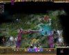
HERE is a great example of a completely unique HUD that works. Everything is subdued and everything fits with everything else.
1. As mentioned before it looks too flashy, I wouldn't mind a more interesting HUD, but only if it stays out of the way. Right now there is way to much going on, the moment I looked at it my first thought were "wow cool" and then "SENSORY OVERLOAD!" Minuscule details are great in units and other graphics, but a HUD should be simple and easy.
2. The icons don't match the HUD. What I mean by that is that while the new HUD is all burnt and falling apart the icons are bright and pure. It destroys the illusion that the icons are printed on the HUD and makes them look merely superimposed. Having witting on some of the papers doesn't help the effect much either. If the buttons and completion bars were integrated with new HUD that would help a lot. (for example, taking away the circles around the adviser buttons and making them look like they were drawn on paper.
3. Having a new HUD would add to this already thematic mod, but I would only add it if it still presents the information in a tight and concise fashion. I think that keeping the papers much simpler would be a big help, and only burning and ripping them a bit at the edges. Also, turning the books into simple pieces of paper would get rid on the annoying center part. I'm sorry to be so harsh, but right now I would heavily prefer the simplicity of the current one. This new HUD has potential, but only if it simplifies itself and backs off the clutter.
HERE is a great example of a completely unique HUD that works. Everything is subdued and everything fits with everything else.
")

 . Everybody has another taste, another ideas, but you are the only one to effectively put it into images. But everybody is in a position to write a comment. No easy task for you. But you do indeed a very good job! I have for my own several ideas for units but cannot put it into images or nifs
  . Therefore I do admire your talent
  .
.
") I have finally learned enough about what I am doing with the Code to unbind seZereth's hands. He should now have complete artistic control over the layout of the HUD.
I have finally learned enough about what I am doing with the Code to unbind seZereth's hands. He should now have complete artistic control over the layout of the HUD.