Flags!

Tell that to Rwanda.
Don't have to, because there isn't any text on their flag. A coat of arms isn't a flag and has wholly different properties for design. In fact, if anything, the stylized sun just goes to prove the point.
 
Meh. It looks bad. Hence, SPQR flags went out a long time ago for a reason. No accounting for taste.
 
Style tends to be.
 
Saudi Arabia has text on its flag!
 
Yes, but it's a script that most of us here can't read- thus it looks little different than any other symbol.
 
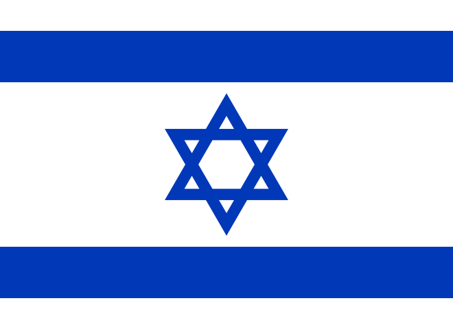
Just like on the Israeli flag most people don't see the |)(| (D and backwards D) in the centre, because its a different language(and ancient one at that)
 
Just like on the Israeli flag most people don't see the |)(| (D and backwards D) in the centre, because its a different language(and ancient one at that)

Please tell me where it is, I fail to see it.

660px-Flag_of_Israel.svg.png
 
J_eps is referring to the somewhat obscure theory that the Magen David is so named because one can see a triangle cut out on either side, the triangle resembling a very ancient form of the Hebrew letter dalet, and David's name being spelled Dalet-Vav-Dalet.
 
The earliest archaeological evidence of the use of the star, for Jews, dates only to the 3-4th century CE, and it shares a shape smiler to that of the believed Seal of Solomon. It was believed to have give protective powers, since it represented the number 7 with its 6 points and center (3 on each triangle giving 3+1+3 a mathematical system also seen on the menorah). The earliest use of the term Shield of David comes from the 11th century and it could easily be called the Shield of David with people relating it to David instead of Solomon (which arabs/muslims related it to) and its mystical 'protective' powers (thus th shield).

If anything the double D is a more modern invention now that we can see what ancient alphabets looked like, even the dead sea scrolls had Hebrew much more resembling the modern letters than the 'very ancient' form of Hebrew (Paleo-Hebrew) which was almost exactly like the Phoenician alphabet rather than the one we now call Hebrew. Its like how a backronym works.
 
Here is a much improved Qing Dynasty flag with a better color scheme and contrast, and animal.

China_Qing_Dynasty_Flag_1862.png


I'm trying to make that my avatar...not working out...damn bulriness....
 
Except the white around the tiger is obviously wrong. Actually, it would be better if the tiger were bigger and facing the opposite direction. Tigers in Chinese tradition tend to be a more reddish orange, too.

Still, neat idea. Would work well for a 20th century warlord-emperor duumvirate.
 
It looks nice, but I don't think you should have a white circle on black. Sure it looks nice, but it's hardly auspicious ;)
 
The statuette looks too cut in. Maybe make it all one colour? Less artistic, but more flag-like.
 
The basic design of the Communist India flag looks great, it could just use some touch ups to make it cleaner. You may also want to consider a different organisation of the emblems, although what you have is pretty good as it is.
 
Back
Top Bottom