Flags!

I don't know if it's the coloring, there's just something that doesn't seem royal about it. If I'm the only one that sees it, then by all means ignore me and press on. It just seems like it's more of a children's company logo than a nation to me.

That probably makes no sense, especially since I like the concept a lot.
 
Here's an improved one. I played around with the special effects a bit, and made it flag-shaped instead of square.

crown2.png


Edit: Hmm, the funky upload system appears to have overwritten the old one...
 
I like it, although a calligraphy font would probably work better, or put the KP somewhere other than on the crown.
 
I would agree that despite the changes it still looks too children's entertainment company logo-y. Flags typically have stylized and simplified objects when they have them at all, not 3D or detailed objects (a few exceptions exist, sure).
 
As Symph said. You should use a stylised crown, and possibly more specifically Provencal colors rather than the black. Also, you should replace the Kingdom of Provence initials with Royaume de Provence or Reialme de Provenca (depending on if thsi Provence is Francophone or Occitanophone).
 
Isry: It's Providence, not Provance! :lol: The people are the Providarians (yes, I know) and they speak English, since it's the future. (Well, mostly.)
 
I felt like putting a star below the crown, but refrained.

flagn.png
 
I'm not so much of a hotshot with with whole graphics thing, so here's how Syracia's flag from LINES II turned out:

SyracianFlag.png


The dun-brown represents the land, the blue the sea; Syracia is a coastal nation. The fire is just that, fire: The first "invention" that made all the others down the road possible. Ingenuity and inventiveness are prized traits amongst the people.

I'm hoping for some suggestions, constructive critiques, etc. How should I clean it up? Is the layout good? Would a more "stylized" flame be preferred? Should I be using a program other than MS Paint for this? Etc. Seeing all the amazing flags in this thread, I figure I can get at least two or three good ideas out of you lot. ;)
 
The layout is nice. The flame could do with some red in the middle, IMO. Nice work on the tongue of fire shapes.
 
Flag is very good, nice and simple. A more stylised flame would probably help.

As for programs and such, I just use Paint (and on a couple occassions Gimp, but not for anything reall special). I would suggest you use the vexillology site Flags of the World. It has a relatively easy to handle database with flag images listed aphabetically by components, represented body, and title. There is also a search engine, but it is not that effective. Basically, find a map with a flame (or whatever) you like, save the map to your computer, edit the source image to issolate the flame, save, paste to the flag you are making, edit to make more visually appealing, save. It sounds like a lengthy process, but it is not nearly as hard as it sounds, especially compared to creating the kind of detailed image you want from scratch without advanced computer graphics knowledge.

EDIT: @Erik - My mistake. In any case, the flag still looks a little...strange, non-heraldic. Perhaps, for one, if you cleaned up the background. The white specks (I'm guessing they're meant to be stars?) are kind of annoying. The simple plain background defaced with a single emblem isn't all that appealing. You need some way to tie the corwn in better to the rest of the flag, rather than simply sitting there suspended in the middle of nowhere. One option would be to shift the crown to the upper hoist and then place the initials KP beneath it and then doing something to break up the back ground. A different crown, something more heraldic, may also be nice. Perhaps something like this (there are many more crowns on FOTW too chose from/draw inspiration from). These are all, of course, just suggestions, there are a lot of other options as well.
 
Erik, I would just move the text off the crown and make it something older, calligraphy or something more flowery. The stars don't look too bad to me.
 
The stars again don't look very flag-y, as they wouldn't really work on an actual flag, or other assorted insignia (patches and such). They'd have to be standardized (1x dot, 3x3 cross, and 5x5 diamond, say) and of somewhat less prolific distribution to look right. I also agree that the font just doesn't work either--the name should either be spelled out or not included at all. SPQR-type flags went out a long time ago for a reason.

I'd suggest just stealing the Crown Royal icon and putting it on a black field, or something. It's vaguely detailed but it's in a similar style to, say, the Eagle/Cactus/Snake on the Mexican flag.
 
I found a lovely mass of stylized flame and snatched it from another flag (thanks, Israel). I recolored it to a nice flame-yellow from its former beige (one pixel at a time :crazyeye: 
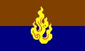
) and replaced the hand-drawn MS paint fire:

SyracianFlag3.png


While it was still beige, however, it really drew my eye to how the brown is more pastel than the other colours. After getting the fire right, I re-filled the upper bar with a bolder hue. I like it more than the original.
 
Furthermore, its a flag of a "Jucheist" civilisation in the 22nd century. I suspect that it would have very different aesthetical standards and conventions.

Although it indeed doesn't look like a flag. It just doesn't.
 
Back
Top Bottom