You are using an out of date browser. It may not display this or other websites correctly.
You should upgrade or use an alternative browser.
You should upgrade or use an alternative browser.
Guess the Map IX: The Richese are no match
- Thread starter say1988
- Start date
TheMulattoMaker
Dictator of RF
Contributors to Wikipedia's latest fund drive?
Goodfella
Showing results for
Hint: South Africa's score will probably go up in the next few days.
druidravi
King
Country specific topic edits?
Country specific topic views?
Country wise contributors to wiki?
Country specific topic views?
Country wise contributors to wiki?
Goodfella
Showing results for
Well since the last hint wasn't obvious enough, if Nelson Mandela were a country, his score would be going up a lot. Probably overtaking India and the US sometime tomorrow.
Edit: Nevermind, we have a winner! Yes, it's number of times each country's wiki has been viewed in the last 90 days.
Edit: Nevermind, we have a winner! Yes, it's number of times each country's wiki has been viewed in the last 90 days.
druidravi
King
Well I declare open floor..I having a busy week.Could someone else please take the gauntlet.
druidravi
King
Ok here goes..got some free time,shouldn't be too difficult.

strijder20
Wallowing in irony
Pop. growth per country. Russia gave it away.
Open floor.
Open floor.
Pop. growth per country. Russia gave it away.
Open floor.
I am not sure if it is that. For example Albania has a large pop growth, and here it has the same color as the Scandinavian countries. Other things don't match either.
strijder20
Wallowing in irony
I am not sure if it is that. For example Albania has a large pop growth, and here it has the same color as the Scandinavian countries. Other things don't match either.
Norway is growing faster than Albania. And that's because Albania is growing slowly, not the other way round.
You should try googling 'Population growth per country' and see what's the first result you get.
druidravi
King
Well yes it is population growth per country . http://commons.wikimedia.org/wiki/File:Population_growth_rate_world.PNG is the link.It is from CIA factbook 2006. Is this the fastest solve for these map questions?
Is this the fastest solve for these map questions?
Not even close, there have been some within a few minutes.
Norway is growing faster than Albania. And that's because Albania is growing slowly, not the other way round.
You should try googling 'Population growth per country' and see what's the first result you get.
Right.
wiki page with that map said:The first list is based on the estimates taken from the 2006 edition of the United Nations World Population Prospects report.[1] Figures are population growth rate estimates for the period 2005–2010 using the medium variant.
http://en.wikipedia.org/wiki/List_of_countries_by_population_growth_rate
Based on estimates from 2006. Must be impossible to miss seperating countries on account of 0.2% then
")
Goodfella
Showing results for
Is this the fastest solve for these map questions?
Not even close, there have been some within a few minutes.
Not to brag but I think I probably have the record.
http://forums.civfanatics.com/showthread.php?p=12267131#post12267131
1 minute. It was really easy though.
Lohrenswald
世界的 bottom ranked physicist
TheMulattoMaker
Dictator of RF
Population density?
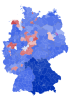
Different... well, I don't know if Germans call them "ethnicities" or whatever, but % of Saxons/Prussians/Bavarians etc.?
German puzzle pieces?
EDIT: Is white a color or no data?
Different... well, I don't know if Germans call them "ethnicities" or whatever, but % of Saxons/Prussians/Bavarians etc.?
German puzzle pieces?
EDIT: Is white a color or no data?
Lohrenswald
世界的 bottom ranked physicist
I actually didn't see the white before. It shouldn't be there.
... Just ignore it, please.
Anyway, all your guesses were wrong.
... Just ignore it, please.
Anyway, all your guesses were wrong.
ArneHD
Just a little bit mad
Level of political conservatism in Germany? Or how many people voted CDU.
Edit: Wait, no that can't be it, east Germany should be redder in that case.
Edit: Wait, no that can't be it, east Germany should be redder in that case.
TheMulattoMaker
Dictator of RF
Level of industrialization and/or urbanization?
Similar threads
- Replies
- 0
- Views
- 152
- Replies
- 3
- Views
- 490
- Replies
- 5
- Views
- 742