Omega124
Challenging Fate
For many countries, their flag is a inspiration and a sign of pride. All nations flags have a backstory, and even the exact colors used have a meaning behind the choice. So, obviously, nations generally want their flags to look good. But it seems, once we go to state level in the US, only a few flags seem like effort was put in. For example, Alaska's flag is extremely well designed, fit for a fully independent nation.

The states that used to be countries (Texas and California) also look like real flags. This, however, is for the ugly flags, such as Delaware. It has writing all over the place, such as its date when it ratified the Constitution and its motto, a putrid color choice, and the complicated people. If I am correct, California is the only independent nation ever to have any sort of writing on the flag. Pastel colors are a big no-no in flags; no one will take you seriously with pastel colors*. The people on the flag complicate the flag, where flags should be simple yet deep.
Besides these "Two people stand near some complicated crap" that only New York successfully pulls off, you also have these common flags of the bald eagle carrying either words on a banner or the great seal. Yes, a bald eagle is one of our biggest national symbols, and could work if done correctly, but no state tries to. Look at Illinois, for example. Bald Eagle carrying a banner almost as big as itself, along with a complex sunset (Or sunrise, whatever). This is also a disaster of a flag.

So, I'm going to cut off the rant here. Obviously, the question is clear. Do you think these flags are ugly? Are there any particular flags you don't like (And because they're ugly, not because you hate that state)? Any particular flags you think were well done (Again, due to how good they were, not because you like that state)?
*Except the UN, apparently
Spoiler Alaska :
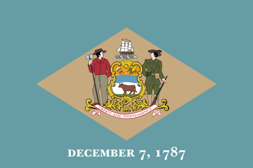
The states that used to be countries (Texas and California) also look like real flags. This, however, is for the ugly flags, such as Delaware. It has writing all over the place, such as its date when it ratified the Constitution and its motto, a putrid color choice, and the complicated people. If I am correct, California is the only independent nation ever to have any sort of writing on the flag. Pastel colors are a big no-no in flags; no one will take you seriously with pastel colors*. The people on the flag complicate the flag, where flags should be simple yet deep.
Spoiler Delaware :
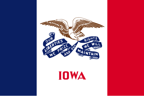
Besides these "Two people stand near some complicated crap" that only New York successfully pulls off, you also have these common flags of the bald eagle carrying either words on a banner or the great seal. Yes, a bald eagle is one of our biggest national symbols, and could work if done correctly, but no state tries to. Look at Illinois, for example. Bald Eagle carrying a banner almost as big as itself, along with a complex sunset (Or sunrise, whatever). This is also a disaster of a flag.
Spoiler Illinois :
So, I'm going to cut off the rant here. Obviously, the question is clear. Do you think these flags are ugly? Are there any particular flags you don't like (And because they're ugly, not because you hate that state)? Any particular flags you think were well done (Again, due to how good they were, not because you like that state)?
*Except the UN, apparently


")