• We are currently performing site maintenance, parts of civfanatics are currently offline, but will come back online in the coming days. For more updates please see here.

What's up with Fantasy/Sci-Fi book covers?

Thadlerian

Dreamin' of a RED X-mas!
Joined
Oct 27, 2002
Messages
740
Location
here be polar bears
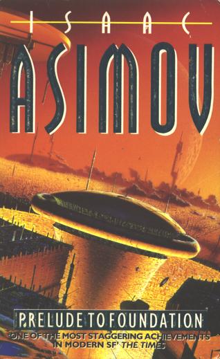
Hard not to notice when you read Fantasy or Scinece-Fiction that a lot of book covers simply don't match the content of the book itself. An example is Asimov's Prelude to Foundation:
Prelude_To_Foundation_f.jpeg

Spoiler :
Now what is this supposed to be? Reading the book, you soon find that hardly any technology or structures are visible from above Trantor's surface. And what other planet could this be? Trantor is the only one involved.


Orson Scott Card's Ender's Game is an even better example:
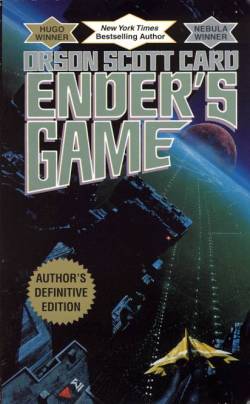
card-endersgame.jpg

Battle School?

And Robert Jordan's The Great Hunt.
tghf.jpg

Spoiler :
Something is slightly wrong with the humans, can't put my finger on it, but overall a nice picture. However rather irrelevant to the actual storyline. IIRC, the claiming of the Horn of Valerie was under completely different circumstances. And where's Hurin?


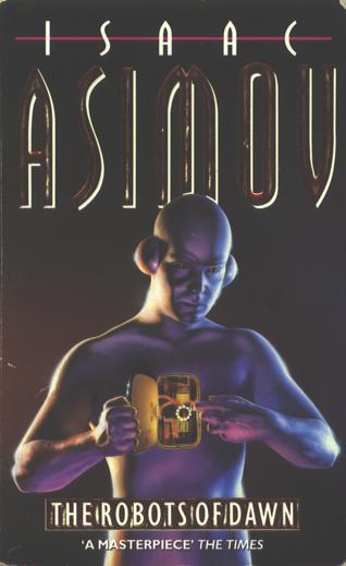
Asimov's Robots of Dawn is much of the same, though we may accept it as symbolic.
The_Robots_Of_Dawn_f.jpeg


At this point you're probably asking me: "Do you have too much time off? Haven't you got better things to complain about?" :nospam:

But after all, isn't there a possibility this is hurting the genres? The covers promise a lot, and they certainly give a lot too, but not the same stuff as they promised. You pick it up, read it, and you're perhaps disappointed, perhaps not. But what if you don't read it, just watch the cover? You look at the cover of Foundation:
found1as.jpg

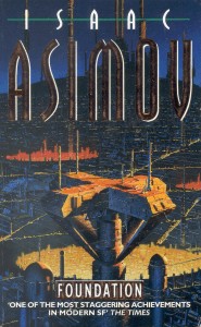
And then you conclude "This is just another Star Wars-like spaceship-shoot-spaceship fairy-tale." Ouch.

Is this a problem? Discuss. Or don't, whatever.
 
Well, in GERMANY we get most of our good SciFi and Fantasy books as translations... but the covers are sold independently.

We have often covers not fitting at all, too.

Examples?

The Curse of Chalion

0380818604.03.LZZZZZZZ.jpg


German Version: Chalions Fluch

3404204867.03.LZZZZZZZ.jpg


The Cover was taken from GRR Martin's "A Clash of Kings"

kings10.jpg


But this book was divided in two books, and got this cover e.g.

3442249341.03.LZZZZZZZ.jpg


probably Thoros of Myr, but well, it would have fitted better later books where he actually uses a flaming sword... he did not do that in this volume.

Well... :)
 
Covers for fantasy and SF is often truly awful. Not in their art directly as there is some nice out there but with their relevance. The main reason for this is that the author has no say whatsoever on what art there will be on the cover.

A current example, and I would have posted a pic if I knew how, is Steven Erikson's "Gardens of the moon" American TOR edition. In the original UK edition there is a reasonable relevant and nice cover featuring a big battle from a bird perspective while in the US edition there is a pic of a chick and dude in armour looking like knights. There isnt a single knight in the entire series. That cover gives a completely faulty impression of the content of the book, and a negative one at that in my opinion.
 
I've noticed this trend not for just Sci-Fi books, but pretty much for every book. Book covers are just that, covers.
 
Speaking of which, anyone seen the new Discworld covers?
Before
After
Someone obviously had a hangover at the time. I will never in my life buy any of these editions in protest for this evil. :mad: :( :mad:
 
That one was just plain horrible. One would think that such a succesful writer as Pratchett would have some say in the cover art even for new editions.
 
Worse yet, the books with a female fighter character. She is almost always shown on the cover as an overly-endowed woman in a chain mail bikini and she is fighting some hideous beast or a foe in full plate armor. How asinine! If a woman really built that way (and she probably wouldn't be--look at female athletes) wanted to engage in sword-play, she would bind her chest tightly to improve her range of arm movement. She would also wear as much armor as she could carry and still be competitive. Her hair would either be cut off, lashed back, or shoved under a helmet. She certainly would NOT leave 90% of her flesh fully exposed. To compound the issue, the woman in the story is normally fighting to overcome prejudicial thinking against women in one way or another. I think these are the most obvious cases of a cover designed purely to sell the book without having any relevance.
 
~Corsair#01~ said:
Someone obviously had a hangover at the time. I will never in my life buy any of these editions in protest for this evil. :mad: :( :mad:

Perhaps this person had a hangover, but Kirby drew as if he spent most of his life stoned. Remember the cover of Moving Pictures?
moving-pictures-2.jpg

Urgh...

Not to mention how he spoils the whole plot of Men at Arms on the back cover :mad:

Paul Kidby, on the other hand, that's some skill...
night-watch-1.jpg

Not really relevant to the storyline either, but a damn good interpretation of the Rembrandt picture.
 
Kirby is awesome. He may be stoned but I atleast thought his drawing fitted the Discworld novels.
 
ManOfMiracles said:
Worse yet, the books with a female fighter character. She is almost always shown on the cover as an overly-endowed woman in a chain mail bikini and she is fighting some hideous beast or a foe in full plate armor. How asinine! If a woman really built that way (and she probably wouldn't be--look at female athletes) wanted to engage in sword-play, she would bind her chest tightly to improve her range of arm movement. She would also wear as much armor as she could carry and still be competitive. Her hair would either be cut off, lashed back, or shoved under a helmet. She certainly would NOT leave 90% of her flesh fully exposed.


for example

0743488458.01.LZZZZZZZ.jpg


or

0743471644.01.LZZZZZZZ.jpg
 
WTH did you get that cover for a Clash of Kings? :???: The version I have shows Stannis on the throne, Melisandra beside him, with a knight on bended knee before them. I always thought the Ice and Fire covers pretty much followed the books.
 
Melisandra? - In Germany, her name is Melisandre. And well, the "A Song of" Covers are used for Lois McMaster Bujolds Chalion series - btw, the sequel "Paladin of Souls" won a Hugo award, the fifth for Bujold.

You can look up all foreign language editions, including UK, at George R.R. Martins website, DBear.

Take a look:

http://www.georgerrmartin.com/
 
I agree entirely. The artists are good, but they tend to have NO IDEA what the book is supposed to look like! They'll miss important details and end up making covers that contradict the novel.

Example here:
aliens-genocide.jpg

We see the cover for Aliens: Genocide, with Two marines showing off their new acid-resistant armor. But why the F arren't they wearing helmets in the middle of a battle?

Artists and Authors realy need to communicate more.
 
Thadlerian said:
And Robert Jordan's The Great Hunt.
tghf.jpg

Spoiler :
Something is slightly wrong with the humans, can't put my finger on it, but overall a nice picture. However rather irrelevant to the actual storyline. IIRC, the claiming of the Horn of Valerie was under completely different circumstances. And where's Hurin?


Hurin was the big pacifist type of guy, right? In that cover he's the guy holding the book with the pointy ears. It actually sorta makes sense if you realllly look into it. The scenery and the characters look nothing like I pictured them though. But if you use your imagination it actually sorta fits.
 
That's not Hurin, that's Loial. :D The cover makes sense, although the artist made the Trollocs look like humans wearing costumes for some reason....
 
CivCube said:
That's not Hurin, that's Loial. :D The cover makes sense, although the artist made the Trollocs look like humans wearing costumes for some reason....

Haha, you're right. I forgot the names. Hurin is the wolf guy? No, that's Perrin. I forget who Hurin is.
 
Spoiler :
Hurin was a Shienaran, one of the King's "sniffers". I only know that because I just Googled it. Don't know if I want to get into WoT again. :(


This is an abomination. :mad:

%7B90DE0629-7C03-469B-ADB7-6BDB81C2EC70%7DImg200.jpg
 
CivCube said:
Spoiler :
Hurin was a Shienaran, one of the King's "sniffers". I only know that because I just Googled it. Don't know if I want to get into WoT again. :(

Ahhhh, that's right. I don't know if I want to read em again either. Especially trying to get past book 5-6 or so.
 
Back
Top Bottom