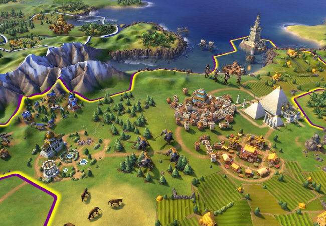
Art Style Poll - Are you turned off or excited?

What is your reaction to the new art style we have been shown?

  • I'm excited! I like the new artstyle.

    Votes: 58 16.8%
  • It's okay. Not overexcited but not disappointed.

    Votes: 85 24.6%
  • I'm not completely turned off but not exactly impressed.

    Votes: 105 30.4%
  • Ugly. Flat out crap. I hope they change it!

    Votes: 72 20.9%
  • I don't really care about the art style.

    Votes: 25 7.2%

  • Total voters
    345
  • Poll closed .
Status
Not open for further replies.
Hard, but not unthinkable. I remember hating the art direction for Civ 5 when I first saw it.

Coming from 4, I thought 5 looked needlessly muddy and cluttered with washed out colors that would make the map difficult to read when zooming out, but I eventually got used to it because I liked the changes they made to the gameplay.

And that's really the meat of it. If the gameplay delivers, this time next year you'll see people forgetting their reservations about the art and instead sharing stories about the game itself.

But it's as people have been saying, there's nothing else to really talk about right now.

Same here. I for one welcome a return to stylization. Are the colors too bright? Sure. But otherwise I think it's a much better fit for the franchise than Civ5's "realism." Some people are convinced that realism is the highest goal of any artform, when it's really not.
 
Its really high contrast, really high saturation, overly detailed, bad stylization.

I see a lot of "reallys" and "bads" but not a lot of reasons provided for why the art style would inhibit gameplay.

And I don't even know why "overly detailed" would be counted as a negative.

Most complaints have been that it's not detailed enough.
 
I see a lot of "reallys" and "bads" but not a lot of why those would inhibit gameplay.

And I don't even know why "overly detailed" would be counted as a negative.

Most complaints have been that it's not detailed enough.

Well, the primary part of this complaint is about aesthetics, not necessarily gameplay.

But being more detailed also makes it more noisy. Which goes against the argument that this style is more "clear" -- its not.
 
I guess we have a difference of opinion then, because to me Civ 5's aesthetics look far, far more noisy.
 
Well, the primary part of this complaint is about aesthetics, not necessarily gameplay.

But being more detailed also makes it more noisy. Which goes against the argument that this style is more "clear" -- its not.

ie, the more you have a lot of high contrast detail the less there's visual focus to rest your eyes on. I find these very messy looking, for instance,


The game from screencaps is clearer the more you're zoomed in, and the less things you have on screen, but the more things, and the more you're zoomed out, the more of a mess of detail it is.
 
I like that I can tell what everything is without needing to show resource icons.

To me this is more of a callback to Civ 4, while Civ 5 felt much "noiser" and cluttered by comparison, with everything kind of blending together in a way that can make the map confusing.
 
I like that I can tell what everything is without needing to show resource icons.

Maybe, once you focus on something.. but the style doesn't create good visual focus. If you have a large view thats zoomed out a bit, and there's some unit near the forests in a corner of the map, its going to blend in with a lot of the noise, and it'll be easy to miss.

I'm hoping that the unit icons, etc. are still there, because they'll definitely still be useful in this style.
 
I'm sure they will be, but I prefer to have them off either way. Maybe it'll be harder to make out when zoomed away like you said, but at this point I think it's too early to say for sure.
 
I voted for
"I'm not completely turned off but not exactly impressed."

Day/night cycle and how it runs will make it or break it for me.
But the overall synergy of the aesthetics is growing on me a bit. I like how everything is easy on the eyes, compared to the the busy map on say.. Civ5
 
Art style doesn't bother me at all, I mean, I wouldn't want 8-bit graphics or anything like that, but seriously, Civ is allllllll about the gameplay......it's a plus if it looks nice, but gameplay is reall all that matters.

This art style is fine. It looks clean and crisp, at first glance it looks a bit cartoony, but it's still clean and crisp, and much more detail in buildings, units, and terrain (from the screenshots).

For example, going from sims 3 to sims 4 was kind of the same jump regarding art style. I remember being immediately turned off of Sims 4 because of the art style........but once I played it, the art looks fine, but the loading screens are just terrible. It's all about the gameplay. The more you look at graphics on the screen, the more you acclimate to them.......but sour gameplay is a deal-breaker.
 
Art style doesn't bother me at all, I mean, I wouldn't want 8-bit graphics or anything like that, but seriously, Civ is allllllll about the gameplay......it's a plus if it looks nice, but gameplay is reall all that matters.

Completely agree with this sentiment. What was Civ I? It was a collection of pixels, it looked terrible. But it's a better game than modern games with lovely beautiful art style and graphics and I'd take it over-- what, Call of Duty 15?-- any day of the week.

Civ VI can look literally identical to Clash of Clans but as long as it's a playable game it's got my money and time.
 
I want to vote for "There is no art style since I play Civ in Strategic View".
 
I went with "I'm not completely turned off but not exactly impressed."

I figured that the more you zoomed out the less noisy it becomes but brianshapiro made some good points...

In the end the game play comes first and if it is great, the graphics will be an after thought.
 
I like that I can tell what everything is without needing to show resource icons.
I think that is a bad prioritization. Normally, you'll want to zoom out a good way anyway to get an overview, and then things get really small. Even if you CAN make things out at a distance, it will be extremely tiring on the eyes, with all the bright colours and contrast everywhere.

Civ5 worked perfectly well in that respect, they terrain was a beautiful backdrop to the game, that didn't distract you or draw unwarranted attention, and the icons easily made you notice all the relevant things, even at a distance.
 
Another example of what I'm talking about

Look at the swordsmen in the hex SW of the city here,


First the obvious; they look like the swordsmen in CivRev.

But also I almost didn't notice them when looking over the various screenshots -- they blend into the clutter of the trees. When you're paying attention, they're obviously there and you see them, but I don't believe they stand out. We see the same kind of problem in Civ5, of course, where units are standing on forest hexes, because of the close range of the color scheme and the lack of contrast. But that's kind of my point: in terms of clarity, I don't think the art style is better than Civ5; and, in my view, at least, its worse. We're still going to need icon overlays.

Compare to here,


I think everything stands out a lot more in general.
 
I'm not into the bright, cartoony art style. For me, I have a hard time finding the units on those screenshots, but I see the districts easily. I also think the Wonders could be smaller.

Like a few others have said, if the gameplay hooks me like 2, 3, 4 and 5, then I'll get used to the graphics. I thought Civ 4's graphics were better than Civ 5's, with the exception of the Civ 5 vanilla Art Deco themed interface.

I'm a little disappointed that it's going to be a cartoony one, but whatever. Bombs will still explode, so by the industrial age and later, I'll be able to give those cartoony units the excessive and explosive destruction they deserve.
 
I like that I can tell what everything is without needing to show resource icons.

To me this is more of a callback to Civ 4, while Civ 5 felt much "noiser" and cluttered by comparison, with everything kind of blending together in a way that can make the map confusing.

Yes! Finally someone articulated my impressions. I completely understand the need for abstraction and information, but I would always try to play without icons until it became too much of a handicap.
 
Status
Not open for further replies.
Top Bottom