You are using an out of date browser. It may not display this or other websites correctly.
You should upgrade or use an alternative browser.
You should upgrade or use an alternative browser.
Can anyone find any other maps like these?
- Thread starter Mouthwash
- Start date

Silurian
Deity
- Joined
- Jan 5, 2010
- Messages
- 7,567

kramerfan86
Deity
- Joined
- Feb 10, 2008
- Messages
- 3,572
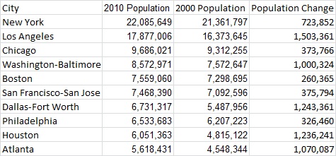
And basically looks like they handpicked what medium cities would add up to give them the percent they wanted and excluded others.
Crezth
i knew you were a real man of the left
A useful image to deploy against those who would post the "red vs. blue campaign maps" and say "SEE LOOK HOW MUCH RED THE DEMON-CRATS HAVE USURPED THE WHITE THRONE"
sophie
Break My Heart
Here's another image like that one:
Hygro
soundcloud.com/hygro/
Though that said those areas in orange are between 1/4 and 1/3 the population, and that's interesting.
Traitorfish
The Tighnahulish Kid
What's that blob to the North-East of Atlanta? Charlotte, NC?
Evie
Pronounced like Eevee
I think so.
Yeah.
Just because the data just correlates to population doesn't mean it has t be that way for all countries- that's why I asked for other maps.
Just because the data just correlates to population doesn't mean it has t be that way for all countries- that's why I asked for other maps.


Domen
Misico dux Vandalorum
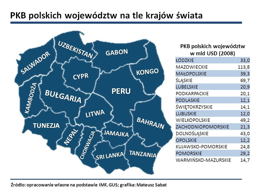
GDP per 1 square km in Poland:

Compared to several other countries (also GDP per 1 square km - so countries with higher pop. density are favoured)

From:
http://analizy.investio.pl/co-stoi-na-przeszkodzie-w-rozwoju-polski/
Total GDP of Polish Voivodeships as total GDP of countries of the world:
So for example Greater Polish Voivodeship has the same total GDP as entire country of Bulgaria:
Subcarpathian Voivodeship has the same total GDP as entire country of Tanzania:
Mazovian Voivodeship has the same total GDP as entire country of Peru:
Warmia-Masuria V. = Gabon
Podlachia V. = Congo
Łódzkie V. = Lithuania (Litwa)
Etc., etc., etc.
Compared to several other countries (also GDP per 1 square km - so countries with higher pop. density are favoured)
From:
http://analizy.investio.pl/co-stoi-na-przeszkodzie-w-rozwoju-polski/
Total GDP of Polish Voivodeships as total GDP of countries of the world:
So for example Greater Polish Voivodeship has the same total GDP as entire country of Bulgaria:
Subcarpathian Voivodeship has the same total GDP as entire country of Tanzania:
Mazovian Voivodeship has the same total GDP as entire country of Peru:
Warmia-Masuria V. = Gabon
Podlachia V. = Congo
Łódzkie V. = Lithuania (Litwa)
Etc., etc., etc.
Domen
Misico dux Vandalorum
Check this one:

Traitorfish
The Tighnahulish Kid
To be fair, it's still impressive.
Hygro
soundcloud.com/hygro/
I found it cool.
To be fair, it's still impressive.
No. Because I know how many people live in China, India, and Japan respectively, and I also know that Southeast Asia is also very heavily populated. So it's hardly breathtaking for me; I actually thought the circle should have been smaller.
Also, nice how people immediately leap to defend the originality and usefulness of that particular map.
Lillefix
I'm serious. You can.
- Joined
- Dec 1, 2003
- Messages
- 5,699
No. Because I know how many people live in China, India, and Japan respectively, and I also know that Southeast Asia is also very heavily populated. So it's hardly breathtaking for me.
Perhaps not, but even if they know it, people don't think about the fact that there live more people in India than in entire Europe, United States, Canada and Australia.
Perhaps not, but even if they know it, people don't think about the fact that there live more people in India than in entire Europe, United States, Canada and Australia.
The latter two are wastelands for the most part.
Similar threads
- Replies
- 104
- Views
- 3K
- Replies
- 97
- Views
- 3K