You are using an out of date browser. It may not display this or other websites correctly.
You should upgrade or use an alternative browser.
You should upgrade or use an alternative browser.
[RD] Daily Graphs and Charts II: Another 10,000 to come.
- Thread starter Cutlass
- Start date
^^^ I had one of those growing up and thought it was so wonderful to see all that information all in one place. the amount of information displayed in a easy to see format conveyed an enormous amount of data. For its day it was an expert use of graphics to display multiple levels data all at once.
Last edited:
Despite being an unusual form of a gridded cartogram, it gives insights into the human geography of the world’s population. The four traditional physical hemispheres, dividing the world into north, south, east, and west, become almost irrelevant and are replaced here by a new division. The population centre of the world is situated on top of a mountain next to the Tiger Lake (Badai Talai) near the city of Udaipur. That point, displayed in the map’s centre, stands symbolic for the effects of recent demographic changes in the world population. The global population centre is gradually shifting from the currently most populated region in Asia towards a most rapidly growing African continent, which pushes the signifi cance of Europe and the Americas literally towards the edges of the planet in this modern version of a mappa mundi.
The data is a decade or so old, but the graphic is cool.

The data is a decade or so old, but the graphic is cool.
Gotta insert the standard note about this being primary energy supply, which means the hydro and the solar and wind part of other renewables are doing 3x as much useful work as the combusted fuels and nuclear energy. Which is to say, it'll only take about a third as much of those fuels to replace the rest.
Here is our attempt. It was not as dramatic as it could have been, and the photo does not capture some of the colour changes but I think the kids learnt something.^^^^ I do not understand the colors.
Working class tax rates now higher than billionaires'

From the NYT but it is paywalled and I have not been to the actual site
From the NYT but it is paywalled and I have not been to the actual site
Link to ^^^ story

 www.nytimes.com
Opinion | It’s Time to Tax the Billionaires (Published 2024)
Billionaires are experts at avoiding taxes. By banding together, countries can make them pay up.
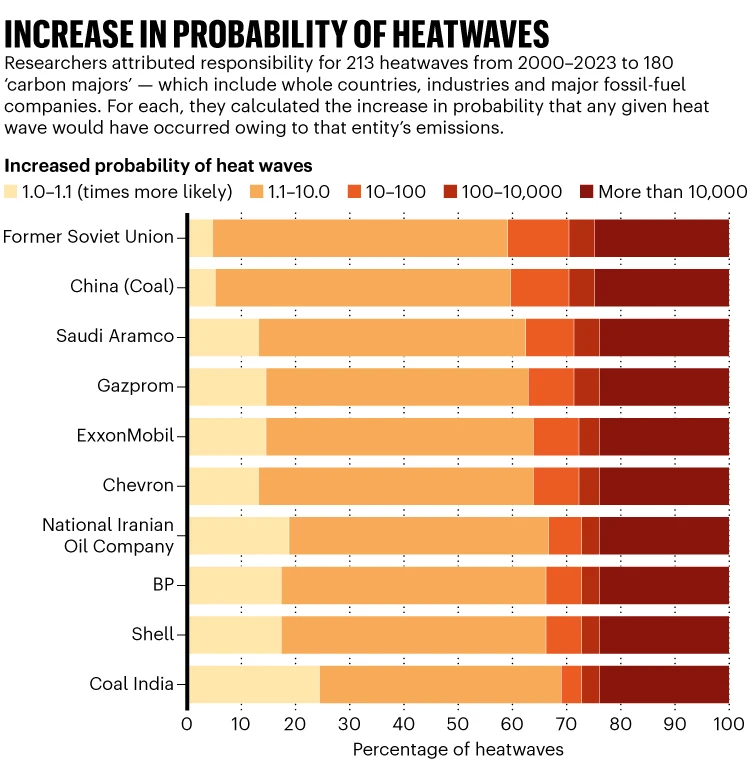
Individual companies linked to heatwaves
Spoiler Explanation :
Climate scientists have been attributing storms, droughts and heatwaves to global warming for two decades. Now, they are tracing the chain of responsibility all the way back to the producers of fossil fuels. A study published today in Nature shows that around one-quarter of the heatwaves recorded over 2000–23 can be directly linked to greenhouse-gas emissions from individual energy giants
The findings could provide fresh evidence to support lawsuits seeking to hold companies accountable for their impacts on the climate.
“I cannot as a scientist assign legal responsibilities for these events,” says lead author Yann Quilcaille, a climate researcher at the Federal Institute of Technology in Zurich, Switzerland. “What I can say is that each one of these carbon majors is contributing to heatwaves, making them more intense and also making them more likely.”
More than one-quarter of the 213 events recorded would have been “virtually impossible” without human-induced global warming, the study found. The emissions linked to energy companies and other major carbon emitters increased the likelihood of some 53 heatwaves by a factor of more than 10,000.
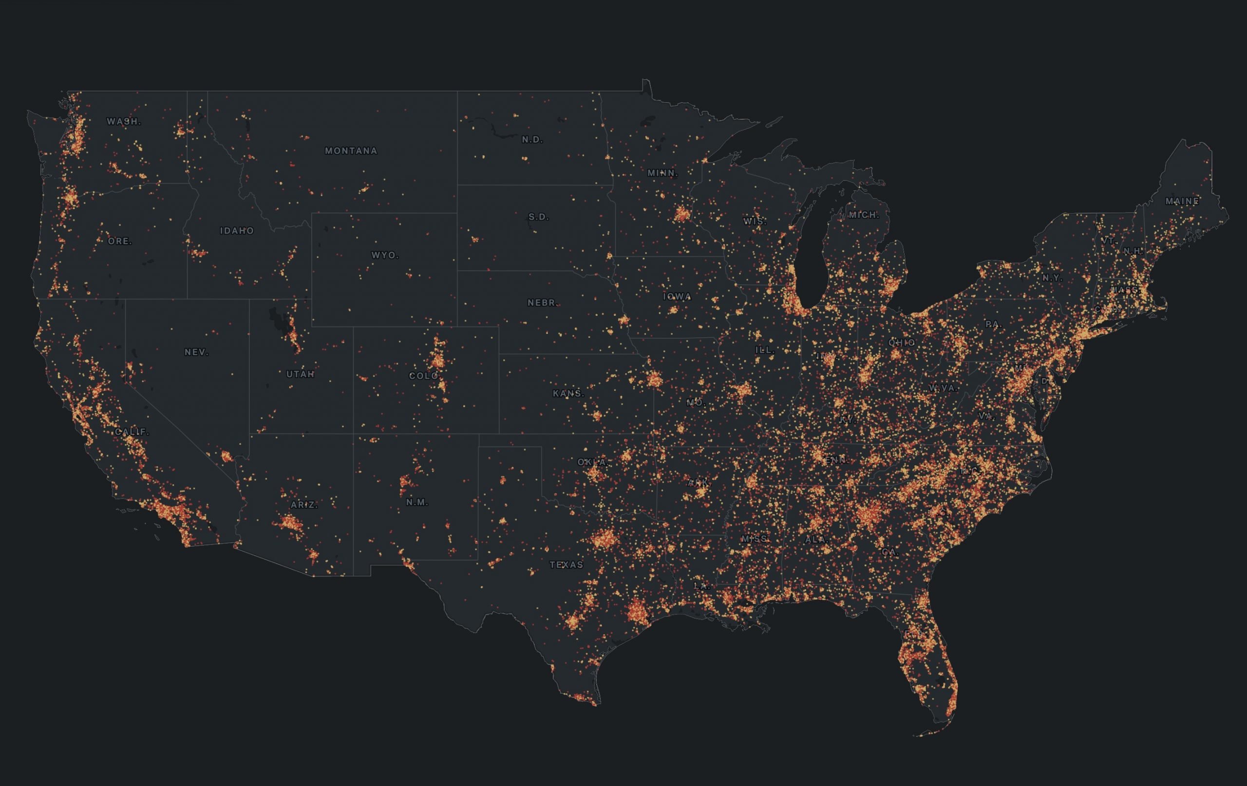
Gun violence in the US. Find your neighborhood!
 www.thetrace.org
An Atlas of American Gun Violence
Eleven years. 410,000 shootings. How has gun violence marked your corner of the U.S.?
www.thetrace.org
stfoskey12
Emperor of Foskania
Individual companies linked to heatwaves
Spoiler Explanation :Climate scientists have been attributing storms, droughts and heatwaves to global warming for two decades. Now, they are tracing the chain of responsibility all the way back to the producers of fossil fuels. A study published today in Nature shows that around one-quarter of the heatwaves recorded over 2000–23 can be directly linked to greenhouse-gas emissions from individual energy giants
The findings could provide fresh evidence to support lawsuits seeking to hold companies accountable for their impacts on the climate.
“I cannot as a scientist assign legal responsibilities for these events,” says lead author Yann Quilcaille, a climate researcher at the Federal Institute of Technology in Zurich, Switzerland. “What I can say is that each one of these carbon majors is contributing to heatwaves, making them more intense and also making them more likely.”
More than one-quarter of the 213 events recorded would have been “virtually impossible” without human-induced global warming, the study found. The emissions linked to energy companies and other major carbon emitters increased the likelihood of some 53 heatwaves by a factor of more than 10,000.
Based on my interpretation of the paper, the study seems to show that the greatest contribution to heatwaves from individual emitters is around 0.2°C. Yet they also find that that 0.2°C increase can somewhat readily lead to a 10,000x increase in the likelihood of certain heatwaves. That goes against my meteorological intuitions. Especially if many individual entities alone lead to a 10,000x increase in heatwave likelihood, that would suggest the combination of entities would lead to a 10,000^?? likelihood increase, which seems absurd. However, reading over the methodology section of the paper, it looks like they were attempting to get a distribution that captures extreme events well and not just going with a Gaussian, so it seems like they were trying to be reasonable in their statistical modeling of the data. All of their statistics is more complex than I can deal with in 30 minutes of an afternoon, but I still don't quite get how they can see such a large probability increase from such a small temperature change.
The web that tried to steal the presidency

Spoiler Some details :
Grassley this week released nearly 200 subpoenas from Special Counsel Jack Smith's investigation into the post-2020-election efforts, documents that sought information or testimony from a range of organizations and individuals. The scale of the document dump was the point; the argument was simply in the vein of "look at how deranged these guys were."
Looking at the documents, though, something stood out to me. It depicts thoroughness, not overreach. And buried in that thoroughness are patterns, implied connections between people and organizations that hint at the scale of the effort.
The word "implied" is important there. When Person A is asked for any information about Person B, it doesn't mean that Jack Smith knew the two were in cahoots. It just means that Smith and his team had reason to believe they might have been in contact.
That said, something interesting happens when you (as I did) walk through the 1,700-plus pages of documents and correlate all of the Persons A and Organizations B. You get a network of connections, one that also inherently highlights participants more important to the network.
Using the open-source visualization program Gephi, I created a visualization of those networks.
danjuno
Cole Phelps, Badge 1247
A bit more light-hearted fare. These have been around for ages.


Similar threads
- Replies
- 4
- Views
- 457
- Replies
- 128
- Views
- 14K