• Civilization 7 has been announced. For more info please check the forum here .

[RD] Daily Graphs and Charts

Status
Not open for further replies.
Help me find a graph. I believe I saw it here, but can't locate. It was a chart of the hype cycle of new technologies. Things like 3d printing, smart phones, I think designer babies is in there. Essentially, tech ideas hit peak interest and promise at some point, then plummet as the graph goes toward the right (x axis = time). Some plummet never to recover, while others stabilize and become ubiquitous.
 
weird coincidence: I just saw that graph in some business course learning material and thought about posting it here.

or just Texas Sharpshooter Fallacy; what do I know.
 
Britain sure loved fomenting inter-group rivalries. Anyway, here's a map of a putative Greater Somalia.
 
weird coincidence: I just saw that graph in some business course learning material and thought about posting it here.

or just Texas Sharpshooter Fallacy; what do I know.
Yeah, you just don't notice the million times you look at a graph and think about posting it here without it already being posted.
 
Lets get this party started back up.

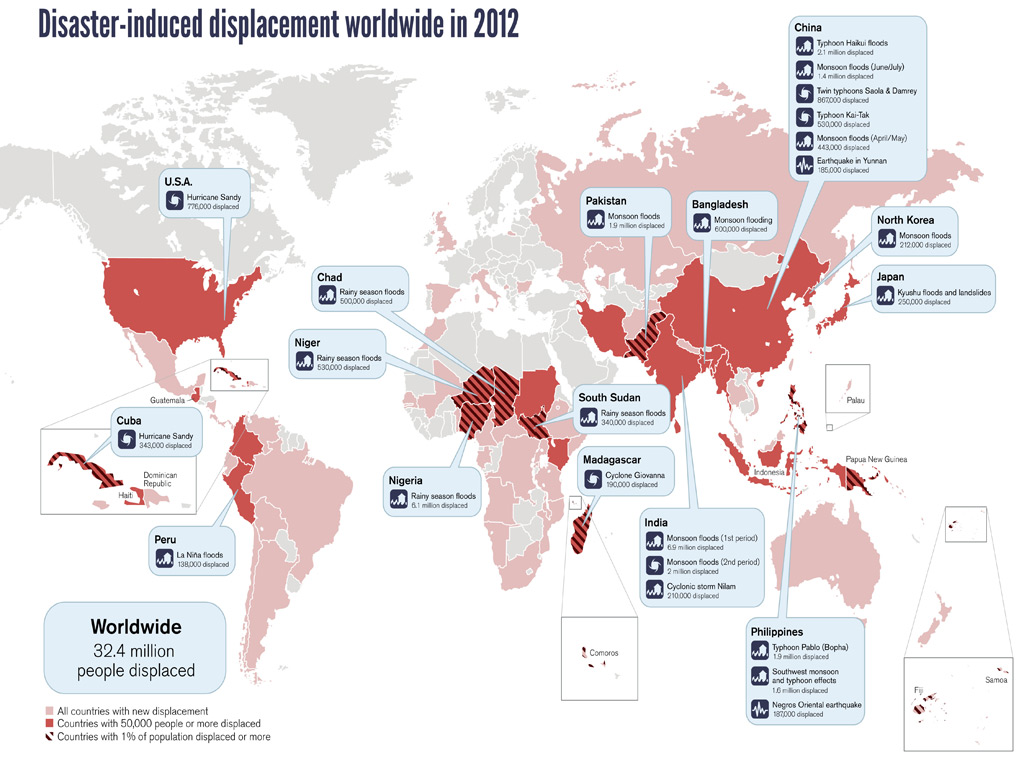
[url=http://www.ecofys.com/en/news/updated-information-on-the-worlds-greenhouse-gas-emissions]Ecofys[/url] said:
In 2000, WRI came with a flowchart that shows the worldwide emission of greenhouse gases. WRI is a renowned research centre for policy on resources and the environment. For the first time it was made clear how much CO2 was truly produced and by whom. The flowchart became one of the most frequently used graphs about greenhouse gases and their impact on the environment.

ASN Bank and Ecofys, in cooperation with DuurzaamBedrijfsleven.nl, have now updated the flowchart with data from 2010. The new graph shows, from start to finish, the sources of the greenhouse gases (e.g. oil, coal or deforestation) and the amount of each gas (CO2, CH4 and N2O) that ultimately finds its way into our atmosphere. In addition, the graph shows which industries contribute the most to the emission of greenhouse gases and which resource they use doing so.


For comparison's sake, the 2000 chart is here:
Spoiler :


Attachments

  • bbc-space-all-03.jpg
    bbc-space-all-03.jpg
    439.6 KB · Views: 43
CivNoobie's post needs spoiler tags.


not overvalued OR ANYTHING..... i also like the fact that we're slipping towards DEFLATION after QE infinity has been done and most of the talk is about UNWINDING QE.

from my studies into endogenous money theory, i get two things:
- a lot more QE needs to be done to stave off deflation
- the QE has to be permanent; never to be unwound (i.e. what is called for is debt nullification, not temporary lending)

this data is consistent with that view.

see also:

Spoiler :

wile e coyote crash coming up? a mirror image of the recent Japan crash maybe?

 
It does not show the rejection probability but the probability to be rejected only because of age. ;)

I guess this data is extremely culture dependent (especially for "want to date a male"). It would be interesting to know where the data has been gathered and to see a comparison of different countries. :)
 
a lot* of 14 year olds probably idealistically said age didn't matter to them; whether they actually follow through on that in reality is another matter.

* actually it's likely a very small sample too, so not "a lot"...
 
Yeah, I guess if 1 girl ticked all ages up to 50 and the other girl ticked ages 13-15 or whatever then at any age you'd have a 50% chance of getting the girl who ticked all ages up to 50 and a 50% chance of getting the other girl.
 
Status
Not open for further replies.
Top Bottom