onejayhawk
Afflicted with reason
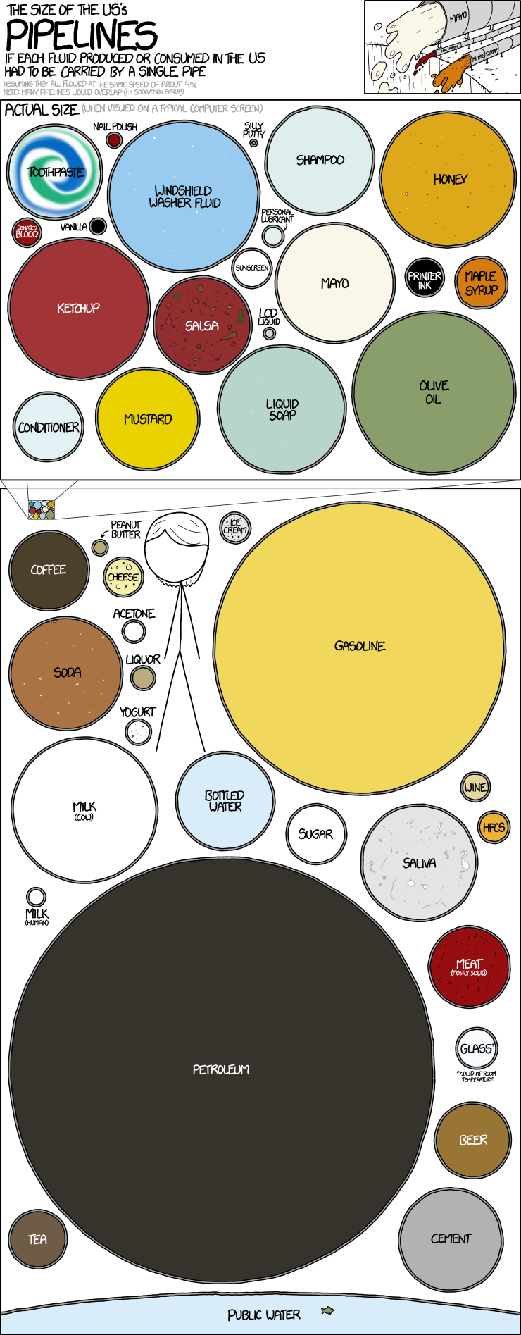
Here's a good article with too many charts to post in the post.
https://www.washingtonpost.com/graphics/national/maps-of-american-infrastrucure/
J
https://www.washingtonpost.com/graphics/national/maps-of-american-infrastrucure/
J