Guess the map 15: GDP or population?

Status
Not open for further replies.
Minnesota, Wisconsin and North Michigan really stand out to me, as I believe this was the period where lotsa Skandis came over.
and moving into areas that weren't terribly heavily populated in the first place, thus the high-on-the-scale coloring here.
 
I forget what we call that these days. "Settler society?" It's a map of ongoing settler society. "Indian Territory" on the map.
 
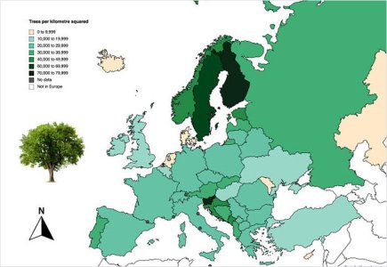
Here's another one to keep the game going, then. The quantity increases light -> dark.

Guess the map.jpg
 
Are all the micronation dots (but not Luxembourg) the darkest colour, or is that a feature of making them dots?
 
No, they're grey (no data). White means not included.
 
There are some notable markings on that map, what looks like an upward arrow near Antwerp ? Also in Greece, Italy Ukraine, Norway..

Something to do with shipping and harbours ? Fishing ?
 
It's a quantity of something, so it's absolute numbers, but not to do with shipping or fishing.
 
Does yellow represent a low or like no data?

Slovenia and Finland...hmm....alcohol consumption?
 
Forests/nature parks and such?
Finland is just trees.
Oh, I think you're really close. Something like share of forested area would explain perfectly Finnland, Sweden, Slovenia at the top, and Iceland, Denmark, NL at the bottom. But some minor deviations, Spain would have to be higher than Portugal, etc.
But it must be related to forests somehow
 
It is indeed tree coverage: trees per kilometre squared, in fact. The legend is tiny, but I was only doing a really quick search for an interesting map.

Qactus, do you want to go next?

Tree coverage.jpg
 
Ha, cfc instead of six people liking the post that could've been six guesses :lol:
You know you don't have to nail it with the first one, right?
Let me just kick things off by revealing it has nothing to do with spaceflight :)
 
I have no idea. :( Could you give us a clue?
 
Might it have something to do with food or agricultural produce? Like, say, rice?
 
Last edited by a moderator:
Ha, cfc instead of six people liking the post that could've been six guesses :lol:
You know you don't have to nail it with the first one, right?
Let me just kick things off by revealing it has nothing to do with spaceflight :)
I liked the post so that it could be inferred it was ok that I didn't get the new map ^^
Maybe it is a women to men ratio? (doesn't fit most of the map though)
 
Last edited:
Status
Not open for further replies.
Top Bottom