You are using an out of date browser. It may not display this or other websites correctly.
You should upgrade or use an alternative browser.
You should upgrade or use an alternative browser.
Irkalla's "Firaxis-Like" Civilization Icon Tutorial
- Thread starter Irkalla
- Start date
Irkalla
ENTP POWWWEEEEEER
Thank you for the tutorial. Here's my attempt at Empire of Brazil:
.svg/500px-Flag_of_Empire_of_Brazil_(1847-1889).svg.png)
(original flag)
We should only be using 3 colours if we aim for firaxis-level work. You also should use cutouts to give the perception of depth in your monochrome logo. I might post an example of this later. Remember, go hard or go home. You want your work to approach perfection.
Nutty
Deity
Just noticed these posts re: portrait icons.
Download sukritact's PSD template ("with alpha and starburst effect") here. I know Gimp doesn't support all aspects of PSD, so you may have to reinvent the wheel a bit.
I just played around with it for the first time last week after being inspired by post #6 in this thread. (My result is in post #9).
Starting with a vector program like Adobe Illustrator or Inkscape (free) would be better per the short how-to by sukitract that Putmalk linked. However, I couldn't find a good vector starburst, and I didn't want to make one from scratch. Anyway, vector's not my forte; doing it in Photoshop took me long enough!
The biggest problem I have with making Civ V icons is the colors. I'm assuming the icon artists are using images from google as a template, but getting them to look like this from this is impossible for me with GIMP, especially with more complex images like this being made into this.
GIMP does have alpha and starburst, but color manipulation is the problem (for me, at least). Is there anyone here who provide insight on that?
I'll look into inkscape, but that would be a new program for me.
I hadn't noticed that pattern, thanks.Looks good, but remember icons are only 2 colours, not 3
I'll work on it, but what do you mean by cutouts exactly? I imagine the drop shadow is used to give that perception?We should only be using 3 colours if we aim for firaxis-level work. You also should use cutouts to give the perception of depth in your monochrome logo. I might post an example of this later. Remember, go hard or go home. You want your work to approach perfection.
Nutty
Deity
The biggest problem I have with making Civ V icons is the colors.
Exactly. You basically need to make it into a cartoon. You can do what Firaxis likely did, and sukitract does, which is to trace it (probably with a tablet), and recolor it themselves. However, there are tutorials all over the web how to use filters to fake it, some written for Gimp. You'll use the same techniques, but make your changes more subtle (rather than make it look like a comic book).
Caveat, I'm not an expert in Photoshop, and even less so in Gimp, but...
In general, you use some combination of posterization to flatten out the picture by reducing the number of colors, and edge detection to make black edges between elements. And of course color balance, brightness, and contrast.
Apparently Gimp has a Posterize filter, as well as a Cartoon filter (used in the first of these 2 tutorials). The second of those tutorials and this one use inverted Sobel edge detection.
The alternate method you'll find some places is to blurring a duplicate layer and then set the original layer to darken or burn the duplicate.
EDIT: Someone claims he improved Gimp's Posterize filter, calling it Quantize filter.
EDIT #2: Wow, this is a cool set of filters for Gimp: G'MIC. See graphic boost, graphic novel, ink wash + recolorize, etc.
I can tell you that I rarely ever diverge from an image's original colors. There's not much I can help you with other than suggesting practice. I've come a long way myself, going from this to thisThe biggest problem I have with making Civ V icons is the colors. I'm assuming the icon artists are using images from google as a template, but getting them to look like this from this is impossible for me with GIMP, especially with more complex images like this being made into this.
GIMP does have alpha and starburst, but color manipulation is the problem (for me, at least). Is there anyone here who provide insight on that?
I might suggest trying some of the tutorials for anyone with photoshop:
http://www.photoshoplady.com/tutorial/develop-a-machinery-downloading-icon/3893
http://www.photoshoplady.com/tutorial/design-a-nice-icon-writing-on-a-book/4547
http://www.photoshoplady.com/tutorial/create-a-stylish-mail-icon-in-photoshop/1236
http://www.photoshoplady.com/tutorial/how-to-create-a-super-shiny-pencil-icon/653
http://www.photoshoplady.com/tutorial/design-a-detailed-compass-icon-in-photoshop/698
You can use a smart blur filter if you really want to, I suggest following it with inner and outer glows. Civ V icons do not feature black edges.In general, you use some combination of posterization to flatten out the picture by reducing the number of colors, and edge detection to make black edges between elements. And of course color balance, brightness, and contrast.
Nutty
Deity
You can use a smart blur filter if you really want to, I suggest following it with inner and outer glows. Civ V icons do not feature black edges.
Fair enough, though certainly the edges need to be very crisp. (Note that Gimp doesn't have Smart Blur, but you can find something like this.)
EDIT: Actually, it does have a "Selective Gaussian Blur".
Irkalla
ENTP POWWWEEEEEER
I hadn't noticed that pattern, thanks.
I'll work on it, but what do you mean by cutouts exactly? I imagine the drop shadow is used to give that perception?
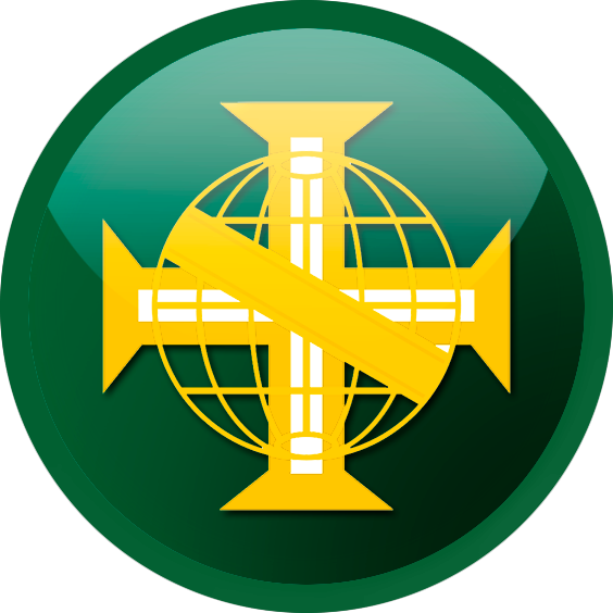
.png)
This is a perfect example. Here we can see that the oblique band lies on top of everything else. Under the band, we have the cross. And under the cross, we have the armillary.
We can tell this because one object cuts into the other. The oblique band cuts into the cross, which in turn cuts into the armillary.
Basically, what you do is select an object, then Selection -> Expand your selection by a few pixels. You should generally work from the bottom up.
Unrelated to this, we're seeing a pattern of civ colours. Firaxis has laid out a pallette. If there isn't an inverse of another civ's colours, then those inverse palettes should be used first. Brazil is inverse of arabia. Portugal is inverse america.
An addendum to the rules of icon design. You may use a slight bevel/emboss on the edge of the logo if the colours do not set apart from each other well. Firaxis has a precedent of doing this. See: Korea. I've used this with my latest icon for Project Civ's current Mystery Civ.


Jinzor
Chieftain
This was such a great tutorial, thanks for the help!
If anyone has played the game from where these logos come from, you can guess which civilizations/scenario/kind of era mod my team are working on right now.



If anyone has played the game from where these logos come from, you can guess which civilizations/scenario/kind of era mod my team are working on right now.


Irkalla
ENTP POWWWEEEEEER
This was such a great tutorial, thanks for the help!
If anyone has played the game from where these logos come from, you can guess which civilizations/scenario/kind of era mod my team are working on right now.


Second icon made me vaguely think of Tenno from Warframe.
bouncymischa
Synthetic Genie
This was such a great tutorial, thanks for the help!
If anyone has played the game from where these logos come from, you can guess which civilizations/scenario/kind of era mod my team are working on right now.


Hmm, judging from the logo names I'm guessing some near-future kind of game... they sound familiar, but I can't put my finger on it.
That said, those icons look gorgeous!
S3rgeus
Emperor
I'm having a bit of difficulty sizing these icons to show up properly in the game. I've been trying to get the 256x256 atlas working so I can just scale it down for the smaller atlases. But it seems like no matter what I resize the icon to from the 600x600 version, it's always off by a pixel or two inside the icon frame, when compared directly with the existing Civ icons. What size do you use to go from the 600x600 image from the tutorial to an icon you can put into an atlas? (192x192 is the closest I've gotten to perfect, but it's still shifted off center a bit compared to any default icons.)
TheHolyPilgrim
Chieftain
- Joined
- Mar 12, 2011
- Messages
- 2
@Jinzor:
Those are from Battlefield 2142, aren't they?
Those are from Battlefield 2142, aren't they?
Jinzor
Chieftain
@Jinzor:
Those are from Battlefield 2142, aren't they?
Yep, gonna be making some 2142 factions to fit a future era mod I'm working on. Before I make a thread about it, I just need to plan out each Civ and the tech tree. I also need to learn how to add my 3D models into the game (I've got them all prepared (Future upgrade versions of every modern unit type, including the mech) and, potentially, a few leaders as well... but I doubt the leader will ever work, so I'm just going to put them in poses in 3DS Max and Photoshop them onto a fitting background for the leader screens).
Yep, gonna be making some 2142 factions to fit a future era mod I'm working on. Before I make a thread about it, I just need to plan out each Civ and the tech tree. I also need to learn how to add my 3D models into the game (I've got them all prepared (Future upgrade versions of every modern unit type, including the mech) and, potentially, a few leaders as well... but I doubt the leader will ever work, so I'm just going to put them in poses in 3DS Max and Photoshop them onto a fitting background for the leader screens).
Would actually really work since walkers are Civ V already.
Man I miss BF2142. What a great game.

bouncymischa
Synthetic Genie
Yep, gonna be making some 2142 factions to fit a future era mod I'm working on. Before I make a thread about it, I just need to plan out each Civ and the tech tree. I also need to learn how to add my 3D models into the game (I've got them all prepared (Future upgrade versions of every modern unit type, including the mech) and, potentially, a few leaders as well... but I doubt the leader will ever work, so I'm just going to put them in poses in 3DS Max and Photoshop them onto a fitting background for the leader screens).
Oh man, I'd love to see more future units! Looking forwards to it!
Irkalla
ENTP POWWWEEEEEER
I'm having a bit of difficulty sizing these icons to show up properly in the game. I've been trying to get the 256x256 atlas working so I can just scale it down for the smaller atlases. But it seems like no matter what I resize the icon to from the 600x600 version, it's always off by a pixel or two inside the icon frame, when compared directly with the existing Civ icons. What size do you use to go from the 600x600 image from the tutorial to an icon you can put into an atlas? (192x192 is the closest I've gotten to perfect, but it's still shifted off center a bit compared to any default icons.)
Icons are all off. It's a problem with the UI. It's like that with every civ icon in the game; Don't worry about it.
Similar threads
- Replies
- 3
- Views
- 548
- Replies
- 0
- Views
- 767
- Replies
- 3
- Views
- 219


