Altered Maps VII: Making the World a Better Place

Status
Not open for further replies.
I like this map very much. Here's a relation of secessionist (blue) vs. unionists (red) in Catalonia in 2001 (orange means that both movements have almost the same strength and yellow (Barcelona only) that unionists win by a sligth margin)


SOURCE: Centro de Investigaciones Sociológicas (Spanish government's statistical institute)
NOTE: Please, note that this picture shows the situation in 2001. According to all statistical approximations, the current situation seems to be much "bluer".

Do you think they'll separate in our lifetime? I hope the Spanish government doesn't try to block it.
 
Now why don't you post a map showing the population distribution in the red and blue areas?
 
lol, everyone wants out except the only part of Catalunya that matters. :lol:
 
I like the superimposition map, I wonder if there any that just superimpose (say) the US over Europe? That way I can really get a sense of how big Europe in in terms of how big the US is, which means more to me than just a bunch of numbers. Ideally lined up on the same latitude as well.
 
South Africa on the East Coast


USA vs China


USA vs Antarctica


Israel in New York


Australian tourist postcard


UK, New Zealand and Japan


Texas on Europe


Iraq on the United States


Iran on the United States

 
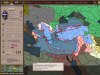
ok. 2 silly maps by me.

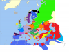
first one is result of my very long Crusader Kings game. I played as - almost doomed - orthodox Nubia kingdom. It should have a culture of its own, but was arabic by culture in this game. However, one of my rulers took a turkish wife from the steppes (after having killed the first one, actually). She gave birth to a turkish child, who I made ruler. It was a mistake, as the offspring of the first son - notabene polish - turned out to be magnificent (while he himself wasn't). So my dynasty turned turkish, which can be seen in this map. It shows the cultural changes that took place until I conquered entire world.

red = turkish.
the other changes when in comparison to the original cultures was
- polish, which gained some provinces in Slovakia, Lithuania and Prussia, but lost some in the west
- german, which gained some in the east and south
- persian, which gained some in Armenia, while losing most to turkish
- greek, which gained some in Balkans
etc

Also, most of the world turned orthodox due to my rule (and Sweden's, which turned orthodox before my conquest due to frequent marriages with my court). Judaism is extinct. Islam is almost extinct, and catholicism is steadily losing ground.

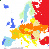
the third map is just a map of the number of neighbours of european countries. Some countries have double numbers. The first one means minimal number (without the mini-countries like Andorra, Liechtenstein, Luxembourg, San Marino, Vatican and Monaco, and countries of disputed souvereignity - Kosovo exactly), the second means maximum number. The colours represent the numbers. The hotter colour, the more neighbours. While adding colours, I used the minimal number when it comes to countries bordering mini-states, while the bigger number when it comes to states bordering Kosovo.

Sea borders were not included.
 

Attachments

  • kultura.png
    kultura.png
    153.6 KB · Views: 225
  • religia.jpg
    religia.jpg
    97.8 KB · Views: 261
  • granice.png
    granice.png
    91.7 KB · Views: 170
You're right. Secessionism is not specially popular in the most populated areas due to the andalusian migration of the 1960's. However, that map has to be put in context in order to understand what does it mean.

Do you think they'll separate in our lifetime? I hope the Spanish government doesn't try to block it.

You should know that the current independentist (not the historical, which was led by Macià) movement is not even 20 years old. It began in 1992, with the "Independentist turn" of ERC. Now consider that this map shows the situation of 2001 (9 years later after the turning point) and that the current approximations seem to show that secessionism has grown a lot.

Given all that, it's not crazy to say that the probabilities of secession have been growing at an unstoppable pace since 1992, so the probabilities of secession in our lifetime are also growing too.


excellent call

As I said, it's a map from 2001 (9 years after the "independentist turn" of ERC). The results nowadays are, given approximations that can be done thanks to the results of the unofficial referenda of this year, much higher. However, no one knows with certainity since the Spanish government has not ordered another study since it saw the (astounding, given that it was only 9 years after the "Turning point") results of 2001.

Like it or not, the most recent official source on the progress of independentism is still from 2001, and all we have about the current progress are mere statistical approximations.

lol, everyone wants out except the only part of Catalunya that matters. :lol:

Andalusian immigrants and their sons are, for the most part, not secessionists.

Now why don't you post a map showing the population distribution in the red and blue areas?

Sorry, my fault :p
 
I don't get it. I did the very same in my very, very old game, and I didn't get Cople, which was my goal. Perhaps I didn't control Melitene. Must return to the game, I've never finished it. Still, I was doing pretty good. Mostly thanks to alliance with Russia in the beginning.
 

Attachments

  • Greece.jpg
    Greece.jpg
    163.5 KB · Views: 194
We can still make maps based on games, though, right?
 
This is a picure I made in paint with my mad skills showing the beautiful women of Africa and South America. :)
 

Attachments

  • S. America & Africa.png
    S. America & Africa.png
    42.4 KB · Views: 153
Status
Not open for further replies.
Top Bottom