Language deathWhat don't you like about it?
")
Language deathWhat don't you like about it?
Exactly ^^ I am fairly certain you typed the question as I was editing my own post with this remark about the legend.What are the circles on the map supposed to be?
It is the UK that stands out to me for some reason. Third highest total, one of the lower populations at the top of the chart but one of the smallest dots.Exactly ^^ I am fairly certain you typed the question as I was editing my own post with this remark about the legend.
Maybe the function includes lack of pubs per capita?It is the UK that stands out to me for some reason. Third highest total, one of the lower populations at the top of the chart but one of the smallest dots.
Maybe it's a clue.Exactly ^^ I am fairly certain you typed the question as I was editing my own post with this remark about the legend.
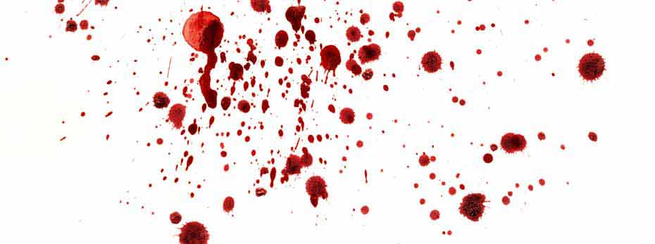
 www.forensicscolleges.com
I have TBH no idea, but I have talked to some old people in English, and they do manage surprisingly.I was thinking of the old people, though! Was English that ubiquitous in the first couple of decades after ww2 there? It's why I don't find 51% unbelievably low for here.
Maybe they had official job requirements for good knowledge of English early on.
My mother does speak English, but it was relatively rare back then.
I mean, you could list pretty much any seven things.7 Things You Didn’t Know About Blood Spatter Analysis
I think it’s just put on the countries represented in the bar chart, not connected to anything. It’s bad design, but when has that ever stopped anyone?The dot representation is strange, to say the least.
DeadstockI thought the same thing. Why spell out "live" for each species when it's in the title of the map? And the alternative wouldn't make any sense anyway! Who has dead anything as their live stock?
Prague and Saarland are white, for some reason. The rest of the whites are all countries.I suppose that's still better than zombie livestock.
I'd guess it is due to the relative lifespans.I thought the same thing. Why spell out "live" for each species when it's in the title of the map? And the alternative wouldn't make any sense anyway! Who has dead anything as their live stock?