Thorgalaeg
Deity
Used to happen in wet climates.
The link between dampness and rheumatism is not really causal in the sense of living in damp areas means you are more likely to get joint inflammation. There may be some link between reduced atmospheric pressure (and therefore a higher chance of precipitation) and flare ups of te condition, but it is not like that dampness really causes it.Used to happen in wet climates.
The bridge bids on the compass link way back in time.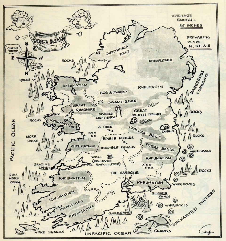
Satirical map of Ireland from WW2 to deter invaders.
This is where it came from. If I was to guess it it is the map plotting library they use, which appears to by python, perhaps in pandas or ploty. I can tell you that the variation in country names is a right hassle when doing these things.This might sound a bit petty but why is Ireland the only country to be qualified with Republic of?
Northern Ireland is coloured differently and labelled separately so there is no real need to qualify.
That would be inconsistent in a different way: every other country has it's name in English.What happened to using Eire?
It is probably that.This is where it came from. If I was to guess it it is the map plotting library they use, which appears to by python, perhaps in pandas or ploty. I can tell you that the variation in country names is a right hassle when doing these things.
That is a deliberate change on the map from the Persian Gulf.Lol, this guy liquidates like half the population of the Arab world but still has the Arabian Gulf label.
Well, what does the "Pal" map look like?
I cannot find it.Well, what does the "Pal" map look like?
What buttons? It's a static image.The map above shows the geographical concentration of a few such words. If you click the buttons, you’ll notice that “dude” is the most widespread.
I have to admit I do not know what is going on. If I had to guess they changed web framework sometime between 2022 and today and the interactive chart was a casualty.What buttons? It's a static image.