You are using an out of date browser. It may not display this or other websites correctly.
You should upgrade or use an alternative browser.
You should upgrade or use an alternative browser.
[RD] Daily Graphs and Charts II: Another 10,000 to come.
- Thread starter Cutlass
- Start date
Zardnaar
Deity
Heh very good

Gori the Grey
The Poster
- Joined
- Jan 5, 2009
- Messages
- 13,996
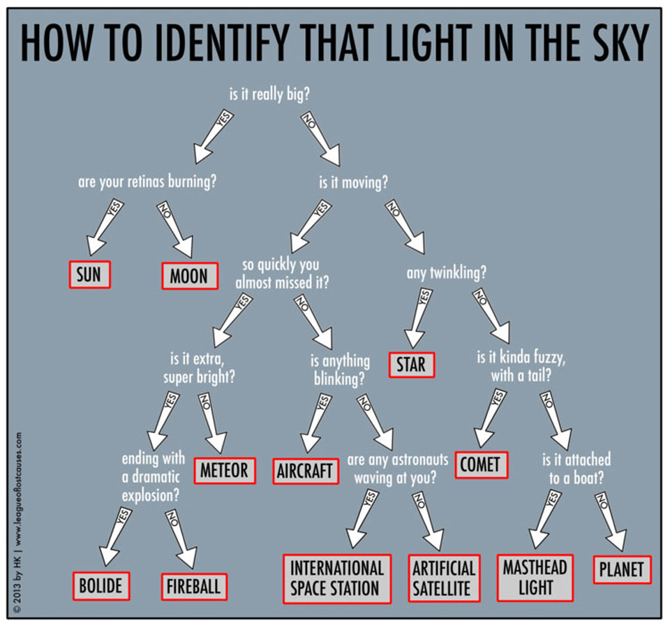
Like you could read the chart if your retinas had been burnt!
Narz
keeping it real
But how is exercise good for us?


Bonyduck Campersang
Not staring into the distance
- Joined
- Dec 11, 2022
- Messages
- 4,895
Only 10 percent of Australians have never been overseas despite the distances involved.
A lot more Canadians have been to a bunch of other countries than Americans, which I assume is largely down to Canada having more foreign born people (23% vs 15%) and more paid leave entitlements.
Europeans playing this on easy mode of course.
Narz
keeping it real
You think he has people post for him? Does the dude have no sleep schedule whatsoever?
warpus
Sommerswerd asked me to change this
Behold, all the walking I did on my Taiwanese adventure! 312 km in total

This does not include the at least 50km of cycling I did.
The "Airport" datapoints at the start and finish also include the walking I did on those days getting to/from the airport and the assorted walking around Taipei I did on those days.
The distance covered on foot (312km) is the equivalent of 3,412 American football fields lined up back to back, for those not comfortable with metric.
Narz
keeping it real

'Ultra-processed' products now half of all UK family food purchases
Exclusive: health experts warn increasing popularity of industrially-made food will lead to negative effects such as obesity and poor health
 www.theguardian.com
Bonyduck Campersang
Not staring into the distance
- Joined
- Dec 11, 2022
- Messages
- 4,895
It is time for a rebellion against black, grey, silver, and white.
Zardnaar
Deity
It is time for a rebellion against black, grey, silver, and white.
Ours is white with black trim lol. Previous one was red.


Similar threads
- Replies
- 4
- Views
- 457
- Replies
- 128
- Views
- 14K
- Replies
- 352
- Views
- 22K